How do I set span background-color so it colors the background throughout the line like in div (d...
Categories:
Achieving Full-Line Background Colors for Spans in CSS

Learn how to style <span> elements to have background colors that extend across the entire line, mimicking block-level behavior without changing display properties.
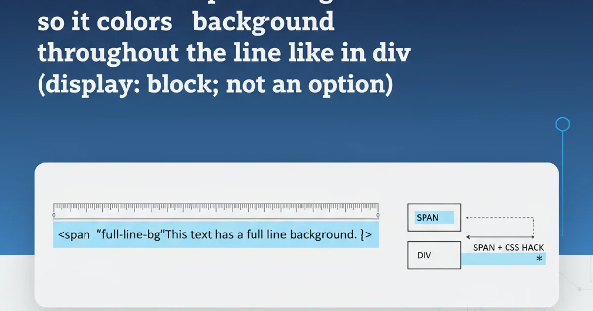
When styling text on the web, developers often encounter a common challenge: how to apply a background color to an inline <span> element so that it fills the entire line, similar to how a <div> or other block-level element would behave. By default, a <span> element, being inline, only applies its background color directly behind its content, leaving gaps on either side if the content doesn't fill the line. This article explores several CSS techniques to achieve a full-line background for <span> elements without resorting to display: block; which can alter the text flow in undesirable ways.
Understanding the Default Behavior of <span>
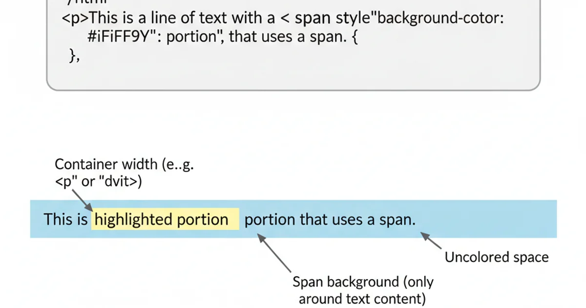
The <span> element is an inline element, meaning it flows with the text content and only occupies the space necessary for its content. When you apply a background-color to a <span>, it will only paint the area directly behind the text. This is often the desired behavior for highlighting specific words or phrases. However, if the goal is to highlight an entire line of text, this default behavior falls short, as the background will not extend to the full width of its containing block.

Default <span> background behavior
Method 1: Using display: inline-block with width: 100%
One straightforward approach is to change the display property of the <span> to inline-block and then set its width to 100%. This allows the <span> to accept width properties while still behaving somewhat like an inline element in terms of vertical flow. However, it's important to note that inline-block elements introduce a small amount of whitespace between them, which might need to be managed, and they can break lines differently than pure inline elements.
<p>
  This is some text with a <span class="full-line-bg-inline-block">highlighted section</span> that should span the entire line.
</p>
.full-line-bg-inline-block {
  display: inline-block;
  width: 100%;
  background-color: #e0f7fa; /* Light cyan */
  padding: 2px 0;
  margin: 5px 0;
}
display: inline-block with width: 100% can work, be mindful of its impact on text flow and potential whitespace issues. It might not always be suitable for truly inline text where you want the background to extend without affecting the line's natural wrapping.Method 2: Leveraging box-shadow for Full-Line Backgrounds
A more creative and often more robust solution for inline elements is to use the box-shadow property. By applying a box-shadow with no blur, no spread, and a large horizontal offset, you can effectively create a background that extends beyond the content of the <span>. This method maintains the inline display property, preserving the natural text flow and wrapping behavior.
<p>
  Here's another example with a <span class="full-line-bg-shadow">different highlighted part</span> using a clever `box-shadow` trick.
</p>
.full-line-bg-shadow {
  background-color: transparent; /* Important: make actual background transparent */
  box-shadow: 0 0 0 100vw #fff3e0; /* Light orange background */
  margin-left: -100vw;
  padding-left: 100vw;
  margin-right: -100vw;
  padding-right: 100vw;
  display: inline;
  /* Optional: to ensure text is readable over the shadow */
  position: relative;
  z-index: 1;
}
box-shadow method is particularly powerful because it respects the inline nature of the <span>. The 100vw (viewport width) value for box-shadow and negative margins/padding ensures the background extends to the edges of the viewport, effectively covering the entire line within its parent container. Remember to set background-color: transparent; on the <span> itself to avoid double backgrounds.Method 3: Using ::before or ::after Pseudo-elements (Advanced)
For more complex scenarios, or when you need more control over the background's positioning relative to the text, pseudo-elements like ::before or ::after can be used. This approach involves positioning a pseudo-element behind the <span> and stretching it to cover the desired area. This method requires the <span> to have position: relative;.
<p>
  And finally, a <span class="full-line-bg-pseudo">third way to highlight a line</span> using pseudo-elements for background.
</p>
.full-line-bg-pseudo {
  position: relative;
  z-index: 0; /* Ensure text is above pseudo-element */
  padding: 2px 0;
}

.full-line-bg-pseudo::before {
  content: '';
  position: absolute;
  top: 0;
  bottom: 0;
  left: -100vw; /* Extend to the left edge of the viewport */
  right: -100vw; /* Extend to the right edge of the viewport */
  background-color: #e8f5e9; /* Light green */
  z-index: -1; /* Place behind the span content */
}
<span>'s content styling. Ensure the z-index is managed correctly to keep the text visible above the pseudo-element background.
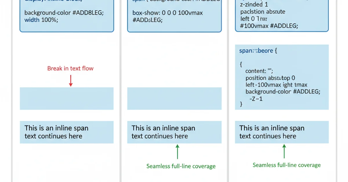
Comparison of full-line background methods