how to make a grouped boxplot graph in matplotlib
Categories:
Creating Grouped Box Plots in Matplotlib for Comparative Data Analysis
Learn how to generate effective grouped box plots using Matplotlib to visualize and compare distributions across different categories and groups in your Python data analysis workflows.
Grouped box plots are a powerful visualization tool for comparing the distribution of a quantitative variable across multiple categorical groups. Unlike simple box plots that show one distribution, grouped box plots allow you to overlay or juxtapose distributions for different sub-categories within a larger category. This article will guide you through the process of creating such plots using Matplotlib, a fundamental plotting library in Python.
Understanding the Need for Grouped Box Plots
Imagine you're analyzing sales data for different product types across various regions. A simple box plot could show the sales distribution for each product type, or for each region. However, to understand how sales of 'Product A' compare across 'North', 'South', 'East', and 'West' regions, and then compare that to 'Product B' across the same regions, a grouped box plot becomes essential. It allows for direct visual comparison of central tendency, spread, and outliers for each product-region combination.
flowchart TD
    A[Start Data Analysis] --> B{Identify Categorical Variables}
    B --> C{Identify Quantitative Variable}
    C --> D{Need to Compare Distributions Across Multiple Categories?}
    D -- Yes --> E[Grouped Box Plot is Ideal]
    D -- No --> F[Consider Simple Box Plot or Other Visualizations]
    E --> G[Prepare Data for Plotting]
    G --> H[Generate Grouped Box Plot with Matplotlib]
    H --> I[Interpret Results]
    I --> J[End Analysis]
Decision flow for choosing a grouped box plot
Preparing Your Data for Grouped Box Plots
Before plotting, your data needs to be structured appropriately. Typically, you'll have one column for the quantitative variable (e.g., 'Sales'), and one or more columns for categorical variables that define your groups (e.g., 'Product Type', 'Region'). Pandas DataFrames are excellent for this. The key is to organize your data such that you can easily extract the subsets for each group you want to plot.
import pandas as pd
import numpy as np

# Sample Data Generation
np.random.seed(42)
data = {
    'Product': np.random.choice(['A', 'B', 'C'], 300),
    'Region': np.random.choice(['North', 'South', 'East', 'West'], 300),
    'Sales': np.random.normal(loc=50, scale=15, size=300)
}
df = pd.DataFrame(data)

# Introduce some variation for different groups
df.loc[df['Product'] == 'A', 'Sales'] = df.loc[df['Product'] == 'A', 'Sales'] + 10
df.loc[(df['Product'] == 'B') & (df['Region'] == 'North'), 'Sales'] = df.loc[(df['Product'] == 'B') & (df['Region'] == 'North'), 'Sales'] - 5

print(df.head())
Example of creating a Pandas DataFrame suitable for grouped box plots.
Implementing Grouped Box Plots with Matplotlib
Matplotlib's boxplot function is versatile. To create grouped box plots, you'll typically iterate through your primary grouping variable and then, for each primary group, extract the data for its sub-groups. This often involves careful indexing or groupby operations in Pandas. We'll use plt.boxplot and manage the positioning of the boxes manually to achieve the grouped effect.
import matplotlib.pyplot as plt
import pandas as pd
import numpy as np

# Re-create sample data for a self-contained example
np.random.seed(42)
data = {
    'Product': np.random.choice(['A', 'B', 'C'], 300),
    'Region': np.random.choice(['North', 'South', 'East', 'West'], 300),
    'Sales': np.random.normal(loc=50, scale=15, size=300)
}
df = pd.DataFrame(data)

df.loc[df['Product'] == 'A', 'Sales'] = df.loc[df['Product'] == 'A', 'Sales'] + 10
df.loc[(df['Product'] == 'B') & (df['Region'] == 'North'), 'Sales'] = df.loc[(df['Product'] == 'B') & (df['Region'] == 'North'), 'Sales'] - 5

# Define the main grouping variable and the sub-grouping variable
main_group_var = 'Product'
sub_group_var = 'Region'
value_var = 'Sales'

# Get unique categories for main and sub-groups
main_groups = df[main_group_var].unique()
sub_groups = df[sub_group_var].unique()

# Sort for consistent plotting order
main_groups.sort()
sub_groups.sort()

# Set up the plot
fig, ax = plt.subplots(figsize=(12, 7))

# Calculate positions for each group of box plots
# Each main group will have len(sub_groups) box plots
# We'll leave some space between main groups
box_width = 0.7 / len(sub_groups) # Adjust width based on number of sub-groups
positions = []
all_data_to_plot = []
labels = []

for i, main_group in enumerate(main_groups):
    base_pos = i * (len(sub_groups) + 1) # +1 for spacing between main groups
    for j, sub_group in enumerate(sub_groups):
        current_pos = base_pos + j
        positions.append(current_pos)

        # Extract data for the current product-region combination
        data_subset = df[(df[main_group_var] == main_group) & (df[sub_group_var] == sub_group)][value_var].dropna()
        all_data_to_plot.append(data_subset)
        labels.append(f'{main_group}-{sub_group}') # Label for legend/axis if needed

# Create the box plots
bp = ax.boxplot(all_data_to_plot, positions=positions, widths=box_width, patch_artist=True, medianprops={'color': 'black'})

# Customize colors for sub-groups within each main group
colors = plt.cm.get_cmap('tab10', len(sub_groups))
for i, patch in enumerate(bp['boxes']):
    patch.set_facecolor(colors(i % len(sub_groups)))

# Set x-axis ticks and labels for main groups
ax.set_xticks([ (i * (len(sub_groups) + 1)) + (len(sub_groups) - 1) / 2 for i in range(len(main_groups)) ])
ax.set_xticklabels(main_groups)

# Add a legend for sub-groups
legend_handles = [plt.Rectangle((0,0),1,1, facecolor=colors(j)) for j in range(len(sub_groups))]
ax.legend(legend_handles, sub_groups, title=sub_group_var, loc='upper left', bbox_to_anchor=(1, 1))

ax.set_title(f'Sales Distribution by {main_group_var} and {sub_group_var}')
ax.set_xlabel(main_group_var)
ax.set_ylabel(value_var)
ax.grid(axis='y', linestyle='--', alpha=0.7)

plt.tight_layout()
plt.show()
Python code to generate a grouped box plot using Matplotlib, showing sales distribution by product and region.
seaborn.boxplot as it often simplifies the syntax for grouped plots, especially when working directly with Pandas DataFrames. However, understanding the Matplotlib approach provides a deeper insight into plot customization.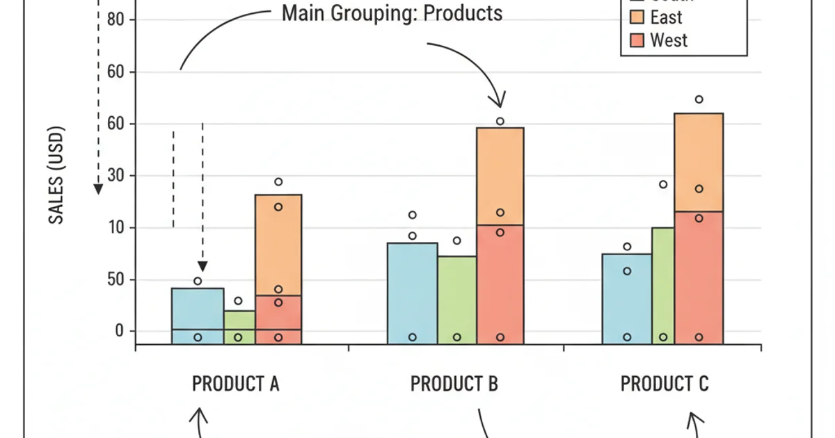
Example of a grouped box plot generated by the provided Python code.
Customization and Interpretation
Customizing your grouped box plot is crucial for clarity. You can adjust colors, add legends, modify axis labels, and add titles to make the plot more informative. The patch_artist=True argument in boxplot allows you to fill the boxes with color, which is excellent for distinguishing sub-groups. The medianprops argument helps highlight the median line.
When interpreting the plot, pay attention to:
- Median Line: The line inside the box indicates the median value. Compare medians across groups to see central tendencies.
- Box Length: The length of the box represents the interquartile range (IQR), showing the spread of the middle 50% of the data. Longer boxes mean more variability.
- Whiskers: These extend to the minimum and maximum values within 1.5 times the IQR from the box, indicating the range of typical data.
- Outliers: Individual points beyond the whiskers are considered outliers, which might warrant further investigation.