How to change the style of the title attribute
Categories:
Styling the HTML Title Attribute: A Comprehensive Guide
Explore the limitations and workarounds for styling the native HTML title attribute, and discover alternative approaches for custom tooltips.
The HTML title attribute is a ubiquitous feature, providing supplementary information when a user hovers over an element. While incredibly useful for accessibility and user experience, many developers quickly discover its primary limitation: direct styling with CSS is not possible. This article delves into why the native title attribute resists styling and offers practical, accessible alternatives for creating custom, stylable tooltips.
Understanding the Native Title Attribute's Behavior
The title attribute is part of the browser's default UI rendering. When you add title="Some helpful text" to an element, the browser takes control of how and when that text is displayed. This includes its appearance, positioning, and timing. This behavior is intentionally designed to be consistent across different operating systems and browsers, ensuring a baseline level of usability without developer intervention.
Because the title attribute's rendering is handled by the browser's native tooltip mechanism, it exists outside the document's DOM (Document Object Model). This means standard CSS selectors and properties simply cannot target or modify it. Attempts to apply styles directly to elements with a title attribute will affect the element itself, but never the tooltip generated by the title attribute.
title attribute is primarily for accessibility and provides a fallback for users who cannot interact with visual cues. It's read by screen readers and can be useful for non-interactive elements like <iframe> or <img>.flowchart TD
A[HTML Element with title attribute] --> B{Browser detects hover}
B --> C{Browser's native tooltip mechanism activated}
C --> D[Tooltip rendered by OS/Browser UI]
D --X E[CSS cannot target this rendering]Flowchart illustrating why the native title attribute cannot be styled by CSS.
Implementing Custom Stylable Tooltips
Since the native title attribute is off-limits for styling, the solution is to create your own custom tooltip mechanism using standard HTML, CSS, and optionally JavaScript. This approach gives you full control over the tooltip's appearance, animation, and behavior.
The general strategy involves:
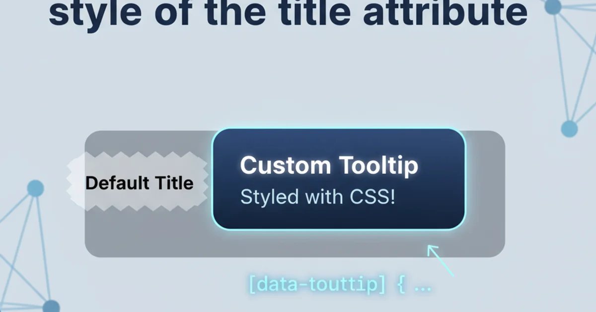
- HTML Structure: Use a data attribute (e.g.,
data-tooltip) to store the tooltip text instead oftitle. - CSS Styling: Create a pseudo-element (
::beforeor::after) or a separate<span>element to display the tooltip text, styling it as desired. - JavaScript (Optional): For more complex interactions, dynamic content, or precise positioning, JavaScript can be used to manage tooltip visibility and placement.
<button data-tooltip="This is a custom tooltip">Hover Me</button>

<a href="#" data-tooltip="Link to another page">Example Link</a>
HTML structure using a data-tooltip attribute.
[data-tooltip] {
  position: relative; /* Required for positioning the tooltip */
}

[data-tooltip]::before,
[data-tooltip]::after {
  --scale: 0; /* Custom property for animation */
  --arrow-size: 10px;
  position: absolute;
  top: -0.25rem;
  left: 50%;
  transform: translateX(-50%) translateY(-100%) scale(var(--scale));
  transition: transform 0.2s cubic-bezier(0.3, 0.7, 0.4, 1.5);
  transform-origin: bottom center;
  z-index: 10;
}

[data-tooltip]::before {
  content: attr(data-tooltip);
  padding: 0.5rem 0.75rem;
  border-radius: 0.25rem;
  background: #333;
  color: #fff;
  font-size: 0.875rem;
  white-space: nowrap;
}

[data-tooltip]::after {
  content: '';
  border: var(--arrow-size) solid transparent;
  border-top-color: #333;
  top: -0.25rem;
  transform: translateX(-50%) translateY(-100%) scale(var(--scale)) translateY(calc(var(--arrow-size) * -1));
}

[data-tooltip]:hover::before,
[data-tooltip]:hover::after {
  --scale: 1;
}
CSS for a basic custom tooltip using pseudo-elements.
aria-describedby or aria-labelledby can link the tooltip content to the interactive element.Advanced Customization with JavaScript
While CSS can handle basic hover-based tooltips, JavaScript provides the flexibility for more advanced features such as:
- Dynamic Content: Changing tooltip text based on user interaction or data.
- Precise Positioning: Ensuring tooltips stay within the viewport, especially near screen edges.
- Delayed Appearance/Disappearance: Customizing the timing of the tooltip.
- Focus-based Activation: Showing tooltips on keyboard focus, not just mouse hover.
- Theming: Applying different styles based on context or user preferences.
Libraries like Popper.js or Tippy.js are excellent choices for robust, accessible, and highly customizable tooltip solutions, abstracting away much of the complex positioning and accessibility concerns.
1. Step 1: Replace title with data-tooltip
Modify your HTML elements to use a data-tooltip attribute instead of title for the tooltip text. This prevents the browser's native tooltip from appearing.
2. Step 2: Implement CSS for basic styling
Write CSS rules to style the [data-tooltip] element and its ::before or ::after pseudo-elements to create the visual appearance of your tooltip. Use position: relative on the parent and position: absolute on the pseudo-element for positioning.
3. Step 3: Add hover/focus states
Use the :hover pseudo-class (and optionally :focus for accessibility) to control the visibility and animation of your custom tooltip. You can use CSS transform and opacity for smooth transitions.
4. Step 4: Enhance with JavaScript (Optional)
If more complex behavior is needed, use JavaScript to dynamically create, position, and manage the visibility of tooltip elements. Consider using a dedicated tooltip library for best results.