Why does "font-weight: bolder" skip boldness steps?
Categories:
Understanding 'font-weight: bolder' and Skipped Boldness Steps
Explore why 'font-weight: bolder' might not produce the expected incremental boldness in CSS, delving into font metrics, browser rendering, and available font faces.
When styling text on the web, font-weight is a fundamental CSS property. While numerical values like 400 (normal) and 700 (bold) are straightforward, keywords like bolder and lighter can sometimes behave unexpectedly. Specifically, font-weight: bolder often appears to 'skip' boldness steps, jumping directly to a much heavier weight or showing no change at all. This article will demystify this behavior, explaining the underlying mechanisms of font rendering and how browsers interpret these relative keywords.
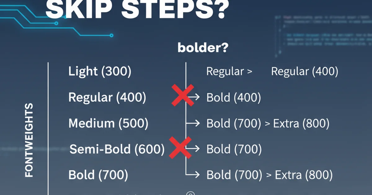
How 'bolder' and 'lighter' are Calculated
The bolder and lighter keywords are relative to the inherited font-weight of the parent element. They don't simply add or subtract a fixed amount of boldness. Instead, they instruct the browser to find the next available weight in a predefined sequence, based on the font family's available faces. The CSS specification defines a mapping for these relative weights:
- If the inherited weight is between 1 and 399,
boldermaps to400(normal). - If the inherited weight is between 400 and 599,
boldermaps to700(bold). - If the inherited weight is between 600 and 899,
boldermaps to900(extra bold). - If the inherited weight is 900,
bolderremains900.
Conversely, lighter follows a similar, inverse logic. The key takeaway is that these are not continuous adjustments but rather jumps to specific, predefined weight categories. If a font family doesn't have a specific weight available, the browser will synthesize it or fall back to the closest available weight, which can further obscure the intended effect.
flowchart TD
    A[Inherited Font-Weight] --> B{Is weight < 400?}
    B -- Yes --> C[bolder = 400]
    B -- No --> D{Is weight < 600?}
    D -- Yes --> E[bolder = 700]
    D -- No --> F{Is weight < 900?}
    F -- Yes --> G[bolder = 900]
    F -- No --> H[bolder = 900]
    C --> I[Render with available font face]
    E --> I
    G --> I
    H --> I
Decision flow for 'font-weight: bolder' calculation based on inherited weight.
The Role of Available Font Faces
The most significant factor contributing to the 'skipped steps' phenomenon is the actual font files available to the browser. Many font families, especially web fonts, do not provide a continuous range of weights (e.g., 100, 200, 300, 400, 500, 600, 700, 800, 900). Instead, they often come with a limited set, such as:
- Regular (400)
- Medium (500)
- Bold (700)
- Black (900)
If you apply font-weight: bolder to an element whose parent has font-weight: 400, the browser's internal calculation will target 700. If the font family only has 400 and 700 available, it will jump directly from 400 to 700, making it seem like intermediate steps (like 500 or 600) were skipped. If the font only has 400 and 900, the jump will be even more pronounced.
Browsers can attempt to synthesize missing weights (e.g., making a 400 weight appear 500 by slightly thickening it), but this is often imperfect and can lead to inconsistent rendering across different browsers or operating systems. For optimal control, it's always best to explicitly load and use the desired font weights.
/* Example CSS demonstrating the issue */
body {
  font-family: 'Open Sans', sans-serif;
  font-weight: 400; /* Inherited normal weight */
}

.container {
  font-weight: 400; /* Explicitly normal */
}

.bolder-text {
  font-weight: bolder; /* Will likely jump to 700 if 500/600 are not available */
}

.explicit-bold {
  font-weight: 700; /* Direct bold */
}

.explicit-medium {
  font-weight: 500; /* Only works if 500 is loaded */
}
CSS demonstrating bolder vs. explicit font-weight values.
font-weight: 500;) and make sure the corresponding font files for those specific weights are loaded via @font-face or a web font service like Google Fonts.Best Practices for Font Weight Management
Given the potential for ambiguity with bolder and lighter, it's generally recommended to use explicit numerical font-weight values whenever possible. This approach offers several benefits:
- Predictability: You know exactly which weight you're targeting, assuming the font file is available.
- Consistency: Reduces reliance on browser synthesis, leading to more consistent rendering across platforms.
- Performance: By explicitly defining weights, you can selectively load only the font files you need, optimizing page load times.
When using web fonts, carefully review the available weights provided by the font foundry or service. If you need a specific weight (e.g., 500 for 'Medium'), ensure you include it in your @font-face declaration or web font import. If a font doesn't offer a particular weight, consider choosing an alternative font family or adjusting your design to use the available weights.
@font-face {
  font-family: 'MyCustomFont';
  src: url('mycustomfont-regular.woff2') format('woff2');
  font-weight: 400;
  font-style: normal;
}

@font-face {
  font-family: 'MyCustomFont';
  src: url('mycustomfont-medium.woff2') format('woff2');
  font-weight: 500; /* Explicitly loading medium weight */
  font-style: normal;
}

@font-face {
  font-family: 'MyCustomFont';
  src: url('mycustomfont-bold.woff2') format('woff2');
  font-weight: 700;
  font-style: normal;
}

/* Usage */
h1 {
  font-family: 'MyCustomFont', sans-serif;
  font-weight: 700; /* Will use the bold font file */
}

p {
  font-family: 'MyCustomFont', sans-serif;
  font-weight: 500; /* Will use the medium font file */
}
Using @font-face to load specific font weights for precise control.