How can I vertically center a div element for all browsers using CSS?
Categories:
Mastering Vertical Centering: A Cross-Browser CSS Guide
Learn various robust CSS techniques to vertically center a div element, ensuring consistent display across all modern browsers and devices.
Vertically centering elements on a webpage has historically been one of CSS's more challenging tasks. Unlike horizontal centering, which is often straightforward with margin: auto or text-align: center, vertical alignment requires a deeper understanding of CSS layout models. This article explores several reliable methods to achieve perfect vertical centering for a div element, compatible with all modern browsers.
Understanding the Challenge of Vertical Centering
The difficulty in vertical centering stems from the default block-level layout behavior in CSS. Elements typically flow from top to bottom, and their height is often determined by their content, making it hard to distribute available vertical space evenly. Traditional methods like vertical-align are primarily designed for inline or table-cell elements, not block-level divs. Modern CSS, however, provides powerful tools like Flexbox and Grid that simplify this task significantly.
flowchart TD
    A[Start: Vertically Center a Div] --> B{Known Height?}
    B -->|Yes| C[Method 1: Absolute Positioning + Negative Margin]
    B -->|No| D[Method 2: Absolute Positioning + Transform]
    D --> E{Modern Browser Support?}
    E -->|Yes| F[Method 3: Flexbox]
    E -->|Yes| G[Method 4: CSS Grid]
    E -->|No| H[Consider Polyfills/Fallbacks]
    C --> I[End]
    F --> I[End]
    G --> I[End]
    H --> I[End]
Decision flow for choosing a vertical centering method
Method 1: Absolute Positioning with Negative Margins (Fixed Height)
This classic technique is effective when the height of the div you want to center is known. It relies on absolute positioning the element, setting its top edge to 50% of the parent's height, and then pulling it back up by half of its own height using a negative top margin. The parent element must have position: relative (or absolute, fixed) for the absolute positioning to work correctly within its context.
.parent {
  position: relative;
  height: 400px; /* Or any defined height */
  border: 1px solid #ccc;
}

.child-fixed-height {
  position: absolute;
  top: 50%;
  left: 50%;
  height: 100px; /* Known height */
  width: 200px;
  margin-top: -50px; /* Negative half of height */
  margin-left: -100px; /* Negative half of width (for horizontal centering) */
  background-color: lightblue;
  text-align: center;
  line-height: 100px;
}
CSS for absolute positioning with negative margins
Method 2: Absolute Positioning with CSS transform (Unknown Height)
This method is a more flexible evolution of the previous one, as it doesn't require a known height for the child element. Instead of using a fixed negative margin, we use the CSS transform property's translateY(-50%). The percentage value for translateY is relative to the element's own height, making it perfect for dynamic content. This also allows for horizontal centering with translateX(-50%).
.parent {
  position: relative;
  height: 400px;
  border: 1px solid #ccc;
}

.child-unknown-height {
  position: absolute;
  top: 50%;
  left: 50%;
  transform: translate(-50%, -50%); /* Centers both horizontally and vertically */
  width: 200px;
  padding: 20px;
  background-color: lightcoral;
  text-align: center;
}
CSS for absolute positioning with transform
transform property is highly performant as it operates on the composite layer, avoiding layout recalculations. This makes it a preferred method for animations and dynamic positioning.Method 3: Flexbox (Modern & Recommended)
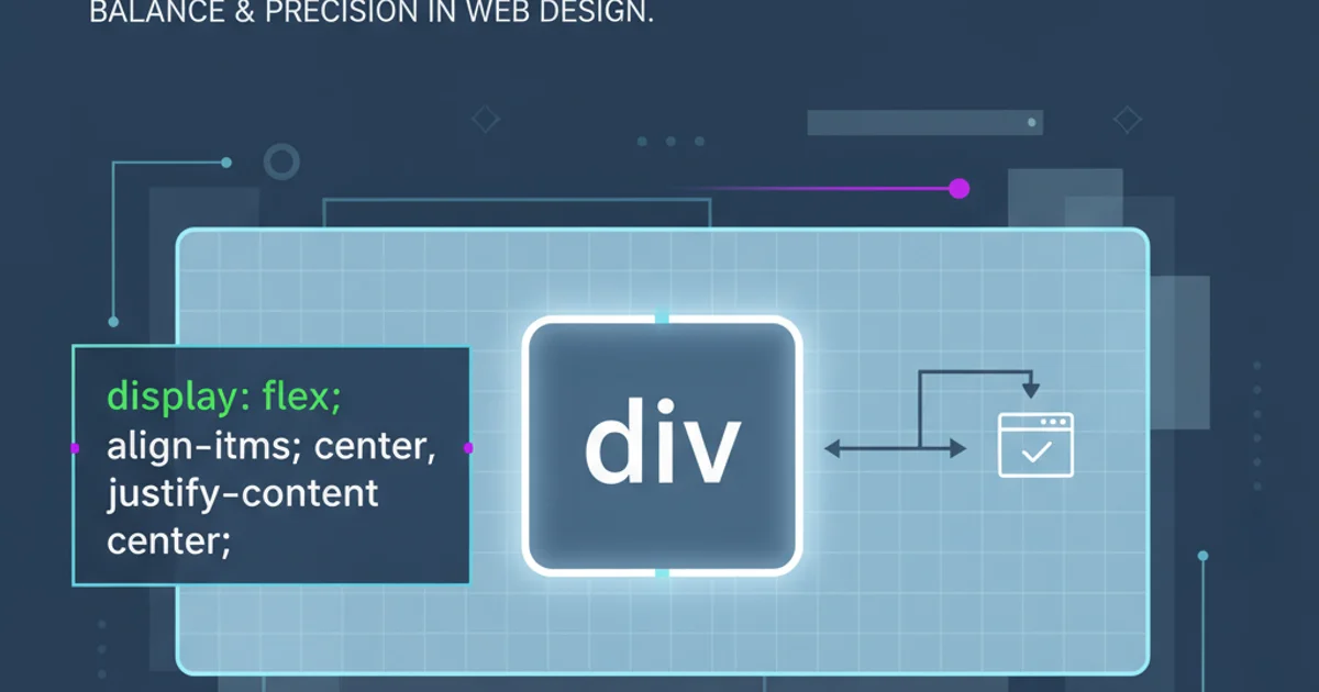
Flexbox is arguably the most robust and versatile solution for alignment in modern CSS. It provides a straightforward way to distribute space and align items within a container. By making the parent a flex container, you can use align-items: center for vertical centering and justify-content: center for horizontal centering.
.parent-flex {
  display: flex;
  justify-content: center; /* Centers horizontally */
  align-items: center;    /* Centers vertically */
  height: 400px;
  border: 1px solid #ccc;
}

.child-flex {
  width: 200px;
  padding: 20px;
  background-color: lightgreen;
  text-align: center;
}
CSS for vertical centering using Flexbox
Method 4: CSS Grid (Powerful & Precise)
CSS Grid Layout offers even more control over two-dimensional layouts. For simple centering, it's very similar to Flexbox, but its power shines when dealing with more complex grid structures. To center a single item, you can use place-items: center on the parent, or align-self: center and justify-self: center on the child.
.parent-grid {
  display: grid;
  place-items: center; /* Centers both horizontally and vertically */
  height: 400px;
  border: 1px solid #ccc;
}

.child-grid {
  width: 200px;
  padding: 20px;
  background-color: lightsalmon;
  text-align: center;
}
CSS for vertical centering using CSS Grid
Choosing the right method depends on your specific needs and the overall layout of your page. For simple, single-item centering, Flexbox or CSS Grid are generally the most straightforward and maintainable. For scenarios requiring support for older browsers or very specific positioning, the absolute positioning methods remain viable.