Align items in a stack panel?
Categories:
Mastering Item Alignment in WPF StackPanels
Learn how to effectively align child elements within a WPF StackPanel using various alignment properties and techniques.
The StackPanel in WPF is a fundamental layout control that arranges child elements in a single line, either horizontally or vertically. While its primary function is stacking, controlling the alignment of individual items within that stack is crucial for creating well-designed user interfaces. This article will guide you through the various properties and methods to achieve precise alignment within your StackPanel.
Understanding StackPanel Orientation and Alignment
The behavior of alignment properties like HorizontalAlignment and VerticalAlignment within a StackPanel is heavily dependent on its Orientation property. When the StackPanel is oriented horizontally, HorizontalAlignment on its children has no effect because the StackPanel itself dictates the horizontal position. Conversely, VerticalAlignment will work as expected. The opposite is true for a vertically oriented StackPanel.
flowchart TD
    A[StackPanel Orientation] --> B{Is Horizontal?}
    B -->|Yes| C[Child HorizontalAlignment: No Effect]
    B -->|Yes| D[Child VerticalAlignment: Works]
    B -->|No| E[Child VerticalAlignment: No Effect]
    B -->|No| F[Child HorizontalAlignment: Works]
Impact of StackPanel Orientation on Child Alignment Properties
Aligning Items in a Vertical StackPanel
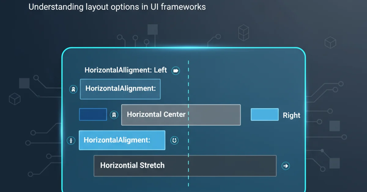
For a StackPanel with Orientation="Vertical", the VerticalAlignment property of its child elements will not have an effect, as the StackPanel itself manages the vertical positioning. However, HorizontalAlignment can be used to position items within the available horizontal space. Common values include Left, Center, Right, and Stretch.
<StackPanel Orientation="Vertical" Background="LightGray" Width="200">
    <Button Content="Left Aligned" HorizontalAlignment="Left" Margin="5"/>
    <Button Content="Center Aligned" HorizontalAlignment="Center" Margin="5"/>
    <Button Content="Right Aligned" HorizontalAlignment="Right" Margin="5"/>
    <Button Content="Stretch Aligned" HorizontalAlignment="Stretch" Margin="5"/>
</StackPanel>
Example of Horizontal Alignment in a Vertical StackPanel
Aligning Items in a Horizontal StackPanel
When the StackPanel has Orientation="Horizontal", the HorizontalAlignment property on its children will not influence their position. Instead, VerticalAlignment becomes the effective property for positioning items along the vertical axis. You can use Top, Center, Bottom, or Stretch.
<StackPanel Orientation="Horizontal" Background="LightBlue" Height="100">
    <Button Content="Top" VerticalAlignment="Top" Margin="5"/>
    <Button Content="Center" VerticalAlignment="Center" Margin="5"/>
    <Button Content="Bottom" VerticalAlignment="Bottom" Margin="5"/>
    <Button Content="Stretch" VerticalAlignment="Stretch" Margin="5"/>
</StackPanel>
Example of Vertical Alignment in a Horizontal StackPanel
HorizontalAlignment="Stretch" or VerticalAlignment="Stretch" will only have an effect if the parent StackPanel has a defined width (for horizontal stretch) or height (for vertical stretch) that is larger than the child's desired size.Using Margin for Spacing and Fine-Tuning
While alignment properties control how an element positions itself within its allocated space, the Margin property provides additional spacing around an element. This can be used in conjunction with alignment to achieve specific visual layouts, especially when Stretch is not desired or applicable.
<StackPanel Orientation="Vertical" Background="LightCoral" Width="200">
    <Button Content="Button 1" HorizontalAlignment="Left" Margin="10,5,0,5"/>
    <Button Content="Button 2" HorizontalAlignment="Right" Margin="0,5,10,5"/>
    <Button Content="Button 3" HorizontalAlignment="Center" Margin="0,15,0,15"/>
</StackPanel>
Using Margin for custom spacing and offset within a StackPanel
Grid or DockPanel as they offer more robust layout capabilities than StackPanel.