How to plot a histogram using Matplotlib in Python with a list of data?
Categories:
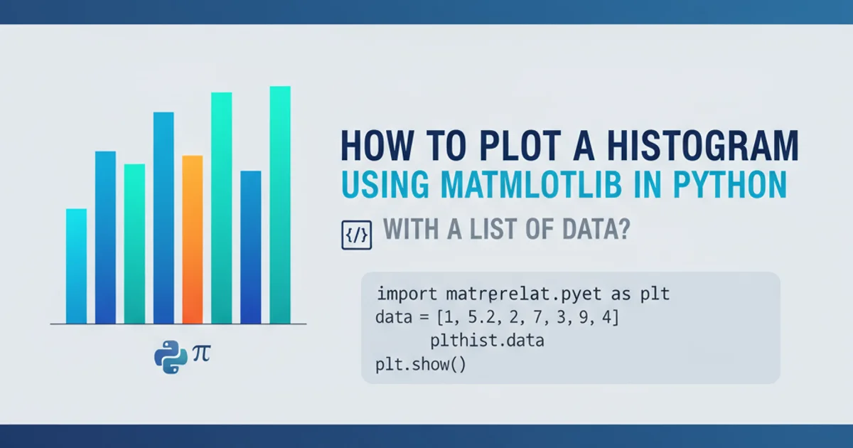
How to Plot a Histogram Using Matplotlib in Python
Learn to visualize data distributions effectively by creating histograms with Matplotlib in Python, using a list of numerical data.
Histograms are powerful tools for visualizing the distribution of a dataset. They group data into 'bins' and display the frequency of data points falling into each bin. This article will guide you through creating histograms using Matplotlib, Python's most popular plotting library, starting with a simple list of numerical data.
Understanding Histograms and Their Components
Before diving into the code, it's essential to understand what a histogram represents. A histogram provides a visual summary of the distribution of a continuous variable. The x-axis represents the data values, divided into intervals called 'bins'. The y-axis represents the frequency (or count) of data points that fall into each bin. The height of each bar corresponds to this frequency.
Key components of a histogram include:
- Bins: These are the intervals into which the data is divided. The number and width of bins significantly impact the histogram's appearance and interpretation.
- Frequency/Count: The number of data points that fall within a specific bin.
- Edges: The boundaries of each bin.
flowchart TD
    A[Start with Raw Data List] --> B{Choose Number of Bins}
    B --> C[Divide Data into Bins]
    C --> D[Count Frequencies per Bin]
    D --> E[Plot Bars: X-axis = Bins, Y-axis = Frequencies]
    E --> F[Add Labels and Title]
    F --> G[Display Histogram]
Workflow for creating a histogram
Basic Histogram Plotting with plt.hist()
Matplotlib's pyplot module provides the hist() function, which is specifically designed for creating histograms. It takes your data as input and automatically calculates bin edges and frequencies, then plots the bars. You can customize various aspects like the number of bins, color, and labels.
import matplotlib.pyplot as plt
import random

# 1. Prepare your data
# Let's create a list of 100 random numbers for demonstration
data = [random.gauss(0, 1) for _ in range(100)]

# 2. Create the histogram
plt.hist(data)

# 3. Add labels and title for clarity
plt.xlabel('Value')
plt.ylabel('Frequency')
plt.title('Basic Histogram of Random Data')

# 4. Display the plot
plt.show()
Basic Python code to generate a histogram from a list of random data.
plt.hist() function returns three values: n (the counts of each bin), bins (the bin edges), and patches (the actual bars). You can capture these if you need to perform further analysis on the histogram's underlying data.Customizing Your Histogram
Matplotlib offers extensive customization options for histograms. You can control the number of bins, color, edge color, transparency, and even normalize the histogram to show probability density instead of raw counts.
import matplotlib.pyplot as plt
import numpy as np

# Generate more data for a clearer distribution
data = np.random.normal(loc=0, scale=1, size=1000) # Mean 0, Std Dev 1, 1000 points

plt.figure(figsize=(10, 6)) # Set the figure size

# Plotting with customizations
plt.hist(
    data,
    bins=30,             # Specify the number of bins
    color='skyblue',     # Set bar color
    edgecolor='black',   # Set bin edge color
    alpha=0.7,           # Set transparency
    density=False        # Set to True for probability density, False for counts
)

plt.xlabel('Data Value', fontsize=12)
plt.ylabel('Frequency', fontsize=12)
plt.title('Customized Histogram of Normal Distribution', fontsize=14)
plt.grid(axis='y', alpha=0.75) # Add a grid for better readability

plt.show()
Customizing a histogram with specific bin count, colors, and labels.
bins is crucial. Too few bins can hide important details, while too many can make the histogram noisy and obscure the overall shape of the distribution. Experiment with different values to find the best representation for your data.Multiple Histograms on One Plot
You might often need to compare the distributions of two or more datasets. Matplotlib allows you to plot multiple histograms on the same axes, which can be very effective for comparative analysis.
import matplotlib.pyplot as plt
import numpy as np

# Generate two different datasets
data1 = np.random.normal(loc=0, scale=1, size=500) # Mean 0, Std Dev 1
data2 = np.random.normal(loc=2, scale=0.5, size=500) # Mean 2, Std Dev 0.5

plt.figure(figsize=(10, 6))

# Plot the first histogram
plt.hist(
    data1,
    bins=25,
    color='blue',
    alpha=0.5,
    label='Dataset 1 (Mean=0)'
)

# Plot the second histogram
plt.hist(
    data2,
    bins=25,
    color='red',
    alpha=0.5,
    label='Dataset 2 (Mean=2)'
)

plt.xlabel('Value')
plt.ylabel('Frequency')
plt.title('Comparison of Two Data Distributions')
plt.legend() # Display the legend to differentiate datasets
plt.grid(axis='y', alpha=0.75)

plt.show()
Plotting two histograms on the same axes for comparison.
By using different colors and setting alpha (transparency) values, you can easily distinguish between the distributions. The plt.legend() function is essential here to label each dataset clearly.