The most practical way to stretch fonts using css
Categories:
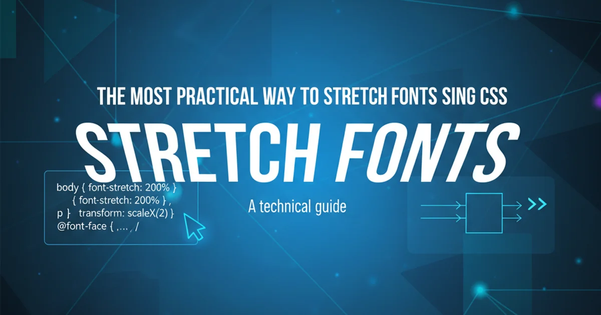
The Most Practical Way to Stretch Fonts Using CSS
Explore various CSS techniques to stretch or condense text, focusing on font-stretch and transform properties for practical and accessible font manipulation.
Stretching or condensing fonts in web design can be a powerful tool for visual hierarchy, artistic expression, or fitting text into constrained layouts. While it might seem straightforward, achieving this effectively and accessibly with CSS requires understanding the nuances of different properties. This article delves into the most practical methods, highlighting font-stretch for variable fonts and transform: scaleX() for broader compatibility, along with their respective use cases and considerations.
Understanding font-stretch for Variable Fonts
The font-stretch CSS property is the most semantically correct and often the best way to condense or expand text. However, its effectiveness is entirely dependent on the font itself. It only works with variable fonts that have a 'wdth' (width) axis defined. When available, font-stretch allows for precise control over the font's width without distorting the glyphs, maintaining their intended design integrity.
/* Example using font-stretch with a variable font */
.condensed-text {
  font-family: 'Open Sans Variable', sans-serif;
  font-stretch: 50%; /* Condenses the font to 50% of its normal width */
}

.expanded-text {
  font-family: 'Open Sans Variable', sans-serif;
  font-stretch: 150%; /* Expands the font to 150% of its normal width */
}

/* Keyword values are also available */
.ultra-condensed {
  font-stretch: ultra-condensed;
}

.extra-expanded {
  font-stretch: extra-expanded;
}
Applying font-stretch to elements using percentage and keyword values.
font-stretch.Using transform: scaleX() for Universal Stretching
When font-stretch isn't an option (i.e., you're not using a variable font or it lacks a width axis), the transform: scaleX() property provides a widely supported alternative. This method scales the text horizontally, effectively stretching or condensing it. The key difference is that transform scales the entire element, including its bounding box, which can sometimes lead to distorted glyphs or layout issues if not handled carefully. However, for non-variable fonts, it's often the most practical solution.
/* Example using transform: scaleX() */
.stretched-text {
  transform: scaleX(1.5); /* Stretches text by 50% horizontally */
  transform-origin: left; /* Ensures stretching starts from the left edge */
  display: inline-block; /* Required for transform to apply correctly to inline elements */
}

.condensed-text-transform {
  transform: scaleX(0.7); /* Condenses text to 70% horizontally */
  transform-origin: left;
  display: inline-block;
}
Applying transform: scaleX() to stretch and condense text.
transform: scaleX(), remember to set transform-origin (usually to left or 0 0) to control the point from which the scaling originates. Also, ensure the element has a display property that allows transforms, such as inline-block or block.flowchart TD
A[Start: Need to Stretch/Condense Font?] --> B{Is it a Variable Font with 'wdth' axis?}
B -- Yes --> C[Use `font-stretch` property]
C --> D[Result: Semantic, high-quality font manipulation]
B -- No --> E[Use `transform: scaleX()` property]
E --> F[Set `transform-origin` (e.g., `left`)]
F --> G[Set `display: inline-block` or `block`]
G --> H[Result: Universal, but potentially distorted glyphs]
D & H --> I[End]Decision flow for choosing between font-stretch and transform: scaleX().
Accessibility and Best Practices
While stretching fonts can be visually appealing, it's crucial to consider accessibility. Overly stretched or condensed text can significantly impair readability, especially for users with cognitive disabilities or visual impairments. Always test your designs with various font sizes and accessibility tools. Prioritize font-stretch when possible, as it's designed for this purpose and maintains better legibility. If using transform: scaleX(), use it sparingly and ensure the resulting text remains easily readable.
transform: scaleX(), values between 0.8 and 1.2 are often a safe bet for subtle effects.