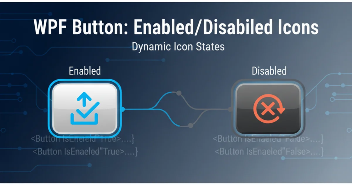
WPF Button use different icon for enabled and disabled state
Categories:
WPF Button Icons: Dynamic States for Enabled and Disabled
Learn how to dynamically change a WPF Button's icon based on its enabled or disabled state, enhancing user experience and visual feedback.
In WPF applications, providing clear visual feedback to users is crucial. A common requirement is to display different icons on a button depending on whether it's enabled or disabled. This article explores various techniques to achieve this, focusing on XAML-based solutions using DataTriggers and ControlTemplates to ensure a clean and maintainable codebase.
Understanding the Challenge
By default, a WPF Button doesn't automatically change its Content (where an icon is typically placed) when its IsEnabled property changes. If you simply embed an Image or Path directly into the button's Content, it will remain static regardless of the button's state. The goal is to create a dynamic visual representation that intuitively communicates the button's current interactive status to the user.
flowchart TD
    A[Button Clicked] --> B{Is Button Enabled?}
    B -->|Yes| C[Execute Command]
    B -->|No| D[Do Nothing]
    D --> E[Display Disabled Icon]
    C --> F[Display Enabled Icon]
    style E fill:#f9f,stroke:#333,stroke-width:2px
    style F fill:#bbf,stroke:#333,stroke-width:2px
Flowchart illustrating button state and icon display logic
Method 1: Using DataTriggers with a ContentPresenter
One of the most straightforward ways to achieve dynamic icon switching is by using DataTriggers within the button's Style. This approach allows you to define different Content for the button based on the IsEnabled property. We'll place our icons (e.g., Path elements for vector graphics or Image elements for bitmaps) inside a ContentPresenter and use triggers to swap them.
<Button Content="Click Me">
    <Button.Style>
        <Style TargetType="Button">
            <Setter Property="Content">
                <Setter.Value>
                    <Path Data="M10,2 L2,10 L10,18 L18,10 Z" Fill="Green" Width="16" Height="16"/>
                </Setter.Value>
            </Setter>
            <Style.Triggers>
                <DataTrigger Binding="{Binding RelativeSource={RelativeSource Self}, Path=IsEnabled}" Value="False">
                    <Setter Property="Content">
                        <Setter.Value>
                            <Path Data="M2,2 L18,18 M2,18 L18,2" Fill="Red" Width="16" Height="16"/>
                        </Setter.Value>
                    </Setter>
                </DataTrigger>
            </Style.Triggers>
        </Style>
    </Button.Style>
</Button>
WPF Button with DataTriggers to switch icons based on IsEnabled property.
Path elements for icons is often preferred in WPF as they scale without pixelation and can be easily styled with Fill and Stroke properties. You can find many SVG-to-Path converters online.Method 2: Leveraging ControlTemplates for Advanced Customization
For more complex scenarios or when you need to integrate the icon change deeply into the button's visual structure, modifying the ControlTemplate is the way to go. This gives you full control over the button's visual tree. Inside the template, you can define multiple visual elements for your icons and use DataTriggers or VisualStates to control their visibility or properties.
<Button>
    <Button.Template>
        <ControlTemplate TargetType="Button">
            <Border Background="{TemplateBinding Background}" BorderBrush="{TemplateBinding BorderBrush}" BorderThickness="{TemplateBinding BorderThickness}">
                <Grid>
                    <!-- Enabled Icon -->
                    <Path x:Name="EnabledIcon" Data="M10,2 L2,10 L10,18 L18,10 Z" Fill="Green" Width="16" Height="16" HorizontalAlignment="Center" VerticalAlignment="Center"/>
                    <!-- Disabled Icon -->
                    <Path x:Name="DisabledIcon" Data="M2,2 L18,18 M2,18 L18,2" Fill="Red" Width="16" Height="16" HorizontalAlignment="Center" VerticalAlignment="Center" Visibility="Collapsed"/>
                </Grid>
            </Border>
            <ControlTemplate.Triggers>
                <Trigger Property="IsEnabled" Value="False">
                    <Setter TargetName="EnabledIcon" Property="Visibility" Value="Collapsed"/>
                    <Setter TargetName="DisabledIcon" Property="Visibility" Value="Visible"/>
                </Trigger>
            </ControlTemplate.Triggers>
        </ControlTemplate>
    </Button.Template>
</Button>
WPF Button with a ControlTemplate to manage icon visibility based on IsEnabled.
ControlTemplates, remember that you are replacing the entire default visual structure of the button. Ensure you include elements like ContentPresenter if you still want to display the button's Content property (e.g., text alongside the icon).Integrating with MVVM and Commands
When working with the Model-View-ViewModel (MVVM) pattern, button states are often controlled by the CanExecute method of an ICommand. While the IsEnabled property of the button is automatically bound to CanExecute, the icon change mechanism remains the same. You would still use DataTriggers on the IsEnabled property, as the command's CanExecute indirectly drives this property.
<Button Command="{Binding MyCommand}">
    <!-- Style with DataTrigger as shown in Method 1 -->
    <Button.Style>
        <Style TargetType="Button">
            <Setter Property="Content">
                <Setter.Value>
                    <Path Data="M10,2 L2,10 L10,18 L18,10 Z" Fill="Green" Width="16" Height="16"/>
                </Setter.Value>
            </Setter>
            <Style.Triggers>
                <DataTrigger Binding="{Binding RelativeSource={RelativeSource Self}, Path=IsEnabled}" Value="False">
                    <Setter Property="Content">
                        <Setter.Value>
                            <Path Data="M2,2 L18,18 M2,18 L18,2" Fill="Red" Width="16" Height="16"/>
                        </Setter.Value>
                    </Setter>
                </DataTrigger>
            </Style.Triggers>
        </Style>
    </Button.Style>
</Button>
Button bound to an MVVM command, still using DataTriggers for icon switching.
Visibility or Source to a ViewModel property that reflects CanExecute. This creates unnecessary coupling between the View and ViewModel's visual concerns. Let the IsEnabled property (which is already driven by CanExecute) handle the visual state changes via XAML triggers.