Best way to style a TextBox in CSS
Categories:
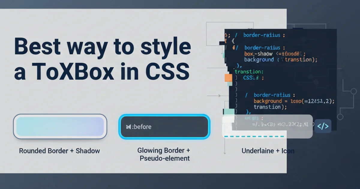
Mastering TextBox Styling with CSS: A Comprehensive Guide
Learn the best practices and techniques for styling HTML textboxes using CSS, from basic aesthetics to advanced interactive effects.
Styling HTML <input type="text"> elements, commonly known as textboxes, is a fundamental aspect of web design. A well-styled textbox not only enhances the visual appeal of a form but also improves user experience by providing clear visual cues and feedback. This article will guide you through various CSS techniques to transform plain textboxes into engaging and intuitive form components.
The Basics: Resetting and Core Styles
Before diving into advanced styling, it's often beneficial to reset some default browser styles and establish a baseline. Browsers apply their own default styles to form elements, which can vary. A simple reset ensures consistency. We'll then apply core styles like border, padding, and font properties.
/* Basic Reset and Core Styles */
input[type="text"] {
  -webkit-appearance: none; /* Remove default iOS styling */
  -moz-appearance: none; /* Remove default Firefox styling */
  appearance: none; /* Remove default browser styling */

  border: 1px solid #ccc;
  padding: 8px 12px;
  font-family: Arial, sans-serif;
  font-size: 16px;
  border-radius: 4px;
  box-sizing: border-box; /* Include padding and border in the element's total width and height */
  width: 100%; /* Make it responsive */
}
Initial CSS for resetting and applying core styles to textboxes.
box-sizing: border-box; for form elements. This prevents padding and borders from increasing the element's overall dimensions, making layout management much easier.Enhancing User Interaction: Focus and Hover States
Interactive states like :hover and :focus are crucial for providing visual feedback to users. When a user hovers over a textbox or clicks into it to type, changing its appearance can significantly improve usability. Common enhancements include changing border colors, adding shadows, or adjusting background colors.
/* Hover and Focus States */
input[type="text"]:hover {
  border-color: #999;
}

input[type="text"]:focus {
  border-color: #007bff;
  box-shadow: 0 0 0 0.2rem rgba(0, 123, 255, 0.25);
  outline: none; /* Remove default focus outline */
}
CSS for styling textboxes on hover and focus events.
flowchart TD
    A[User sees TextBox] --> B{User hovers?}
    B -- Yes --> C[Apply :hover styles]
    B -- No --> D{User clicks/tabs?}
    D -- Yes --> E[Apply :focus styles]
    D -- No --> A
    E --> F[User types]
    F --> G[TextBox styled with :focus]
    G --> H{User leaves TextBox?}
    H -- Yes --> A
Flowchart illustrating textbox interaction states and corresponding CSS styling.
Advanced Styling: Placeholders, Disabled States, and Validation
Beyond basic interaction, you can style placeholder text, indicate disabled states, and provide visual cues for validation. These advanced styles contribute to a more robust and user-friendly form experience.
/* Placeholder Styling */
input[type="text"]::placeholder {
  color: #999;
  opacity: 1; /* Firefox default opacity is lower */
}

/* Disabled State */
input[type="text"]:disabled {
  background-color: #f0f0f0;
  color: #aaa;
  cursor: not-allowed;
  border-color: #e0e0e0;
}

/* Validation (Example for invalid state) */
input[type="text"].is-invalid {
  border-color: #dc3545;
  box-shadow: 0 0 0 0.2rem rgba(220, 53, 69, 0.25);
}
CSS for styling placeholder text, disabled textboxes, and validation states.
.is-invalid or .is-valid dynamically with JavaScript based on validation results, rather than relying solely on pseudo-classes like :invalid which might not cover all validation scenarios.