Colorize Voronoi Diagram
Categories:
Colorizing Voronoi Diagrams for Enhanced Data Visualization

Learn how to effectively colorize Voronoi diagrams using Python's SciPy and Matplotlib libraries to represent data attributes within spatial partitions.
Voronoi diagrams are powerful tools for spatial partitioning, dividing a plane into regions based on proximity to a set of seed points. While the basic diagram shows these regions, colorizing them based on an associated data attribute can significantly enhance their interpretability and visual impact. This article will guide you through the process of generating and colorizing Voronoi diagrams using Python, SciPy, and Matplotlib, allowing you to visualize complex spatial data more effectively.
Understanding Voronoi Diagrams and Their Applications
A Voronoi diagram partitions a plane with n seed points into n regions, where each region consists of all points closer to one seed point than to any other. These diagrams have diverse applications, including:
- Geographic Information Systems (GIS): Analyzing service areas, resource allocation, or proximity to facilities.
- Biology: Modeling cell growth patterns or territorial boundaries.
- Computer Graphics: Generating procedural textures or pathfinding.
- Data Analysis: Visualizing clusters or spatial relationships in datasets.
Colorizing these regions allows us to add another dimension of information, such as density, value, or category, directly onto the spatial partition.
flowchart TD
    A[Input: Set of Seed Points and Associated Data] --> B{Generate Voronoi Diagram}
    B --> C[Identify Voronoi Regions (Polygons)]
    C --> D{Map Data Attribute to Color Scale}
    D --> E[Assign Color to Each Region]
    E --> F[Render Colorized Voronoi Diagram]
    F --> G[Output: Enhanced Spatial Visualization]
Workflow for Colorizing a Voronoi Diagram
Generating and Colorizing the Voronoi Diagram
The core of this process involves using scipy.spatial.Voronoi to compute the diagram and matplotlib to render it. The challenge lies in mapping the Voronoi regions (which are defined by vertices) to their corresponding seed points and then applying colors based on an attribute associated with each seed point. We'll use a matplotlib.collections.PolyCollection to efficiently draw the colored regions.
import numpy as np
import matplotlib.pyplot as plt
from scipy.spatial import Voronoi, voronoi_plot_2d
from matplotlib.collections import PolyCollection

# 1. Generate random seed points and associated data values
np.random.seed(42)
points = np.random.rand(20, 2) * 10 # 20 points in a 10x10 area
data_values = np.random.rand(20) * 100 # Random data values for each point

# 2. Compute Voronoi diagram
vor = Voronoi(points)

# 3. Create a colormap for the data values
# Normalize data values to fit into a colormap range (0 to 1)
norm = plt.Normalize(vmin=data_values.min(), vmax=data_values.max())
sm = plt.cm.ScalarMappable(cmap='viridis', norm=norm)
sm.set_array(data_values)

# 4. Extract Voronoi regions and color them
regions = []
colors = []
for i, region_index in enumerate(vor.point_region):
    if region_index != -1: # Ensure the region is valid
        region = vor.regions[region_index]
        # Filter out empty regions or regions with invalid vertices
        if not region or -1 in region: # -1 indicates an open region
            continue

        # Get the vertices for the current region
        polygon = vor.vertices[region]
        regions.append(polygon)
        colors.append(sm.to_rgba(data_values[i]))

# 5. Plotting
fig, ax = plt.subplots(figsize=(10, 8))

# Create a PolyCollection from the regions and colors
poly_collection = PolyCollection(regions, facecolors=colors, edgecolors='black', linewidths=0.5)
ax.add_collection(poly_collection)

# Plot the original points
ax.plot(points[:, 0], points[:, 1], 'o', markersize=5, color='red', label='Seed Points')

# Set plot limits and labels
ax.set_xlim(vor.min_bound[0] - 1, vor.max_bound[0] + 1)
ax.set_ylim(vor.min_bound[1] - 1, vor.max_bound[1] + 1)
ax.set_aspect('equal', adjustable='box')
ax.set_title('Colorized Voronoi Diagram')
ax.set_xlabel('X-coordinate')
ax.set_ylabel('Y-coordinate')

# Add a colorbar
cbar = fig.colorbar(sm, ax=ax)
cbar.set_label('Data Value')

plt.legend()
plt.grid(True, linestyle='--', alpha=0.7)
plt.show()
Python code to generate and colorize a Voronoi diagram based on associated data values.
scipy.spatial.Voronoi can produce 'unbounded' regions. These regions contain a vertex index of -1. The provided code handles this by skipping such regions, ensuring only bounded, valid polygons are drawn. For specific applications, you might need to clip these unbounded regions to a defined boundary.Interpreting the Colorized Diagram
The resulting diagram provides an immediate visual representation of how the data attribute varies across the spatial partitions. Regions with similar colors indicate similar data values, allowing for quick identification of spatial patterns, clusters, or gradients. For instance, in a GIS context, darker regions might represent higher population density, or in a scientific experiment, warmer colors could indicate higher concentrations of a substance.
Experiment with different colormaps (cmap in matplotlib) to best represent your data. For sequential data, perceptually uniform colormaps like 'viridis', 'plasma', or 'magma' are often recommended. For divergent data (e.g., positive vs. negative values), colormaps like 'coolwarm' or 'RdBu' can be effective.
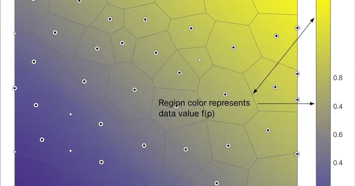
Example of a colorized Voronoi diagram with a 'viridis' colormap.
1. Prepare Your Data
Ensure you have a set of 2D points (coordinates) and a corresponding array of numerical data values, one for each point. These data values will determine the color of each Voronoi region.
2. Compute Voronoi Diagram
Use scipy.spatial.Voronoi(points) to compute the Voronoi diagram. This will give you access to the vertices and regions.
3. Map Data to Colors
Create a matplotlib.colors.Normalize object to scale your data values to the 0-1 range, and then use a matplotlib.cm.ScalarMappable with your chosen colormap (e.g., 'viridis') to convert these normalized values into RGBA colors.
4. Extract and Color Regions
Iterate through the vor.point_region array to link each seed point to its Voronoi region. For each valid region, retrieve its vertices from vor.vertices and assign the corresponding color generated in the previous step.
5. Render with PolyCollection
Use matplotlib.collections.PolyCollection to efficiently draw all the colored polygons on a matplotlib axes. Add a colorbar to provide a legend for your data values.