How do I set distance between flexbox items?
Categories:
Mastering Flexbox Spacing: Techniques for Distributing Items
Learn various methods to effectively control the distance between items in a Flexbox container, from gaps to margins and space distribution properties.
Flexbox is a powerful CSS layout module that provides an efficient way to arrange, align, and distribute space among items within a container, even when their size is unknown or dynamic. A common challenge developers face is precisely controlling the spacing between these flex items. This article explores several robust techniques to achieve desired distances, ensuring your layouts are both functional and visually appealing.
Using the gap Property (Modern Approach)
The gap property (originally grid-gap) is the most straightforward and modern way to add space between flex items. It applies spacing only between items, not on the outer edges of the container. This property is a shorthand for row-gap and column-gap and works for both rows and columns in a flex container, depending on the flex-direction.
.flex-container {
  display: flex;
  gap: 20px; /* Applies 20px space between items */
}

/* For different horizontal and vertical gaps */
.flex-container-directional {
  display: flex;
  flex-direction: row; /* or column */
  row-gap: 10px;
  column-gap: 20px;
}
Applying gap to a flex container
gap property is widely supported in modern browsers. However, if you need to support older browsers (e.g., IE 11), you'll need to use margin-based solutions.Leveraging margin for Spacing
Before gap gained widespread support, using margin on flex items was the primary method for creating space. This approach offers fine-grained control but can sometimes lead to extra spacing on the container's edges if not handled carefully. You can apply margin-left, margin-right, margin-top, or margin-bottom to individual flex items.
.flex-container {
  display: flex;
}

.flex-item {
  margin-right: 15px; /* Adds space to the right of each item */
}

.flex-item:last-child {
  margin-right: 0; /* Removes extra margin from the last item */
}
Using margin-right and :last-child for spacing
flowchart LR
    A[Flex Container] --> B{Flex Item 1}
    B --> C{Flex Item 2}
    C --> D{Flex Item 3}

    subgraph Margin Approach
        B -- "margin-right: 15px" --> C
        C -- "margin-right: 15px" --> D
        D -- "margin-right: 0 (last-child)" --> E[Container Edge]
    end

    subgraph Gap Approach
        B -- "gap: 15px" --> C
        C -- "gap: 15px" --> D
        D -- "No gap after last item" --> E
    end
Comparison of margin vs. gap for spacing
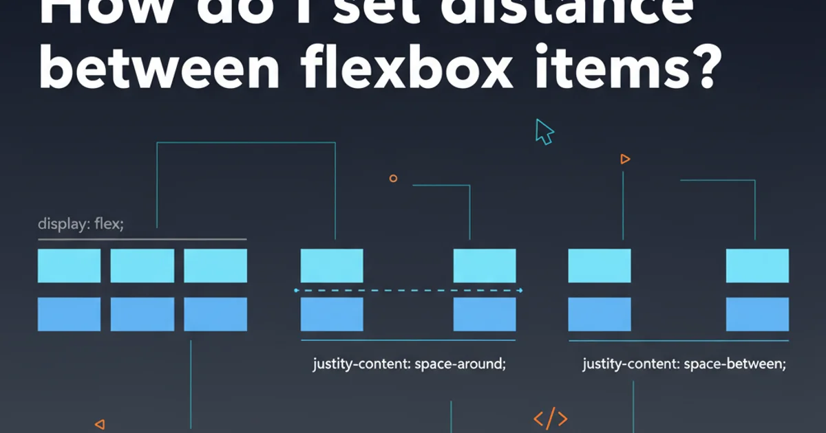
Distributing Space with justify-content
For scenarios where you want the browser to automatically distribute available space between items, the justify-content property on the flex container is invaluable. This is particularly useful when items don't fill the entire width (or height, depending on flex-direction) of the container.
.flex-container-space-between {
  display: flex;
  justify-content: space-between; /* Distributes space evenly between items */
}

.flex-container-space-around {
  display: flex;
  justify-content: space-around; /* Distributes space around items (half space at ends) */
}

.flex-container-space-evenly {
  display: flex;
  justify-content: space-evenly; /* Distributes space evenly around and between items */
}
Using justify-content for automatic space distribution
justify-content distributes space, it doesn't create a fixed 'gap' between items. The amount of space will vary based on the container's available width and the items' sizes. It's best used when you want flexible spacing rather than a consistent, fixed distance.Combining Techniques for Complex Layouts
Often, the most effective layouts combine these techniques. For instance, you might use gap for a consistent base spacing and then use margin-left: auto on a specific item to push it to the far end of the container, or use justify-content for overall distribution while still applying gap for internal item spacing.
.navbar {
  display: flex;
  justify-content: space-between; /* Pushes first and last items to edges */
  gap: 20px; /* Consistent gap between internal items */
}

.navbar-item {
  /* No specific margin needed here due to gap and justify-content */
}
Combining justify-content and gap for a navigation bar
1. Choose Your Primary Spacing Method
For modern browsers, gap is generally preferred for consistent spacing between items. For older browser support or more complex edge cases, margin is a reliable alternative.
2. Consider Overall Distribution
If you need items to fill available space or align to specific edges, use justify-content on the flex container. This works well with or without gap.
3. Handle Edge Cases with Specific Margins
For unique spacing requirements on specific items (e.g., pushing one item to the far right), apply margin-left: auto or margin-right: auto to that particular item.
4. Test Responsiveness
Always test your flexbox layouts across different screen sizes to ensure spacing behaves as expected and doesn't cause overflow or undesirable visual effects.