How to create a bar graph in Excel 2010 by counts?
Categories:
Creating Bar Graphs by Count in Excel 2010

Learn how to effectively visualize frequency data using bar graphs in Microsoft Excel 2010, transforming raw counts into insightful charts.
Bar graphs are powerful tools for visualizing categorical data, especially when you want to show the frequency or count of items within different categories. In Excel 2010, creating a bar graph from counts is a straightforward process that can help you quickly understand the distribution and comparison of your data. This article will guide you through the steps to prepare your data and generate a clear, informative bar graph.
Understanding Your Data for Bar Graphs
Before creating a bar graph, it's crucial to ensure your data is structured correctly. A bar graph typically requires two main components: categories and their corresponding counts (or frequencies). For example, if you're tracking the number of sales for different product types, your categories would be the product types (e.g., 'Electronics', 'Apparel', 'Home Goods'), and your counts would be the total sales for each type.
flowchart TD
    A["Raw Data (e.g., List of Products)"] --> B{"Summarize Data"}
    B --> C["Category Column"]
    B --> D["Count Column"]
    C & D --> E["Select Data Range"]
    E --> F["Insert Bar Chart"]
    F --> G["Customize Chart"]
    G --> H["Final Bar Graph"]
Data preparation and chart creation workflow for bar graphs.
Preparing Your Data in Excel
The most common scenario for creating a bar graph by count involves having a list of items and needing to count the occurrences of each unique item. Excel's COUNTIF function or a PivotTable can efficiently summarize this data into the required category-count format. For instance, if you have a column of product names, you'll first need a unique list of those names and then count how many times each name appears.
1. Summarize Data with COUNTIF (Manual Method)
If you have a list of items in column A (e.g., A2:A100), first create a unique list of these items in a new column (e.g., column C). Then, in an adjacent column (e.g., column D), use the COUNTIF function. For example, if 'Product A' is in cell C2, the formula =COUNTIF(A$2:A$100,C2) in D2 will count its occurrences. Drag this formula down for all unique items.
2. Summarize Data with a PivotTable (Recommended Method)
Select your raw data range. Go to the 'Insert' tab and click 'PivotTable'. Choose to place the PivotTable on a new worksheet. Drag the column containing your categories (e.g., 'Product Type') to both the 'Row Labels' area and the 'Values' area. Ensure the 'Values' field is set to 'Count of [Your Column Name]'.
3. Select the Summarized Data
Once your data is summarized (either manually or with a PivotTable), select the two columns: one containing your categories and the other containing their respective counts. For example, if using a PivotTable, select the 'Row Labels' column and the 'Count of...' column.
4. Insert the Bar Graph
With your summarized data selected, go to the 'Insert' tab on the Excel ribbon. In the 'Charts' group, click on 'Column' or 'Bar'. Choose the desired 2-D or 3-D chart type. A 2-D Clustered Column chart is a common and effective choice for displaying counts.
5. Customize Your Bar Graph
After inserting the chart, you can customize it to improve clarity and aesthetics. Use the 'Chart Tools' tabs ('Design', 'Layout', 'Format') that appear when the chart is selected. You can add a chart title, axis labels (e.g., 'Product Type' for the horizontal axis and 'Count' for the vertical axis), change colors, add data labels, and adjust the legend if necessary. Ensure your chart title clearly indicates what the graph represents.
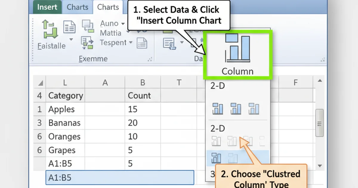
Navigating to the 'Insert Column or Bar Chart' option in Excel 2010.