Add iOS Close Button Icon Without Custom Image
Categories:
Add an iOS Close Button Icon Without Custom Images
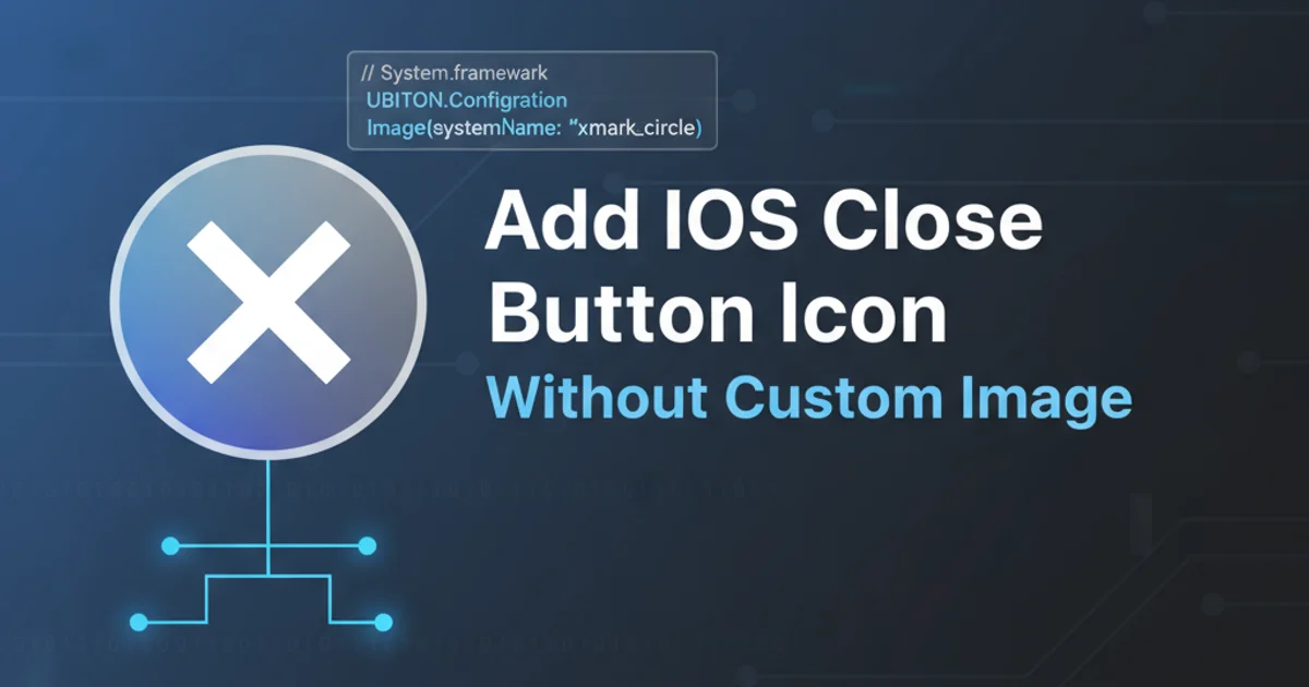
Learn how to implement a standard iOS close button icon using system-provided symbols, eliminating the need for custom image assets and simplifying your UI development.
When developing iOS applications, UI consistency and efficiency are paramount. Often, developers find themselves needing a simple 'close' button, typically represented by an 'X' or a 'circle with an X'. While it's common to import custom image assets for such elements, iOS provides elegant, built-in solutions that can save time, reduce app bundle size, and ensure your UI adheres to Apple's Human Interface Guidelines. This article will guide you through using system symbols and UIBarButtonItem to achieve a native-looking close button without any custom images.
Leveraging System Bar Button Items
The easiest and most recommended way to add a standard close button is by utilizing UIBarButtonItem with a system item. iOS offers several predefined system items, including a 'Done' button which often serves the same purpose as a close button, especially in modal presentations. This approach ensures your button automatically adapts to system-wide appearance changes and accessibility settings.
class MyViewController: UIViewController {

    override func viewDidLoad() {
        super.viewDidLoad()
        setupCloseButton()
    }

    private func setupCloseButton() {
        // Create a UIBarButtonItem with a system item
        let closeButton = UIBarButtonItem(
            barButtonSystemItem: .done, // Or .cancel, .close (iOS 13+)
            target: self,
            action: #selector(closeButtonTapped)
        )

        // Assign it to the left or right navigation item
        navigationItem.leftBarButtonItem = closeButton
    }

    @objc private func closeButtonTapped() {
        // Dismiss the current view controller, typically a modal presentation
        dismiss(animated: true, completion: nil)
    }
}
Implementing a close button using UIBarButtonItem with a system item.
.close as a UIBarButtonSystemItem for a more explicit close icon. For earlier versions, .done or .cancel are common alternatives that convey the same intent.Using SF Symbols for Customization
While system bar button items are great for standard use cases, sometimes you need a specific 'X' or 'circle.slash' icon that isn't directly available as a UIBarButtonSystemItem. This is where SF Symbols come into play. SF Symbols are a library of over 3,000 configurable symbols provided by Apple, designed to integrate seamlessly with San Francisco system fonts. They are vector-based, scale beautifully, and can be tinted just like text.
flowchart TD
    A[Start] --> B{Need a Close Button?}
    B -->|Yes| C{Is a standard 'Done' or 'Cancel' sufficient?}
    C -->|Yes| D[Use UIBarButtonItem with .done or .cancel]
    C -->|No| E{Need specific 'X' or 'circle.slash' icon?}
    E -->|Yes| F[Use SF Symbols (e.g., 'xmark', 'xmark.circle')]
    F --> G[Create UIImage from SF Symbol]
    G --> H[Create UIBarButtonItem with custom image]
    H --> I[Assign to navigationItem]
    E -->|No| J[Consider custom image asset (last resort)]
    D --> I
    I --> K[End]
Decision flow for choosing an iOS close button implementation.
class MyCustomCloseViewController: UIViewController {

    override func viewDidLoad() {
        super.viewDidLoad()
        setupCustomCloseButton()
    }

    private func setupCustomCloseButton() {
        // Ensure SF Symbols are available (iOS 13+)
        if #available(iOS 13.0, *) {
            // Create a UIImage from an SF Symbol
            let closeImage = UIImage(systemName: "xmark.circle.fill")

            // Create a UIBarButtonItem with the custom image
            let closeButton = UIBarButtonItem(
                image: closeImage,
                style: .plain,
                target: self,
                action: #selector(customCloseButtonTapped)
            )

            // Assign it to the navigation item
            navigationItem.leftBarButtonItem = closeButton
        } else {
            // Fallback for older iOS versions if SF Symbols are not available
            // You might use .done or a custom image asset here.
            setupCloseButtonFallback()
        }
    }

    @objc private func customCloseButtonTapped() {
        dismiss(animated: true, completion: nil)
    }

    private func setupCloseButtonFallback() {
        let closeButton = UIBarButtonItem(
            barButtonSystemItem: .done,
            target: self,
            action: #selector(customCloseButtonTapped)
        )
        navigationItem.leftBarButtonItem = closeButton
    }
}
Using SF Symbols to create a custom close button icon.
Practical Steps for Implementation
Implementing these close buttons is straightforward. Here are the general steps to integrate them into your UIViewController.
1. Choose Your Button Type
Decide whether a standard system item (like .done or .cancel) is sufficient, or if you need a specific SF Symbol (like xmark or xmark.circle.fill).
2. Create the UIBarButtonItem
Instantiate UIBarButtonItem using the appropriate initializer: either barButtonSystemItem:, or image: with an UIImage(systemName:) for SF Symbols.
3. Set Target and Action
Assign self as the target and define an @objc method (e.g., closeButtonTapped) that will be called when the button is pressed. This method typically handles dismissing the view controller.
4. Assign to Navigation Item
Place the created UIBarButtonItem on either navigationItem.leftBarButtonItem or navigationItem.rightBarButtonItem depending on your UI design.
5. Handle Dismissal
In your action method, call dismiss(animated:true, completion:nil) if the view controller was presented modally, or navigationController?.popViewController(animated:true) if it's part of a navigation stack.