How to invert the x or y axis
Categories:
Inverting Axes in Matplotlib and Seaborn for Data Visualization
Learn how to easily invert the X or Y axis in your Matplotlib and Seaborn plots using Python, enhancing data interpretation and presentation.
Data visualization is a powerful tool for understanding complex datasets. Often, the default orientation of axes in plots might not align with the most intuitive way to present your data. For instance, in some scientific or financial contexts, a higher value on the Y-axis might represent a 'worse' outcome, or you might want to show time flowing from right to left on the X-axis. This article will guide you through the process of inverting the X or Y axis in your Matplotlib and Seaborn plots, providing clear examples and explanations.
Understanding Axis Inversion
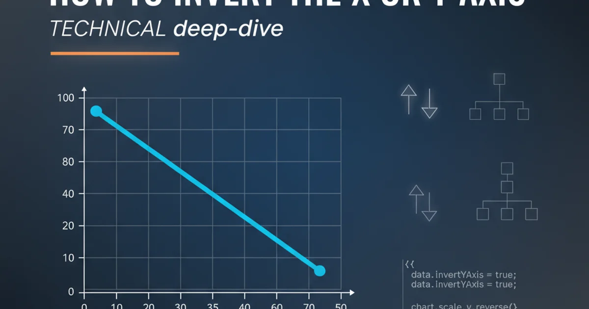
Axis inversion simply means reversing the direction in which values are displayed along an axis. By default, the X-axis typically increases from left to right, and the Y-axis increases from bottom to top. Inverting an axis changes this orientation: an inverted X-axis will show values increasing from right to left, and an inverted Y-axis will show values increasing from top to bottom. This seemingly small change can significantly impact how your audience perceives and interprets the data.
flowchart TD
    A[Start Plotting] --> B{Default Axis Direction?}
    B -->|X: Left to Right| C[X-axis: `plt.xlim()` or `ax.set_xlim()`]
    B -->|Y: Bottom to Top| D[Y-axis: `plt.ylim()` or `ax.set_ylim()`]
    C --> E{Invert X-axis?}
    D --> F{Invert Y-axis?}
    E -->|Yes| G["Set `xlim(max_val, min_val)`"]
    F -->|Yes| H["Set `ylim(max_val, min_val)`"]
    G --> I[Plot Displayed]
    H --> I
Flowchart illustrating the decision process for axis inversion.
Inverting Axes with Matplotlib
Matplotlib provides straightforward methods to control the limits of your axes, which can be leveraged for inversion. The primary functions are plt.xlim() and plt.ylim() for the global plot, or ax.set_xlim() and ax.set_ylim() for a specific Axes object. To invert an axis, you simply pass the maximum value as the first argument and the minimum value as the second argument to these functions.
import matplotlib.pyplot as plt
import numpy as np

# Sample data
x = np.linspace(0, 10, 100)
y = np.sin(x)

plt.figure(figsize=(10, 5))

# Original plot
plt.subplot(1, 2, 1)
plt.plot(x, y)
plt.title('Original Plot')
plt.xlabel('X-axis')
plt.ylabel('Y-axis')

# Plot with inverted Y-axis
plt.subplot(1, 2, 2)
plt.plot(x, y, color='red')
plt.title('Inverted Y-axis')
plt.xlabel('X-axis')
plt.ylabel('Y-axis (Inverted)')
plt.ylim(1, -1) # Invert Y-axis: max value first, then min value

plt.tight_layout()
plt.show()
Python code demonstrating Y-axis inversion using Matplotlib's plt.ylim().
import matplotlib.pyplot as plt
import numpy as np

# Sample data
x = np.linspace(0, 10, 100)
y = np.cos(x)

plt.figure(figsize=(10, 5))

# Original plot
plt.subplot(1, 2, 1)
plt.plot(x, y)
plt.title('Original Plot')
plt.xlabel('X-axis')
plt.ylabel('Y-axis')

# Plot with inverted X-axis
plt.subplot(1, 2, 2)
plt.plot(x, y, color='green')
plt.title('Inverted X-axis')
plt.xlabel('X-axis (Inverted)')
plt.ylabel('Y-axis')
plt.xlim(10, 0) # Invert X-axis: max value first, then min value

plt.tight_layout()
plt.show()
Python code demonstrating X-axis inversion using Matplotlib's plt.xlim().
Axes objects (e.g., from fig.add_subplot() or plt.subplots()), use ax.set_xlim(max_val, min_val) and ax.set_ylim(max_val, min_val) for more granular control over specific subplots.Inverting Axes with Seaborn
Seaborn is built on top of Matplotlib, which means you can often use Matplotlib's axis inversion methods directly on Seaborn plots. After creating a Seaborn plot, you can access the underlying Matplotlib Axes object and apply set_xlim() or set_ylim() to it. Many Seaborn functions return the Axes object, making this integration seamless.
import seaborn as sns
import matplotlib.pyplot as plt
import pandas as pd

# Sample data
data = pd.DataFrame({
    'Value': np.random.rand(50) * 100,
    'Category': np.random.choice(['A', 'B', 'C', 'D'], 50)
})

plt.figure(figsize=(12, 6))

# Original Seaborn plot
plt.subplot(1, 2, 1)
sns.barplot(x='Category', y='Value', data=data)
plt.title('Original Seaborn Bar Plot')

# Seaborn plot with inverted Y-axis
plt.subplot(1, 2, 2)
ax = sns.barplot(x='Category', y='Value', data=data, palette='viridis')
ax.set_title('Seaborn Bar Plot with Inverted Y-axis')
ax.set_ylim(data['Value'].max() * 1.1, 0) # Invert Y-axis

plt.tight_layout()
plt.show()
Python code demonstrating Y-axis inversion in a Seaborn bar plot.
Axes object. This allows you to combine the high-level aesthetics of Seaborn with the fine-grained control of Matplotlib.When to Invert Axes
Inverting axes isn't just a stylistic choice; it can significantly improve the clarity and correctness of your data's narrative. Consider these scenarios:
- Medical Data: Often, lower values for certain metrics (e.g., disease markers) are better. Inverting the Y-axis so that 'better' (lower) values are at the top can be more intuitive.
- Financial Charts: Stock market charts sometimes invert the Y-axis to show price drops more prominently or to align with specific trading conventions.
- Depth/Altitude: When plotting depth, it's natural for values to increase downwards. Inverting the Y-axis makes the plot visually consistent with the physical phenomenon.
- Time Series (Reverse Order): For certain historical analyses, you might want the most recent data on the left and older data on the right, requiring an inverted X-axis.
Always prioritize clarity and the standard conventions of your specific domain when deciding whether to invert an axis.
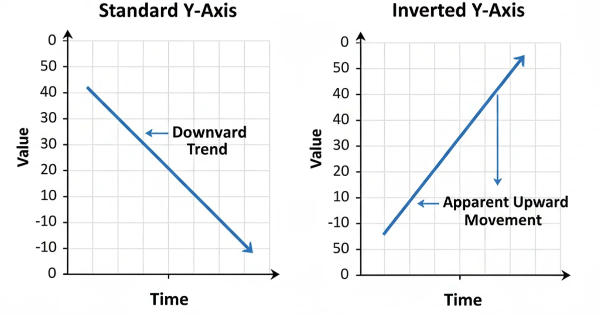
Visual comparison of a standard Y-axis versus an inverted Y-axis, highlighting how perception can change.