How to change the spinner background in Android?
Categories:
Customizing Android Spinner Backgrounds: A Comprehensive Guide
Learn how to effectively change the background of an Android Spinner using XML drawables, Nine-Patch images, and custom layouts for a polished UI.
The Android Spinner is a versatile UI element that allows users to select one value from a set. While functional by default, its appearance often needs customization to match an application's branding and design language. This article will guide you through various methods to change the spinner's background, focusing on common techniques like using XML drawables and Nine-Patch images, and how these choices impact the dropdown menu.
Understanding Spinner Components and Backgrounds
Before diving into customization, it's crucial to understand that an Android Spinner typically consists of two main parts: the selected item view (the visible part when the spinner is closed) and the dropdown list (the menu that appears when the spinner is tapped). Each of these components can have its own background, and customizing one doesn't automatically customize the other. We'll explore how to address both.
flowchart TD
    A[Spinner Component] --> B{Selected Item View}
    A --> C{Dropdown List}
    B --> D[Background Customization]
    C --> E[Background Customization]
    D --> F[XML Drawable]
    D --> G[Nine-Patch]
    E --> H[XML Drawable]
    E --> I[Nine-Patch]
    F & G & H & I --> J[Apply to Spinner]
    J --> K[Enhanced UI]
Flowchart illustrating Spinner component customization paths
Method 1: Using XML Drawables for the Spinner Button
The simplest way to change the background of the spinner itself (the button-like part) is by applying a custom XML drawable. This allows for solid colors, gradients, or simple shapes. This method primarily affects the closed state of the spinner.
<!-- res/drawable/spinner_background.xml -->
<selector xmlns:android="http://schemas.android.com/apk/res/android">
    <item android:state_pressed="true">
        <shape android:shape="rectangle">
            <solid android:color="#FFBB86FC" />
            <corners android:radius="8dp" />
        </shape>
    </item>
    <item android:state_focused="true">
        <shape android:shape="rectangle">
            <solid android:color="#FF6200EE" />
            <corners android:radius="8dp" />
            <stroke android:width="2dp" android:color="#FF3700B3" />
        </shape>
    </item>
    <item>
        <shape android:shape="rectangle">
            <solid android:color="#FFBB86FC" />
            <corners android:radius="8dp" />
            <stroke android:width="1dp" android:color="#FF3700B3" />
        </shape>
    </item>
</selector>
Custom XML drawable for spinner background states
<!-- In your layout XML -->
<Spinner
    android:id="@+id/my_spinner"
    android:layout_width="match_parent"
    android:layout_height="wrap_content"
    android:background="@drawable/spinner_background"
    android:spinnerMode="dropdown" />
Applying the custom drawable to an Android Spinner
android:spinnerMode="dropdown" is crucial for consistent behavior and appearance across different Android versions, especially when customizing the dropdown list.Method 2: Customizing the Dropdown List Background
Changing the background of the dropdown list requires a different approach. You typically achieve this by defining a custom theme or style that targets the spinner's dropdown attributes. This ensures that the background of the actual list of items is also styled to match your application's design.
<!-- res/values/styles.xml or themes.xml -->
<style name="MySpinnerTheme" parent="ThemeOverlay.AppCompat.Light">
    <item name="android:dropDownListViewStyle">@style/MyDropDownListViewStyle</item>
</style>

<style name="MyDropDownListViewStyle" parent="android:style/Widget.ListView.DropDown">
    <item name="android:listSelector">@drawable/spinner_dropdown_item_selector</item>
    <item name="android:background">@drawable/spinner_dropdown_background</item>
    <item name="android:divider">@color/purple_200</item>
    <item name="android:dividerHeight">1dp</item>
</style>
Defining a custom theme and style for the spinner dropdown
<!-- res/drawable/spinner_dropdown_background.xml -->
<shape xmlns:android="http://schemas.android.com/apk/res/android">
    <solid android:color="#FFFFFFFF" />
    <corners android:radius="4dp" />
    <stroke android:width="1dp" android:color="#FF3700B3" />
</shape>
Drawable for the dropdown list's background
<!-- res/drawable/spinner_dropdown_item_selector.xml -->
<selector xmlns:android="http://schemas.android.com/apk/res/android">
    <item android:state_pressed="true" android:drawable="#FFBB86FC" />
    <item android:state_focused="true" android:drawable="#FF6200EE" />
    <item android:drawable="@android:color/transparent" />
</selector>
Selector for individual dropdown item backgrounds
<!-- In your layout XML, apply the theme to the Spinner -->
<Spinner
    android:id="@+id/my_spinner"
    android:layout_width="match_parent"
    android:layout_height="wrap_content"
    android:background="@drawable/spinner_background"
    android:spinnerMode="dropdown"
    android:theme="@style/MySpinnerTheme" />
Applying the custom theme to the Spinner
Method 3: Using Nine-Patch Images for Scalable Backgrounds
Nine-Patch images (.9.png) are ideal for backgrounds that need to stretch or scale without distortion, such as speech bubbles or complex button shapes. They define stretchable and padding regions, ensuring your background looks good on various screen densities and sizes. This is particularly useful for the spinner's main background.
To create a Nine-Patch image, you typically use the Android SDK's draw9patch tool or a graphics editor. The image has a 1-pixel border where you draw black lines to define the stretchable areas (top and left borders) and the content padding areas (bottom and right borders).
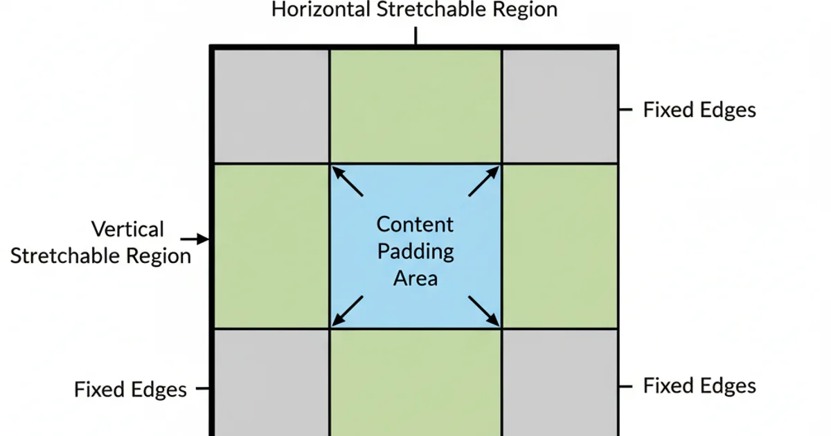
Anatomy of a Nine-Patch image
<!-- In your layout XML, assuming you have res/drawable/my_nine_patch_spinner_bg.9.png -->
<Spinner
    android:id="@+id/my_nine_patch_spinner"
    android:layout_width="match_parent"
    android:layout_height="wrap_content"
    android:background="@drawable/my_nine_patch_spinner_bg"
    android:spinnerMode="dropdown" />
Applying a Nine-Patch drawable as a spinner background
.9.png extension and placed in the appropriate drawable folder. Incorrectly formatted Nine-Patch files can lead to rendering issues or crashes.Advanced Customization: Custom Layouts for Spinner Items
For ultimate control over the spinner's appearance, including text color, font, and more complex layouts within the selected item and dropdown items, you can provide custom layout files to your ArrayAdapter.
<!-- res/layout/custom_spinner_item.xml (for selected item) -->
<TextView xmlns:android="http://schemas.android.com/apk/res/android"
    android:id="@android:id/text1"
    android:layout_width="match_parent"
    android:layout_height="wrap_content"
    android:textSize="18sp"
    android:textColor="#FF3700B3"
    android:padding="10dp"
    android:gravity="center_vertical" />
Custom layout for the selected spinner item
<!-- res/layout/custom_spinner_dropdown_item.xml (for dropdown list items) -->
<TextView xmlns:android="http://schemas.android.com/apk/res/android"
    android:id="@android:id/text1"
    android:layout_width="match_parent"
    android:layout_height="wrap_content"
    android:textSize="16sp"
    android:textColor="#FF000000"
    android:padding="12dp"
    android:background="@drawable/spinner_dropdown_item_selector" />
Custom layout for items within the dropdown list
// In your Activity or Fragment
Spinner spinner = findViewById(R.id.my_spinner);
ArrayAdapter<CharSequence> adapter = ArrayAdapter.createFromResource(
    this,
    R.array.planets_array, // Example string array
    R.layout.custom_spinner_item // Custom layout for selected item
);
adapter.setDropDownViewResource(R.layout.custom_spinner_dropdown_item); // Custom layout for dropdown items
spinner.setAdapter(adapter);
Applying custom layouts to a Spinner using an ArrayAdapter
By combining these techniques, you can achieve a fully customized Android Spinner that seamlessly integrates with your application's visual design. Remember to test your customizations on various Android versions and device sizes to ensure a consistent user experience.