How do I clear a search box with an 'x' in bootstrap 3?
Categories:
Adding a Clear 'x' Button to Bootstrap 3 Search Boxes

Learn how to implement a functional 'x' button to clear input fields, specifically search boxes, in Bootstrap 3 forms for improved user experience.
Providing a quick way for users to clear input fields, especially search boxes, significantly enhances usability. While modern Bootstrap versions often include built-in clear buttons, Bootstrap 3 requires a custom solution. This article will guide you through adding a stylish and functional 'x' button to your Bootstrap 3 search inputs, allowing users to easily reset their queries.
Understanding the Core Concept
The approach involves overlaying a small button or icon on top of the input field. This button will be styled to look like an 'x' and will trigger a JavaScript function to clear the input field's value when clicked. We'll leverage Bootstrap's form-control-feedback and glyphicon classes for styling and positioning, ensuring it integrates seamlessly with your existing Bootstrap 3 design.
flowchart TD
    A[User Types Search Query] --> B{Clear 'x' Button Visible?}
    B -- Yes --> C[User Clicks 'x' Button]
    C --> D[JavaScript Clears Input Field]
    D --> E[Input Field is Empty]
    B -- No --> F[User Manually Deletes Query]
    F --> E
Workflow for clearing a search box with an 'x' button.
HTML Structure for the Search Box
First, let's set up the basic HTML structure for our search input. We'll wrap the input and the clear button within a form-group and use Bootstrap's has-feedback class to position the icon correctly. The clear button itself will be a <span> element with Bootstrap's glyphicon-remove class.
<div class="form-group has-feedback">
    <input type="search" class="form-control" placeholder="Search...">
    <span class="glyphicon glyphicon-remove form-control-feedback"></span>
</div>
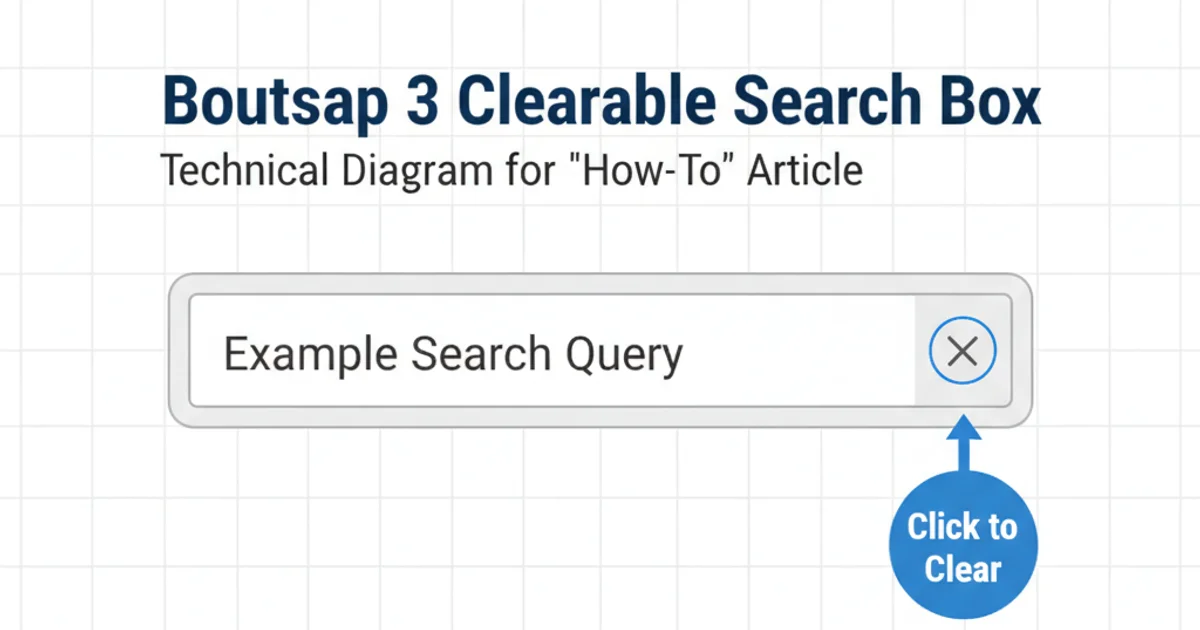
Basic HTML structure for a Bootstrap 3 search input with a clear icon placeholder.
Adding CSS for Styling and Visibility
By default, the glyphicon-remove icon will always be visible. We want it to appear only when there's text in the input field. We'll use CSS to hide it initially and then JavaScript to toggle its visibility based on the input's content. We'll also add some custom styling to make the 'x' clickable and visually distinct.
.form-control-feedback.glyphicon-remove {
    pointer-events: auto; /* Make the icon clickable */
    cursor: pointer;
    display: none; /* Hide by default */
    color: #999; /* Optional: adjust color */
    right: 10px; /* Adjust positioning if needed */
    top: 0; /* Align with input */
    line-height: 34px; /* Vertically center with Bootstrap's default input height */
}

/* Show the icon when the input has content */
.form-group.has-feedback .form-control:not(:placeholder-shown) ~ .glyphicon-remove {
    display: block;
}
Custom CSS to style and control the visibility of the clear 'x' icon.
:not(:placeholder-shown) pseudo-class is a modern CSS feature. If you need to support older browsers, you might need to rely solely on JavaScript to toggle the display property.Implementing JavaScript for Functionality
Finally, we'll add a small JavaScript snippet to handle the click event on our 'x' button. When clicked, it will clear the associated input field. We'll also add an event listener to the input field itself to toggle the visibility of the 'x' based on whether the input has content.
$(document).ready(function() {
    // Function to toggle visibility of the clear button
    function toggleClearButton(input) {
        if ($(input).val().length > 0) {
            $(input).siblings('.glyphicon-remove').show();
        } else {
            $(input).siblings('.glyphicon-remove').hide();
        }
    }

    // On input change, toggle the clear button
    $('.form-group input[type="search"]').on('input', function() {
        toggleClearButton(this);
    });

    // On clear button click, clear the input and hide the button
    $('.form-group .glyphicon-remove').on('click', function() {
        var input = $(this).siblings('input[type="search"]');
        input.val('');
        $(this).hide();
        input.focus(); // Optional: refocus on the input after clearing
        input.trigger('input'); // Trigger input event to update any other listeners
    });

    // Initial check on page load for pre-filled fields
    $('.form-group input[type="search"]').each(function() {
        toggleClearButton(this);
    });
});
jQuery script to handle clear button visibility and functionality.
Putting It All Together
By combining the HTML structure, CSS styling, and JavaScript logic, you'll have a fully functional clearable search box in your Bootstrap 3 application. This provides a much smoother user experience, especially for long search queries.
Example of a clearable search box in Bootstrap 3.