Is sizing fonts using "em" still relevant?
Categories:
Is Sizing Fonts Using "em" Still Relevant in Modern Web Development?

Explore the enduring relevance of 'em' units for font sizing in CSS, comparing them with 'rem' and 'px' for responsive and accessible web design.
In the ever-evolving landscape of web development, choosing the right CSS unit for font sizing is crucial for creating responsive, accessible, and maintainable user interfaces. For years, the em unit was a cornerstone of flexible typography. However, with the advent of rem and the continued use of px, developers often question whether em still holds its ground. This article delves into the mechanics of em, compares it with its counterparts, and provides guidance on its appropriate use in modern web projects.
Understanding the 'em' Unit
The em unit is a relative length unit in CSS, meaning its computed value depends on the font size of its parent element. Specifically, 1em is equal to the computed font-size of the element on which it is used. If an element does not have an explicit font-size set, it inherits it from its parent, and em will be relative to that inherited size. This cascading nature can lead to a compounding effect, where em values can become difficult to predict and manage, especially in deeply nested elements.
flowchart TD
    A[Root Element (e.g., html)] --> B{Body Element}
    B --> C{Parent Div}
    C --> D{Child Paragraph}

    subgraph Font Size Calculation
        A -- "font-size: 16px" --> B
        B -- "font-size: 1.2em (19.2px)" --> C
        C -- "font-size: 1.5em (28.8px)" --> D
    end

    D -- "1em in D is 28.8px" --> E[Resulting Text Size]
Illustrative example of 'em' unit compounding in nested elements.
/* Example of 'em' compounding */
html {
  font-size: 16px; /* Base font size */
}

body {
  font-size: 1.2em; /* 1.2 * 16px = 19.2px */
}

.parent-div {
  font-size: 1.5em; /* 1.5 * 19.2px = 28.8px */
}

.child-paragraph {
  font-size: 1em; /* 1 * 28.8px = 28.8px */
  padding: 0.5em; /* 0.5 * 28.8px = 14.4px */
}
CSS demonstrating the cascading effect of 'em' units.
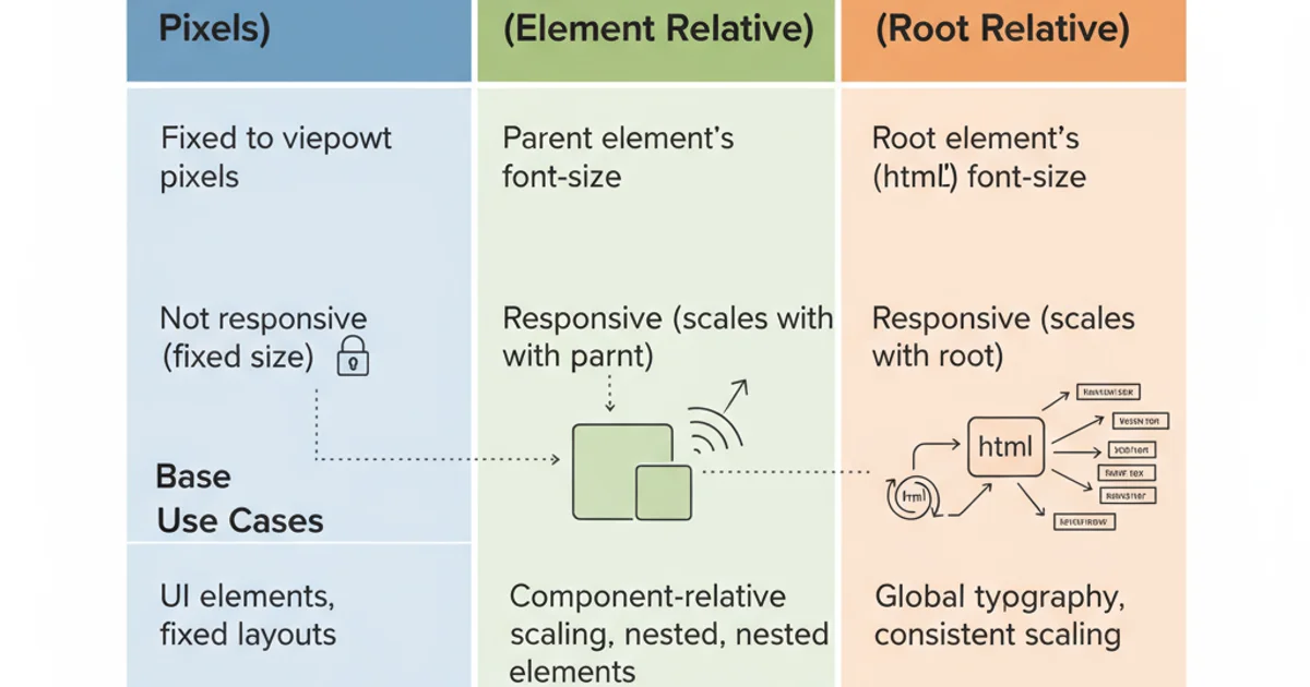
em vs. rem vs. px: A Comparative Analysis
To understand em's place, it's essential to compare it with rem and px. Each unit serves different purposes and has distinct advantages and disadvantages.
Comparison of CSS font sizing units: px, em, and rem.
px(Pixels): An absolute unit.1pxis always1px. It offers precise control but lacks responsiveness to user preferences (like browser default font size) and accessibility settings. While useful for fixed-size elements or borders, it's generally discouraged for font sizing.em(Element's font size): Relative to the parent element's font size. Excellent for scaling elements relative to their immediate context, such as padding or margins within a component. However, its compounding nature can make global typography difficult to manage.rem(Root em): Relative to the roothtmlelement's font size.1remis always equal to thefont-sizeof thehtmlelement. This provides a consistent base for all font sizes across the document, making global scaling and accessibility much easier to manage. It's widely considered the best practice for font sizing in modern web development.
rem is the recommended unit due to its predictability and ease of global scaling. Use em primarily for spacing (padding, margin) or sizing within components where you want values to scale relative to the component's own font size.When to Use 'em' in Modern Web Design
Despite the rise of rem, em still has relevant use cases, particularly when you want elements to scale proportionally to their immediate parent's font size. This is especially useful within self-contained components or for specific contextual adjustments.
Component-level Scaling: When building reusable components, using
emfor internal spacing (padding, margin) or even some internal font sizes can ensure that the component scales harmoniously if its base font size is changed by its parent.Media Queries: While
remis often preferred,emcan be used in media queries. Theemunit in media queries is always relative to the initial font size of the document (usually 16px), not the roothtmlelement's font size. This makesemin media queries behave similarly toremin the document flow, providing a consistent breakpoint reference.Vertical Rhythm: Some developers use
emto establish a vertical rhythm, where line-heights and margins are based on the element's font size, ensuring consistent spacing between lines of text and paragraphs.
/* Using 'em' for component-level scaling */
.card {
  font-size: 1.125rem; /* Base font size for the card */
  padding: 1em; /* 1em = 1.125rem * 16px = 18px */
  margin-bottom: 1.5em; /* 1.5em = 1.5 * 18px = 27px */
}

.card-title {
  font-size: 1.5em; /* 1.5 * 1.125rem = 1.6875rem */
  margin-bottom: 0.5em;
}

/* Using 'em' in media queries (relative to initial font size) */
@media (min-width: 40em) { /* 40 * 16px = 640px */
  body {
    font-size: 18px;
  }
}
Practical examples of 'em' usage in modern CSS.