why would someone write overflow: hidden on <html> tag
Categories:
Understanding overflow: hidden on the <html> Tag

Explore the common and sometimes unexpected reasons developers apply overflow: hidden to the <html> element, and its implications for web layout and user experience.
The overflow: hidden CSS property is typically used to manage content that exceeds the boundaries of its parent container. While commonly applied to <div> elements or other block-level containers, you might occasionally encounter it on the <html> tag itself. This seemingly unusual practice serves specific purposes, often related to controlling scrollbars, preventing unwanted scrolling, or managing layout issues. Understanding why and when to use this technique is crucial for effective web development.
Controlling Global Scrollbars and Preventing Body Jumps
One of the primary reasons to apply overflow: hidden to the <html> element is to gain precise control over the global scrollbars. By default, if content overflows the viewport, the browser will display scrollbars (usually on the <body> element, but effectively for the entire document). When you set overflow: hidden on <html>, you explicitly tell the browser that no scrollbars should appear for the entire document, regardless of content size. This is often done in conjunction with setting overflow: auto or overflow: scroll on a specific child element (like a main content <div>) to create a custom scrolling region.
flowchart TD
    A[User Navigates to Page]
    B{Content Exceeds Viewport?}
    C["<html> { overflow: hidden; }"]
    D["<body> { overflow: auto; }" or specific container]
    E[Global Scrollbar Hidden]
    F[Custom Scrollbar on Container]
    G[Default Browser Scrollbar]

    A --> B
    B -- Yes --> C
    C --> D
    D --> F
    F --> G[No Global Scrollbar]
    B -- No --> G
Flowchart illustrating how overflow: hidden on <html> affects scrollbar behavior.
html {
  overflow: hidden; /* Prevents global scrollbars */
}

body {
  margin: 0; /* Reset default body margin */
  padding: 0;
}

.main-content-wrapper {
  height: 100vh; /* Take full viewport height */
  overflow-y: auto; /* Enable vertical scrolling for this specific element */
  -webkit-overflow-scrolling: touch; /* Smooth scrolling on iOS */
}
Example of using overflow: hidden on <html> with a custom scrollable container.
Preventing Page Jumps During Modal/Overlay Display
Another common scenario is when displaying modal dialogs, pop-ups, or full-screen overlays. When a modal appears, you typically want to prevent the underlying page content from scrolling. If the page content is scrollable and a modal is shown, removing the scrollbar (e.g., by setting overflow: hidden on body) can cause the page content to 'jump' horizontally as the space previously occupied by the scrollbar is reclaimed. Applying overflow: hidden to <html> (or body) when a modal is active can prevent this jump, creating a smoother user experience. It effectively freezes the entire document's scroll state.
overflow: hidden to prevent page jumps, remember to restore the original overflow property (or remove overflow: hidden) when the modal is closed. Otherwise, the user might be unable to scroll the page after closing the modal.Addressing Layout Issues and Unwanted Scrollbars
Sometimes, overflow: hidden on <html> is used as a quick fix for unexpected horizontal scrollbars or layout glitches, especially in older or complex CSS layouts. If an element inadvertently extends beyond the viewport width, it can trigger a horizontal scrollbar. Setting overflow-x: hidden on <html> can hide this scrollbar, effectively clipping the offending content. While this can solve the immediate visual problem, it's often a band-aid solution. The root cause of the overflow should ideally be identified and fixed, as clipping content might hide important information or create accessibility issues.
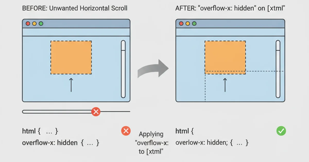
Before and after applying overflow-x: hidden to resolve an unwanted horizontal scrollbar.
overflow: hidden on <html> can be useful, use it judiciously. It can hide content that users expect to see, especially if not paired with a custom scrollable region. Always test thoroughly across different devices and screen sizes to ensure no content is inadvertently clipped or made inaccessible.