How to remove background image for mobile site?
Categories:
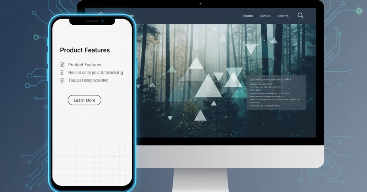
Optimizing Mobile Experience: Removing Background Images with CSS
Learn how to effectively remove or conditionally apply background images for mobile websites using CSS, ensuring faster load times and a cleaner user experience.
Background images can significantly enhance the visual appeal of a website on larger screens. However, on mobile devices, they often lead to slower load times, increased data usage, and can sometimes obscure important content or make text unreadable. This article will guide you through various CSS techniques to remove or adapt background images specifically for mobile users, improving performance and usability.
Understanding the Need for Mobile Optimization
Mobile-first design principles emphasize creating an optimal experience for smaller screens first, then scaling up for larger devices. Background images, especially large ones, can be detrimental to this principle. They consume bandwidth, which is often limited on mobile networks, and can negatively impact Core Web Vitals like Largest Contentful Paint (LCP). By conditionally removing or simplifying background images, we can deliver a snappier and more accessible experience for mobile users.
flowchart TD
    A[Website Load Request] --> B{Device Type?}
    B -->|Desktop| C[Load Full Background Image]
    B -->|Mobile| D[Remove/Simplify Background Image]
    C --> E[Render Desktop Site]
    D --> F[Render Mobile Site]
    E & F --> G[User Experience]
Decision flow for background image loading based on device type.
Method 1: Using CSS Media Queries
The most common and effective way to control styles based on screen size is by using CSS media queries. You can define specific styles that apply only when the screen width falls within a certain range. To remove a background image for mobile, you'll typically target screen widths below a certain breakpoint, such as 768px (a common breakpoint for tablets and smaller devices).
/* Default styles for larger screens */
body {
  background-image: url('path/to/your/large-background.jpg');
  background-size: cover;
  background-repeat: no-repeat;
  background-attachment: fixed;
}

/* Styles for screens smaller than 768px (e.g., mobile) */
@media (max-width: 767px) {
  body {
    background-image: none; /* This removes the background image */
    background-color: #f0f0f0; /* Optional: set a solid background color */
  }
}
CSS media query to remove a background image for mobile devices.
background-color to ensure your content still has a visually appealing backdrop. This prevents a stark white or transparent background if not intended.Method 2: Overriding Bootstrap's Background Utilities
If you're using a framework like Twitter Bootstrap, it might apply background styles through utility classes or its default CSS. You can override these using media queries, ensuring your custom styles take precedence. Bootstrap often uses !important in its utility classes, so you might need to be explicit with your overrides.
/* Assuming Bootstrap applies a background to a div with class 'hero-section' */
.hero-section {
  background-image: url('path/to/desktop-hero.jpg');
  background-size: cover;
}

@media (max-width: 767px) {
  .hero-section {
    background-image: none !important; /* Use !important to override Bootstrap */
    background-color: #ffffff; /* A clean white background for mobile */
  }
}
Overriding Bootstrap's background image with a media query and !important.
Method 3: Conditionally Applying Backgrounds (Mobile-First Approach)
Instead of removing a background image, you can adopt a mobile-first approach where no background image is applied by default, and then it's added only for larger screens. This can be more efficient as mobile devices won't even attempt to download the image.
/* Mobile-first: No background image by default */
body {
  background-color: #f0f0f0; /* Default background color for all devices */
}

/* Apply background image only for screens larger than 767px (e.g., desktop) */
@media (min-width: 768px) {
  body {
    background-image: url('path/to/your/large-background.jpg');
    background-size: cover;
    background-repeat: no-repeat;
    background-attachment: fixed;
  }
}
Mobile-first approach: applying background image only for larger screens.
min-width media query is generally preferred for a mobile-first strategy, as it ensures that base styles are for mobile, and enhancements are added for larger screens.Considerations for Performance and User Experience
Beyond simply removing the image, think about the overall impact. If the background image contains crucial information, you might need to present that information differently on mobile. For purely decorative images, removing them is usually the best approach. Always test your changes on actual mobile devices or emulators to ensure the desired outcome.
1. Identify Background Elements
Locate the CSS rules that apply background images to your body, specific div elements, or other containers.
2. Choose Your Approach
Decide whether to use a max-width media query to remove an existing background or a min-width media query for a mobile-first application.
3. Implement CSS Changes
Add the appropriate CSS media queries to your stylesheet. Remember to use !important if overriding framework styles.
4. Test on Mobile Devices
Crucially, test your website on various mobile devices and screen sizes to confirm the background image is removed and the layout remains functional and aesthetically pleasing.
5. Monitor Performance
Use tools like Lighthouse or PageSpeed Insights to check if removing the background image has improved your mobile site's loading performance.