Center a position:fixed element
Categories:
Centering a position: fixed Element with CSS
Learn various robust CSS techniques to perfectly center a position: fixed element, ensuring cross-browser compatibility and responsiveness.
Centering elements on a webpage is a fundamental CSS task, but it can become tricky when dealing with position: fixed elements. Unlike statically positioned elements, fixed elements are removed from the normal document flow and positioned relative to the viewport. This article explores several effective methods to achieve perfect horizontal and vertical centering for fixed elements, catering to different scenarios and browser support requirements.
Understanding position: fixed
A position: fixed element is positioned relative to the viewport, meaning it stays in the same place even if the page is scrolled. This makes it ideal for elements like navigation bars, modals, or 'back to top' buttons. However, because it's out of the normal flow, traditional centering methods like margin: auto on block-level elements won't work directly. We need to leverage properties that account for its viewport-relative positioning.
flowchart TD
    A[Start: Element with position: fixed]
    B{Needs Centering?}
    A --> B
    B -- Yes --> C[Method 1: Transform]
    B -- Yes --> D[Method 2: Flexbox]
    B -- Yes --> E[Method 3: Grid]
    B -- No --> F[End: No Centering Needed]
    C --> G[Result: Centered]
    D --> G
    E --> G
Decision flow for centering a fixed element
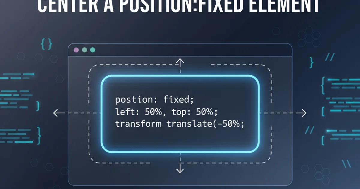
Method 1: Using transform and top/left
This is a widely supported and highly effective method. It involves setting the top and left properties to 50% to move the element's top-left corner to the center of the viewport, and then using transform: translate(-50%, -50%) to shift the element back by half its own width and height. This ensures the element's true center aligns with the viewport's center.
.fixed-centered-transform {
  position: fixed;
  top: 50%;
  left: 50%;
  transform: translate(-50%, -50%);
  /* Optional: Set width/height or padding */
  width: 300px;
  height: 200px;
  background-color: lightblue;
  border: 1px solid blue;
  z-index: 1000;
}
CSS for centering with transform
transform property creates a new stacking context, which can sometimes affect z-index behavior. Be mindful of this when layering elements.Method 2: Leveraging Flexbox
Flexbox provides a powerful and intuitive way to center elements. While a position: fixed element doesn't directly participate in a flex container's layout, we can make the fixed element itself a flex container or use a wrapper. A more direct approach is to use margin: auto in conjunction with top, right, bottom, and left properties set to 0.
.fixed-centered-flex {
  position: fixed;
  top: 0;
  right: 0;
  bottom: 0;
  left: 0;
  margin: auto; /* This is the key for centering */
  /* Optional: Set width/height or padding */
  width: 300px;
  height: 200px;
  background-color: lightgreen;
  border: 1px solid green;
  z-index: 1000;
}
CSS for centering with margin: auto and fixed offsets
margin: auto and top/right/bottom/left: 0 works because the browser calculates the available space and distributes the margins equally, effectively centering the element. This method is also very well-supported.Method 3: CSS Grid for Centering
CSS Grid offers another modern and robust solution. Similar to the flexbox approach, we can use top, right, bottom, left set to 0, and then apply grid properties to the element itself to center its content, or, more commonly, use place-items: center if the fixed element is a grid container for its children.
.fixed-centered-grid-container {
  position: fixed;
  top: 0;
  right: 0;
  bottom: 0;
  left: 0;
  display: grid;
  place-items: center; /* Centers content both horizontally and vertically */
  z-index: 1000;
}

.fixed-centered-grid-container > div {
  /* This is the actual content to be centered */
  width: 300px;
  height: 200px;
  background-color: lightcoral;
  border: 1px solid red;
}
CSS for centering using CSS Grid on a wrapper
transform or margin: auto for older browsers. Always check your target audience's browser usage.Each of these methods provides a reliable way to center a position: fixed element. The best choice often depends on your specific project requirements, browser support needs, and personal preference. For maximum compatibility, the transform method is often preferred. For modern applications, Flexbox and Grid offer cleaner, more semantic solutions.