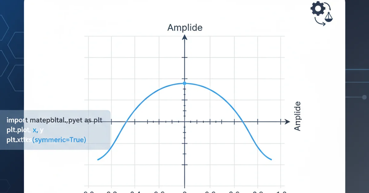
Tick labels on x-axis aren't symmetric (Matplotlib)
Categories:
Achieving Symmetric X-Axis Tick Labels in Matplotlib
Learn how to troubleshoot and resolve issues with asymmetric tick labels on the x-axis in Matplotlib plots, ensuring a clean and professional data visualization.
Matplotlib is a powerful plotting library in Python, but sometimes achieving the exact visual presentation you desire can be tricky. A common issue users encounter is asymmetric tick labels on the x-axis, where the labels don't align properly with the data points or the visual center of the ticks. This can make a plot look unprofessional and harder to interpret. This article will guide you through understanding why this happens and provide practical solutions to ensure your x-axis labels are always symmetric and well-aligned.
Understanding Asymmetric Tick Labels
Asymmetric tick labels often arise from a combination of factors, including the data range, the number of ticks Matplotlib automatically generates, and the default alignment settings for tick labels. Matplotlib tries to intelligently place labels to avoid overlap, but this can sometimes lead to labels shifting off-center, especially when dealing with uneven data distributions or specific plot types like bar charts where the tick might represent the center of a bar. Understanding the default behavior is the first step to overriding it effectively.
flowchart TD
    A[Plot Data] --> B{Matplotlib Auto-Tick Generation}
    B --> C{Label Placement Algorithm}
    C --> D{Check for Overlap}
    D -- Overlap Detected --> E[Adjust Label Position (Asymmetric)]
    D -- No Overlap --> F[Default Symmetric Placement]
    E --> G[User Observes Asymmetry]
    F --> G
Flowchart illustrating Matplotlib's tick label generation and potential for asymmetry.
Common Causes and Solutions
Several common scenarios lead to asymmetric tick labels. Identifying the root cause is crucial for applying the correct fix. We'll explore the most frequent culprits and their corresponding solutions, ranging from simple alignment adjustments to more explicit tick placement strategies.
Solution 1: Adjusting Horizontal Alignment
The most straightforward approach to correcting asymmetric x-axis labels is to explicitly set their horizontal alignment. Matplotlib's set_ha() method (or set_horizontalalignment()) on the tick labels allows you to control how the text is aligned relative to its position. Common values are 'center', 'left', and 'right'. For most symmetric requirements, 'center' is the desired setting.
import matplotlib.pyplot as plt

fig, ax = plt.subplots()
ax.plot([1, 2, 3, 4], [10, 20, 15, 25])

# Get all x-axis tick labels
for label in ax.get_xticklabels():
    label.set_ha('center') # Set horizontal alignment to center

plt.title('X-Axis Labels Centered')
plt.show()
Centering x-axis tick labels using set_ha('center').
Solution 2: Explicit Tick Placement
If simply adjusting the alignment doesn't yield the desired result, or if you need more precise control, you can explicitly define the tick locations and their corresponding labels. This is particularly useful when your x-axis represents categorical data or specific intervals where Matplotlib's automatic tick locator might not align perfectly with your conceptual divisions.
import matplotlib.pyplot as plt

fig, ax = plt.subplots()

categories = ['A', 'B', 'C', 'D']
values = [5, 7, 3, 8]

ax.bar(categories, values) # Example with a bar chart

# Set explicit tick locations and labels
ax.set_xticks(range(len(categories)))
ax.set_xticklabels(categories)

# Ensure labels are centered (often needed with explicit ticks too)
for label in ax.get_xticklabels():
    label.set_ha('center')

plt.title('Explicit Tick Placement and Centering')
plt.show()
Using set_xticks and set_xticklabels for precise control over x-axis ticks.
Solution 3: Using FixedLocator and FixedFormatter
For advanced scenarios, especially when dealing with complex data or custom formatting, Matplotlib's FixedLocator and FixedFormatter can provide robust control. These tools allow you to define exact positions for ticks and then assign specific labels to those positions, ensuring perfect symmetry and alignment.
import matplotlib.pyplot as plt
import matplotlib.ticker as mticker

fig, ax = plt.subplots()
ax.plot([0.5, 1.5, 2.5, 3.5], [10, 20, 15, 25])

# Define custom tick locations and labels
tick_locations = [0.5, 1.5, 2.5, 3.5]
tick_labels = ['Point 1', 'Point 2', 'Point 3', 'Point 4']

ax.xaxis.set_major_locator(mticker.FixedLocator(tick_locations))
ax.xaxis.set_major_formatter(mticker.FixedFormatter(tick_labels))

# Ensure labels are centered
for label in ax.get_xticklabels():
    label.set_ha('center')

plt.title('FixedLocator and FixedFormatter for Precise Control')
plt.show()
Employing FixedLocator and FixedFormatter for highly customized tick placement.
FixedLocator and FixedFormatter, ensure that the number of locations matches the number of labels. Mismatches can lead to errors or unexpected behavior.By applying these techniques, you can overcome the challenge of asymmetric x-axis tick labels in Matplotlib, leading to clearer, more professional, and aesthetically pleasing data visualizations. Always remember to test your changes and adjust parameters until your plot perfectly conveys your data.