What is the alternative of SlidingDrawer which is deprecated? For sliding up from bottom
Categories:
Modern Alternatives to Android's Deprecated SlidingDrawer
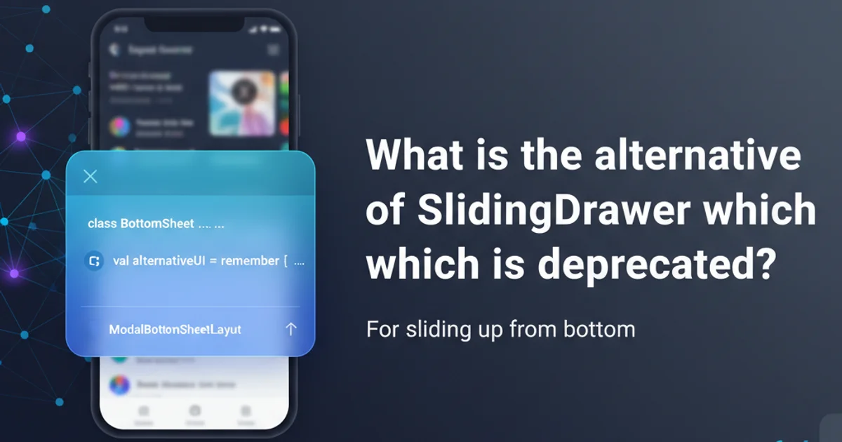
Explore contemporary UI components and techniques for implementing a 'slide up from bottom' panel in Android, replacing the deprecated SlidingDrawer.
The SlidingDrawer widget in Android, once a common way to implement a slide-up or slide-down panel, has been deprecated since API Level 17. This means it's no longer recommended for new development and might not behave as expected on newer Android versions or devices. Developers often look for modern, flexible, and officially supported alternatives to achieve similar 'slide up from bottom' functionality. This article will guide you through the best practices and components available in the Android ecosystem today.
Why SlidingDrawer Was Deprecated
The SlidingDrawer suffered from several limitations that led to its deprecation. It was difficult to customize, often led to layout issues, and didn't integrate well with modern Android UI patterns and material design guidelines. Its fixed nature made it challenging to adapt to different screen sizes and orientations, and it lacked the smooth, interactive animations expected in contemporary applications. Furthermore, its implementation often clashed with other touch events and gestures, leading to a poor user experience.
flowchart TD
    A[SlidingDrawer (Deprecated)] --> B{Limitations?}
    B -->|Yes| C[Poor Customization]
    B -->|Yes| D[Layout Issues]
    B -->|Yes| E[No Material Design Support]
    B -->|Yes| F[Fixed Size/Orientation]
    C & D & E & F --> G[Suboptimal User Experience]
    G --> H[Deprecation (API 17+)]
    H --> I[Need for Modern Alternatives]
Reasons for SlidingDrawer Deprecation
Modern Alternatives for 'Slide Up from Bottom' UI
Fortunately, Android now offers several robust and flexible components that can effectively replace SlidingDrawer for creating slide-up panels. The most common and recommended solutions are BottomSheetBehavior (part of Material Design Components) and custom View animations or ConstraintLayout animations.
BottomSheetBehavior is the go-to solution. It handles states, gestures, and accessibility out of the box.1. BottomSheetBehavior (Material Design Components)
The BottomSheetBehavior is a powerful component provided by the Material Design library. It allows a view (typically a LinearLayout or FrameLayout) to slide up from the bottom of the screen, revealing content. It supports various states like STATE_COLLAPSED, STATE_EXPANDED, STATE_HIDDEN, and STATE_HALF_EXPANDED (if a peek height is defined). It integrates seamlessly with CoordinatorLayout to provide gesture-driven interactions.
<!-- activity_main.xml -->
<androidx.coordinatorlayout.widget.CoordinatorLayout
    xmlns:android="http://schemas.android.com/apk/res/android"
    xmlns:app="http://schemas.android.com/apk/res-auto"
    android:layout_width="match_parent"
    android:layout_height="match_parent">

    <!-- Main content of your activity -->
    <TextView
        android:layout_width="wrap_content"
        android:layout_height="wrap_content"
        android:text="Main Activity Content" />

    <!-- Bottom Sheet Layout -->
    <LinearLayout
        android:id="@+id/bottom_sheet"
        android:layout_width="match_parent"
        android:layout_height="wrap_content"
        android:orientation="vertical"
        android:background="@android:color/white"
        app:layout_behavior="com.google.android.material.bottomsheet.BottomSheetBehavior">

        <TextView
            android:layout_width="match_parent"
            android:layout_height="wrap_content"
            android:padding="16dp"
            android:text="Bottom Sheet Content" />

        <Button
            android:id="@+id/toggle_button"
            android:layout_width="wrap_content"
            android:layout_height="wrap_content"
            android:text="Toggle Sheet" />

    </LinearLayout>

</androidx.coordinatorlayout.widget.CoordinatorLayout>
XML layout for a basic Bottom Sheet
// MainActivity.kt
import android.os.Bundle
import android.widget.Button
import android.widget.LinearLayout
import androidx.appcompat.app.AppCompatActivity
import com.google.android.material.bottomsheet.BottomSheetBehavior

class MainActivity : AppCompatActivity() {

    private lateinit var bottomSheetBehavior: BottomSheetBehavior<LinearLayout>

    override fun onCreate(savedInstanceState: Bundle?) {
        super.onCreate(savedInstanceState)
        setContentView(R.layout.activity_main)

        val bottomSheet = findViewById<LinearLayout>(R.id.bottom_sheet)
        bottomSheetBehavior = BottomSheetBehavior.from(bottomSheet)

        // Set initial state (optional)
        bottomSheetBehavior.state = BottomSheetBehavior.STATE_COLLAPSED
        bottomSheetBehavior.peekHeight = 200 // pixels

        findViewById<Button>(R.id.toggle_button).setOnClickListener {
            if (bottomSheetBehavior.state == BottomSheetBehavior.STATE_COLLAPSED) {
                bottomSheetBehavior.state = BottomSheetBehavior.STATE_EXPANDED
            } else {
                bottomSheetBehavior.state = BottomSheetBehavior.STATE_COLLAPSED
            }
        }

        // Optional: Listen for state changes
        bottomSheetBehavior.addBottomSheetCallback(object : BottomSheetBehavior.BottomSheetCallback() {
            override fun onStateChanged(bottomSheet: View, newState: Int) {
                when (newState) {
                    BottomSheetBehavior.STATE_COLLAPSED -> Log.d("BottomSheet", "Collapsed")
                    BottomSheetBehavior.STATE_EXPANDED -> Log.d("BottomSheet", "Expanded")
                    BottomSheetBehavior.STATE_DRAGGING -> Log.d("BottomSheet", "Dragging")
                    BottomSheetBehavior.STATE_SETTLING -> Log.d("BottomSheet", "Settling")
                    BottomSheetBehavior.STATE_HIDDEN -> Log.d("BottomSheet", "Hidden")
                    BottomSheetBehavior.STATE_HALF_EXPANDED -> Log.d("BottomSheet", "Half Expanded")
                }
            }

            override fun onSlide(bottomSheet: View, slideOffset: Float) {
                // React to slide events
            }
        })
    }
}
Kotlin code to control the Bottom Sheet behavior
2. Custom View Animations or ConstraintLayout
For highly custom slide-up panels that don't fit the BottomSheetBehavior model, you can implement your own animations. This typically involves animating the translationY property of a View or using ConstraintLayout to animate changes in constraints. This approach offers maximum flexibility but requires more manual implementation of touch handling, state management, and animation details.
<!-- activity_custom_slide.xml -->
<androidx.constraintlayout.widget.ConstraintLayout
    xmlns:android="http://schemas.android.com/apk/res/android"
    xmlns:app="http://schemas.android.com/apk/res-auto"
    android:id="@+id/root_layout"
    android:layout_width="match_parent"
    android:layout_height="match_parent">

    <!-- Main content -->
    <TextView
        android:layout_width="wrap_content"
        android:layout_height="wrap_content"
        android:text="Main Content Area"
        app:layout_constraintTop_toTopOf="parent"
        app:layout_constraintStart_toStartOf="parent" />

    <!-- Custom Slide-up Panel -->
    <LinearLayout
        android:id="@+id/custom_panel"
        android:layout_width="match_parent"
        android:layout_height="250dp"
        android:background="#FFC107"
        android:orientation="vertical"
        android:translationY="250dp" <!-- Initially off-screen -->
        app:layout_constraintBottom_toBottomOf="parent"
        app:layout_constraintStart_toStartOf="parent"
        app:layout_constraintEnd_toEndOf="parent">

        <TextView
            android:layout_width="match_parent"
            android:layout_height="wrap_content"
            android:padding="16dp"
            android:text="Custom Panel Content" />

        <Button
            android:id="@+id/toggle_custom_button"
            android:layout_width="wrap_content"
            android:layout_height="wrap_content"
            android:text="Toggle Custom Panel" />

    </LinearLayout>

</androidx.constraintlayout.widget.ConstraintLayout>
XML layout for a custom slide-up panel using ConstraintLayout
// CustomSlideActivity.kt
import android.animation.ObjectAnimator
import android.os.Bundle
import android.view.View
import android.widget.Button
import android.widget.LinearLayout
import androidx.appcompat.app.AppCompatActivity

class CustomSlideActivity : AppCompatActivity() {

    private lateinit var customPanel: LinearLayout
    private var isPanelShown = false

    override fun onCreate(savedInstanceState: Bundle?) {
        super.onCreate(savedInstanceState)
        setContentView(R.layout.activity_custom_slide)

        customPanel = findViewById(R.id.custom_panel)
        val toggleButton = findViewById<Button>(R.id.toggle_custom_button)

        toggleButton.setOnClickListener {
            toggleCustomPanel()
        }
    }

    private fun toggleCustomPanel() {
        val panelHeight = customPanel.height.toFloat()
        val targetTranslationY = if (isPanelShown) panelHeight else 0f

        ObjectAnimator.ofFloat(customPanel, View.TRANSLATION_Y, targetTranslationY).apply {
            duration = 300
            start()
        }
        isPanelShown = !isPanelShown
    }
}
Kotlin code to animate a custom slide-up panel
Choosing the Right Alternative
The choice between BottomSheetBehavior and custom animations depends on your specific requirements:
- BottomSheetBehavior: Ideal for standard 'peek and expand' functionality, adhering to Material Design, and requiring minimal setup for common use cases. It handles gestures, states, and accessibility automatically.
- Custom Animations (e.g.,
ObjectAnimator,ConstraintLayoutanimations): Best when you need highly specific, non-standard sliding behavior, unique visual effects, or when you want to avoid the Material Design dependency. This approach gives you full control but demands more development effort.
graph TD
    A[Requirement] --> B{Standard 'Slide Up' Behavior?}
    B -->|Yes| C[Adhere to Material Design?]
    C -->|Yes| D[Use BottomSheetBehavior]
    C -->|No| E[Need Full Customization?]
    E -->|Yes| F[Implement Custom View Animations]
    E -->|No| D
    B -->|No| F
Decision Flow for Choosing a SlidingDrawer Alternative