Rotate an image in image source in html
Categories:
Rotating Images in HTML: Techniques and Considerations

Explore various methods to rotate images directly within HTML and CSS, from simple visual adjustments to dynamic manipulations, ensuring cross-browser compatibility and optimal user experience.
Rotating an image in HTML isn't as straightforward as a single HTML attribute. HTML itself is primarily for structuring content, while CSS is responsible for styling and visual presentation, including transformations like rotation. This article will guide you through the most common and effective ways to rotate images using CSS, discuss their implications, and provide practical examples.
Understanding CSS Transforms for Image Rotation
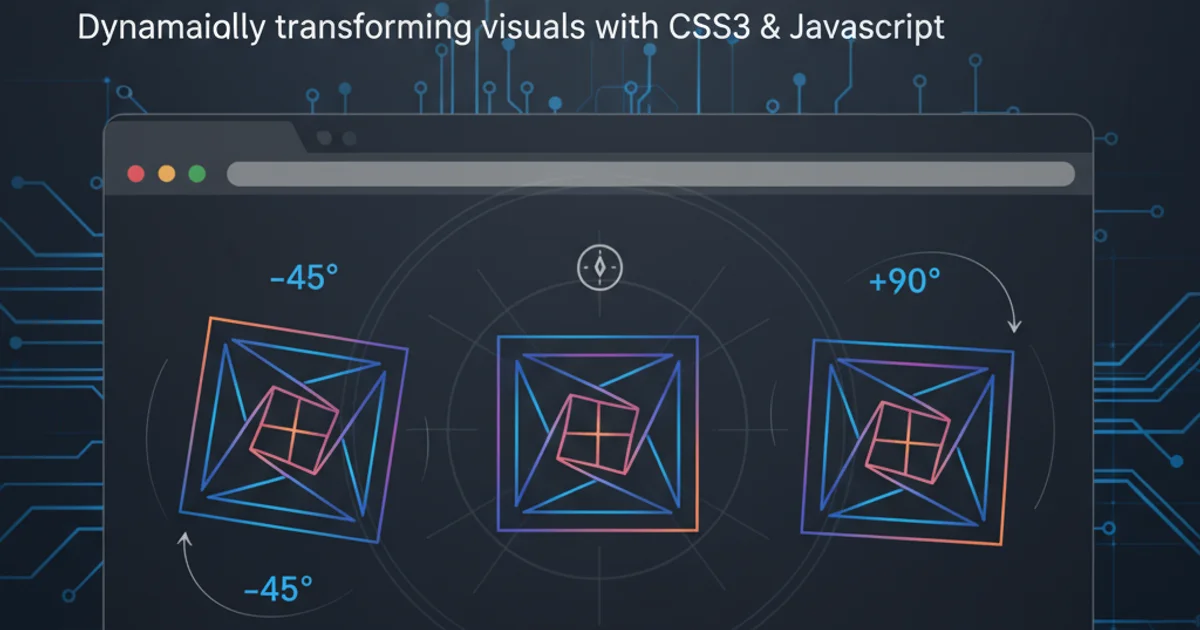
The primary method for rotating elements, including images, in web development is through CSS transform property, specifically the rotate() function. This property allows you to apply 2D or 3D transformations to an element. When you apply a rotation, the image is rotated around its transform-origin, which by default is the center of the element.
flowchart TD
    A[Image Element in HTML] --> B{Apply CSS 'transform' Property}
    B --> C{Use 'rotate(angle)' Function}
    C --> D[Specify Angle (e.g., 90deg, 0.5turn, 180deg)]
    D --> E[Image Rotated Visually]
    E --> F{Consider 'transform-origin' (Default: Center)}
    F --> G[Adjust 'transform-origin' if needed]
Conceptual flow for rotating an image using CSS transform.
Basic Image Rotation with CSS
The simplest way to rotate an image is to apply a CSS transform: rotate() directly to the <img> tag or a container holding the image. You can specify the rotation angle in degrees (deg), gradians (grad), radians (rad), or turns (turn).
<!DOCTYPE html>
<html>
<head>
<title>Basic Image Rotation</title>
<style>
  .rotated-image {
    transform: rotate(45deg); /* Rotate by 45 degrees */
    transition: transform 0.5s ease; /* Smooth transition for hover effect */
  }
  .rotated-image:hover {
    transform: rotate(90deg);
  }
</style>
</head>
<body>

  <h1>Image Rotation Example</h1>
  <img src="https://via.placeholder.com/150" alt="Placeholder Image" class="rotated-image">

</body>
</html>
HTML and CSS for basic image rotation.
transition property on the transform property. This makes the rotation visually appealing rather than an abrupt change.Rotating Images Dynamically with JavaScript
While CSS is great for static or hover-based rotations, JavaScript provides the power to rotate images dynamically based on user interaction, data, or other events. You can manipulate the style.transform property of an image element directly.
<!DOCTYPE html>
<html>
<head>
<title>Dynamic Image Rotation</title>
<style>
  #dynamicImage {
    transition: transform 0.3s ease;
  }
</style>
</head>
<body>

  <h1>Dynamic Image Rotation Example</h1>
  <img id="dynamicImage" src="https://via.placeholder.com/150" alt="Dynamic Image">
  <button onclick="rotateImage()">Rotate 90°</button>

  <script>
    let currentRotation = 0;
    function rotateImage() {
      const img = document.getElementById('dynamicImage');
      currentRotation += 90;
      img.style.transform = `rotate(${currentRotation}deg)`;
    }
  </script>

</body>
</html>
JavaScript to dynamically rotate an image on button click.
Considerations for Image Rotation
When rotating images, several factors should be considered to ensure a good user experience and proper rendering across different browsers and devices.
1. Browser Compatibility
The transform property is widely supported by modern browsers. For very old browsers, vendor prefixes (e.g., -webkit-transform, -moz-transform) might have been necessary, but they are largely obsolete now. Always test your rotations across target browsers.
2. Layout Shift
Rotating an image can change its perceived dimensions and might cause other elements on the page to shift. If the rotated image extends beyond its original bounding box, it might overlap other content. Consider using overflow: hidden on a parent container or adjusting margins/padding.
3. Accessibility
Ensure that rotating an image doesn't obscure important information or make it unreadable. If the image contains text, rotating it might make the text difficult to read for some users. Provide appropriate alt text that describes the image's content regardless of its orientation.
4. Performance
While CSS transforms are generally hardware-accelerated and performant, excessive or complex transformations on many elements can impact rendering performance. Use will-change: transform to hint to the browser about upcoming transformations, potentially optimizing performance.