Alternative to Chrome Extension "Window Resizer"
Categories:
Beyond Window Resizer: Native & Alternative Tools for Responsive Design

Explore powerful native browser features and alternative extensions to efficiently test responsive layouts without relying solely on the 'Window Resizer' Chrome extension.
The Chrome Extension "Window Resizer" has been a popular tool for web developers to quickly test how their websites adapt to different screen sizes. However, relying on a single extension can sometimes be limiting, especially with evolving browser capabilities and the need for more integrated workflows. This article explores robust alternatives, including powerful native browser developer tools and other extensions, that offer more control, accuracy, and efficiency for responsive design testing.
Leveraging Chrome's Built-in DevTools for Responsive Testing
Google Chrome's Developer Tools (DevTools) offer a comprehensive suite of features for responsive design testing, often surpassing the capabilities of simple extensions. The Device Mode, in particular, is a game-changer, providing pixel-perfect control over viewport dimensions, device pixel ratios, user agents, and even network conditions. It's an essential tool for any serious web developer.
flowchart TD
    A[Start Responsive Testing] --> B{"Open Chrome DevTools (F12)"}
    B --> C["Toggle Device Toolbar (Ctrl+Shift+M / Cmd+Shift+M)"]
    C --> D{"Select Device Preset or Custom Dimensions"}
    D -- "Preset" --> E[Test Common Devices]
    D -- "Custom" --> F[Enter Width & Height Manually]
    F --> G["Adjust DPR, User Agent, Network Throttling"]
    G --> H[Inspect & Debug Layout/Styles]
    H --> I[Refine CSS/Media Queries]
    I --> J[End Testing Cycle]
Workflow for Responsive Design Testing using Chrome DevTools Device Mode
The Device Mode allows you to simulate various devices, including mobile phones and tablets, with their specific resolutions and pixel densities. You can also rotate the viewport, simulate touch events, and even throttle network speeds to test performance on slower connections. This level of detail is crucial for ensuring a truly responsive and performant user experience across all devices.
Alternative Chrome Extensions for Specific Needs
While DevTools are powerful, some developers might still prefer extensions for quick, specific tasks or different workflows. Here are a few notable alternatives that offer unique features or a different approach to responsive testing:
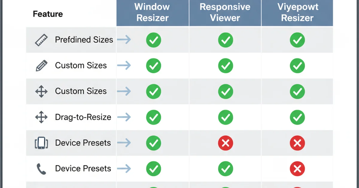
Feature comparison of popular responsive testing extensions.
- Responsive Viewer: This extension allows you to view your website on multiple devices simultaneously in a single window. It's excellent for side-by-side comparisons and quickly spotting layout issues across different breakpoints.
- Viewport Resizer: Similar to Window Resizer, but often updated more frequently or offering slightly different preset options. It focuses on quickly changing the browser window size to predefined dimensions.
- Responsinator: While not a Chrome extension, Responsinator (a web service) provides a similar multi-device view by rendering your URL on various device frames. It's a quick way to get a visual overview without installing anything.
Practical Steps for Responsive Testing with DevTools
Here's a step-by-step guide to effectively use Chrome DevTools for responsive design testing, covering the most common scenarios you'll encounter.
1. Open DevTools and Toggle Device Mode
Navigate to your website in Chrome. Press F12 (Windows/Linux) or Cmd + Option + I (macOS) to open DevTools. Then, click the 'Toggle device toolbar' icon (it looks like a phone and tablet) or press Ctrl + Shift + M (Windows/Linux) or Cmd + Shift + M (macOS).
2. Select a Device or Custom Dimensions
In the device toolbar, use the dropdown menu to select a predefined device (e.g., 'iPhone SE', 'iPad Air'). Alternatively, choose 'Responsive' and manually enter the desired width and height in the input fields provided. You can also drag the edges of the viewport to resize it interactively.
3. Simulate Device Features
Explore the additional options in the device toolbar. You can rotate the screen (portrait/landscape), adjust the Device Pixel Ratio (DPR) to simulate high-resolution screens, and even simulate touch events. For performance testing, use the 'Network throttling' dropdown to simulate slow 3G or fast 3G connections.
4. Inspect and Debug
As you resize, use the 'Elements' panel to inspect specific elements and see how their styles change based on your media queries. The 'Styles' pane will show which CSS rules are active for the current viewport size. Use the 'Console' for any JavaScript debugging.
5. Take Screenshots
To capture screenshots of your responsive layouts, click the three-dot menu in the device toolbar and select 'Capture screenshot' for the visible area or 'Capture full size screenshot' for the entire page, even off-screen content.