How do I make a burn down chart in Excel?
Categories:
Mastering Burn Down Charts in Excel: A Step-by-Step Guide

Learn how to create effective burn down charts in Microsoft Excel to track project progress, visualize remaining work, and ensure your team stays on schedule for agile development or any project management.
Burn down charts are a crucial tool in agile project management, providing a visual representation of the work remaining versus time. They help teams understand their progress, identify potential roadblocks, and forecast completion dates. While specialized software exists, you can effectively create and manage burn down charts using Microsoft Excel, a widely available and powerful spreadsheet application. This article will guide you through the process, from data preparation to chart customization, ensuring you can accurately track your project's sprint or overall progress.
Understanding the Components of a Burn Down Chart
Before diving into Excel, it's essential to understand the core components that make up a burn down chart. This will inform the data you need to collect and how you'll structure your spreadsheet. A typical burn down chart plots two main lines against time: the ideal burn down and the actual burn down. It also includes the total work initially planned.
graph TD
    A["Start Date"] --> B["End Date"];
    B --> C["Total Story Points/Hours"];
    C --> D["Ideal Burn Down Line"];
    C --> E["Actual Remaining Work"];
    E --> F["Actual Burn Down Line"];
    D -- "Decreases linearly" --> F;
    F -- "Fluctuates based on progress" --> B;
    style A fill:#f9f,stroke:#333,stroke-width:2px
    style B fill:#bbf,stroke:#333,stroke-width:2px
    style C fill:#ccf,stroke:#333,stroke-width:2px
    style D fill:#afa,stroke:#333,stroke-width:2px
    style E fill:#faa,stroke:#333,stroke-width:2px
    style F fill:#fcf,stroke:#333,stroke-width:2px
Key components and data flow for a burn down chart.
Here's a breakdown of the key data points you'll need:
- Sprint/Project Duration: The number of days your sprint or project is planned to run.
- Total Initial Work: The sum of all estimated work (e.g., story points, hours) at the beginning of the sprint/project.
- Ideal Burn Down: A straight line representing the perfect scenario where work is completed at a constant rate each day.
- Actual Remaining Work: The amount of work (story points, hours) that is still incomplete at the end of each day.
- Dates: A list of all working days within your sprint/project duration.
Setting Up Your Excel Spreadsheet
The first step is to organize your data in Excel. A clear and consistent layout will make creating and updating your chart much easier. We'll set up columns for dates, ideal remaining work, and actual remaining work.
1. Prepare Your Data Columns
Open a new Excel workbook. In the first row, create the following headers:
- A1:
Date - B1:
Ideal Remaining - C1:
Actual Remaining
2. Enter Project Dates
In column A, starting from A2, enter the dates for your sprint or project. For example, if your sprint starts on Monday and lasts two weeks, you would list each working day. You can use Excel's auto-fill feature by entering the first two dates, selecting them, and dragging the fill handle down.
3. Calculate Ideal Remaining Work
This line represents a steady decrease in work. Let's assume your total initial work is 100 story points and your sprint is 10 days long. The daily burn rate would be 100 / 10 = 10 points per day.
- In cell B2 (corresponding to your start date), enter your
Total Initial Work(e.g.,100). - In cell B3, enter the formula
=B2 - (Total Initial Work / Number of Days). For our example, ifTotal Initial Workis in a cell likeE1andNumber of Daysis inE2, this might look like=B2 - ($E$1/$E$2). Make sure to use absolute references ($) for the total work and number of days so they don't change when you drag the formula. - Drag this formula down column B to fill in the ideal remaining work for each day. The last day should show
0or close to0.
4. Input Actual Remaining Work
This is the most dynamic part. At the end of each day, you will update the Actual Remaining column (column C) with the total amount of work (story points/hours) that is still unfinished. On the first day (C2), this will be your Total Initial Work. As the sprint progresses, you'll manually update this value daily. For days in the future, you can leave the cells blank or enter the last known Actual Remaining value.
Total Initial Work and Number of Days, it's a good practice to put these values in separate cells (e.g., E1 and E2) and reference them using absolute cell references (e.g., $E$1) in your formulas. This makes it easy to update these parameters without changing all your formulas.Creating the Burn Down Chart
Once your data is structured, creating the chart in Excel is straightforward. We'll use a 2-D Line chart to visualize the burn down.
1. Select Your Data
Select the entire range of your data, including the headers (e.g., A1:C11 if you have 10 days of data).
2. Insert a Line Chart
Go to the Insert tab on the Excel ribbon. In the Charts group, click on Insert Line or Area Chart and select the first option under 2-D Line.
3. Customize the Chart (Optional but Recommended)
Excel will generate a basic line chart. You'll likely want to customize it for clarity and aesthetics:
- Chart Title: Click on the chart title and change it to something descriptive, like "Sprint 1 Burn Down Chart."
- Axis Labels: Add axis titles by clicking the
+icon next to the chart, thenAxis Titles. Label the vertical axis "Remaining Work (Story Points/Hours)" and the horizontal axis "Date." - Legend: Ensure the legend clearly distinguishes between "Ideal Remaining" and "Actual Remaining."
- Data Series Formatting: Right-click on each line in the chart and select
Format Data Series. You can change line colors, thickness, and add markers to improve readability. - Remove Gridlines: Often, removing horizontal gridlines can make the chart cleaner. Select the gridlines and press
Delete.
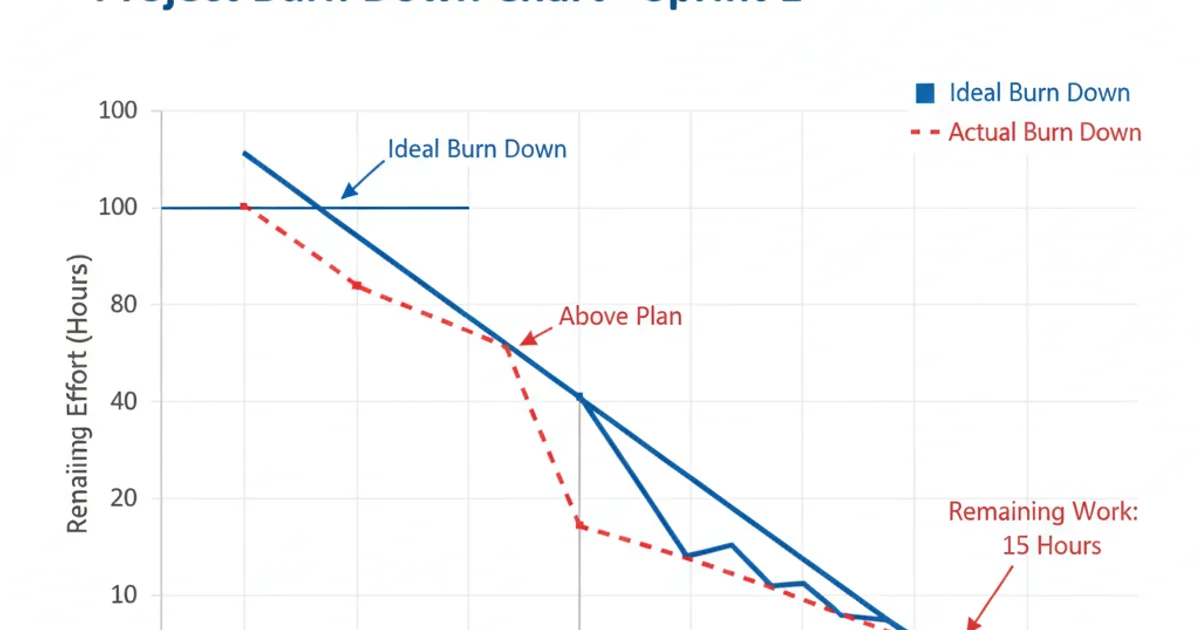
An example of a well-formatted burn down chart in Excel.