Show date on DatePickerDialog instead of "Set Date"
Categories:
Displaying the Selected Date in Android DatePickerDialog
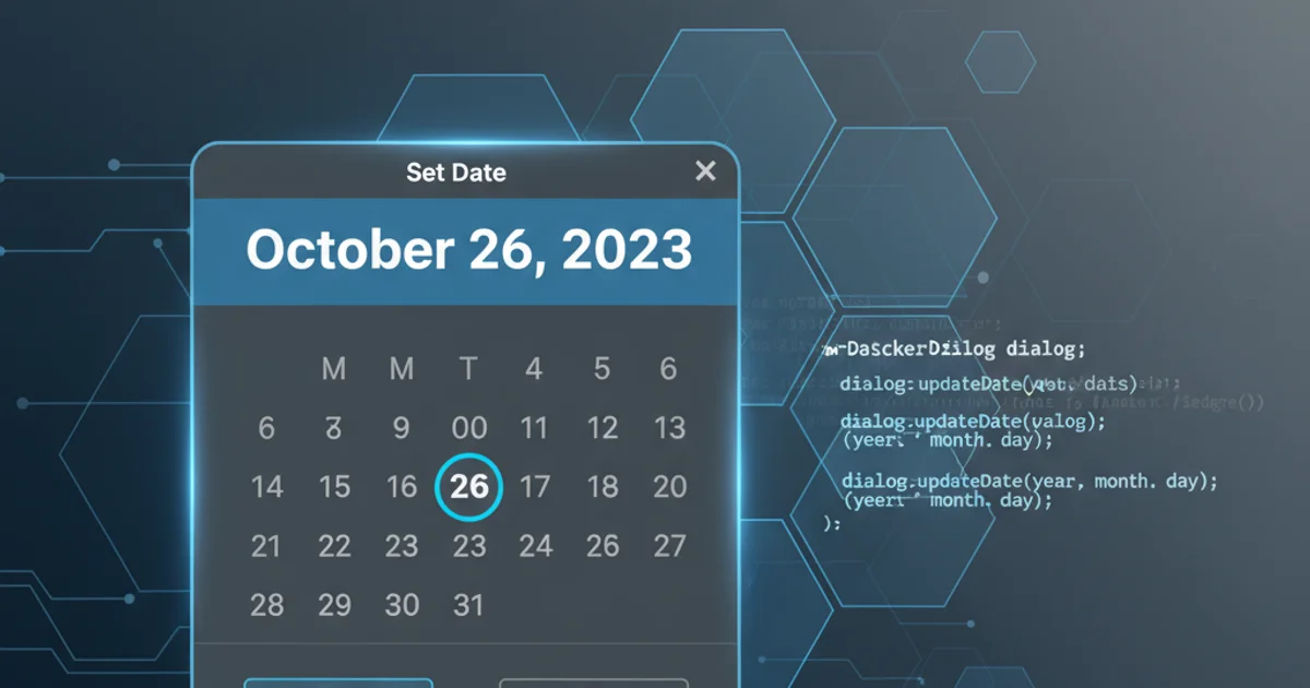
Learn how to customize the Android DatePickerDialog to show the currently selected date instead of the default 'Set Date' title, improving user experience and clarity.
The DatePickerDialog in Android is a crucial UI component for allowing users to select dates. By default, when you open a DatePickerDialog, its title often displays a generic string like 'Set Date'. While functional, this can sometimes be less intuitive for users, especially if they are re-selecting a date or need a clearer indication of the current state. This article will guide you through customizing the DatePickerDialog to display the actual selected date in its title, enhancing the user experience.
Understanding the Default Behavior
Out of the box, the DatePickerDialog constructor takes parameters for the context, listener, and initial year, month, and day. The title 'Set Date' is often a default string provided by the Android system or a theme. To change this, we need to either use a constructor that allows for a custom theme or directly manipulate the dialog's title after creation. The key is to ensure the title dynamically updates to reflect the date chosen by the user.
flowchart TD
    A[User Clicks Date Input] --> B{Create DatePickerDialog}
    B --> C{Default: 'Set Date' Title}
    C --> D[User Selects Date]
    D --> E{Dialog Dismisses}
    E --> F[Selected Date Displayed in Input]
    B --> G{Custom: 'Selected Date' Title}
    G --> D
Comparison of default vs. custom DatePickerDialog title flow
Implementing a Custom DatePickerDialog
To achieve our goal, we'll extend DialogFragment to host our DatePickerDialog. This is the recommended approach for managing dialogs in Android, as it handles lifecycle events correctly. Inside our DialogFragment, we'll override onCreateDialog to instantiate and configure the DatePickerDialog. The trick lies in using a constructor that allows us to set a custom title or theme, and then updating this title within the onDateSet callback.
import android.app.DatePickerDialog
import android.app.Dialog
import android.os.Bundle
import android.widget.DatePicker
import androidx.fragment.app.DialogFragment
import java.util.Calendar

class DatePickerFragment : DialogFragment(), DatePickerDialog.OnDateSetListener {

    private var listener: OnDateSelectedListener? = null

    interface OnDateSelectedListener {
        fun onDateSelected(year: Int, month: Int, day: Int)
    }

    fun setOnDateSelectedListener(listener: OnDateSelectedListener) {
        this.listener = listener
    }

    override fun onCreateDialog(savedInstanceState: Bundle?): Dialog {
        // Use the current date as the default date in the picker
        val c = Calendar.getInstance()
        val year = c.get(Calendar.YEAR)
        val month = c.get(Calendar.MONTH)
        val day = c.get(Calendar.DAY_OF_MONTH)

        // Create a new instance of DatePickerDialog and return it
        val datePickerDialog = DatePickerDialog(requireActivity(), this, year, month, day)

        // Set the initial title to the current date
        updateTitle(datePickerDialog, year, month, day)

        return datePickerDialog
    }

    override fun onDateSet(view: DatePicker, year: Int, month: Int, day: Int) {
        // Do something with the date chosen by the user
        listener?.onDateSelected(year, month, day)

        // Update the dialog title with the newly selected date
        val dialog = dialog as? DatePickerDialog
        dialog?.let { updateTitle(it, year, month, day) }
    }

    private fun updateTitle(dialog: DatePickerDialog, year: Int, month: Int, day: Int) {
        // Format the date as desired for the title
        val formattedDate = String.format("%d/%d/%d", month + 1, day, year)
        dialog.setTitle(formattedDate)
    }
}
DatePickerFragment.kt: Custom DatePickerDialog with dynamic title update.
month in DatePickerDialog.OnDateSetListener is 0-indexed (0-11), so you'll need to add 1 when displaying it to the user or formatting the date string.Integrating the Custom DatePickerFragment
Once you have your DatePickerFragment, you can integrate it into your Activity or Fragment. You'll typically have a button or an EditText that, when clicked, shows the DatePickerFragment. The OnDateSelectedListener interface allows your Activity or Fragment to receive the selected date and update your UI accordingly.
import android.os.Bundle
import android.widget.Button
import android.widget.TextView
import androidx.appcompat.app.AppCompatActivity

class MainActivity : AppCompatActivity(), DatePickerFragment.OnDateSelectedListener {

    private lateinit var dateTextView: TextView

    override fun onCreate(savedInstanceState: Bundle?) {
        super.onCreate(savedInstanceState)
        setContentView(R.layout.activity_main)

        dateTextView = findViewById(R.id.date_text_view)
        val pickDateButton: Button = findViewById(R.id.pick_date_button)

        pickDateButton.setOnClickListener {
            val newFragment = DatePickerFragment()
            newFragment.setOnDateSelectedListener(this)
            newFragment.show(supportFragmentManager, "datePicker")
        }
    }

    override fun onDateSelected(year: Int, month: Int, day: Int) {
        // Update the TextView with the selected date
        val formattedDate = String.format("%d/%d/%d", month + 1, day, year)
        dateTextView.text = formattedDate
    }
}
MainActivity.kt: Example of how to show the DatePickerFragment and handle the selected date.
By following these steps, you can replace the generic 'Set Date' title with a more informative display of the currently selected date, making your Android application's date selection process more user-friendly and intuitive.