How to Add Data Labels in Google Chart
Categories:
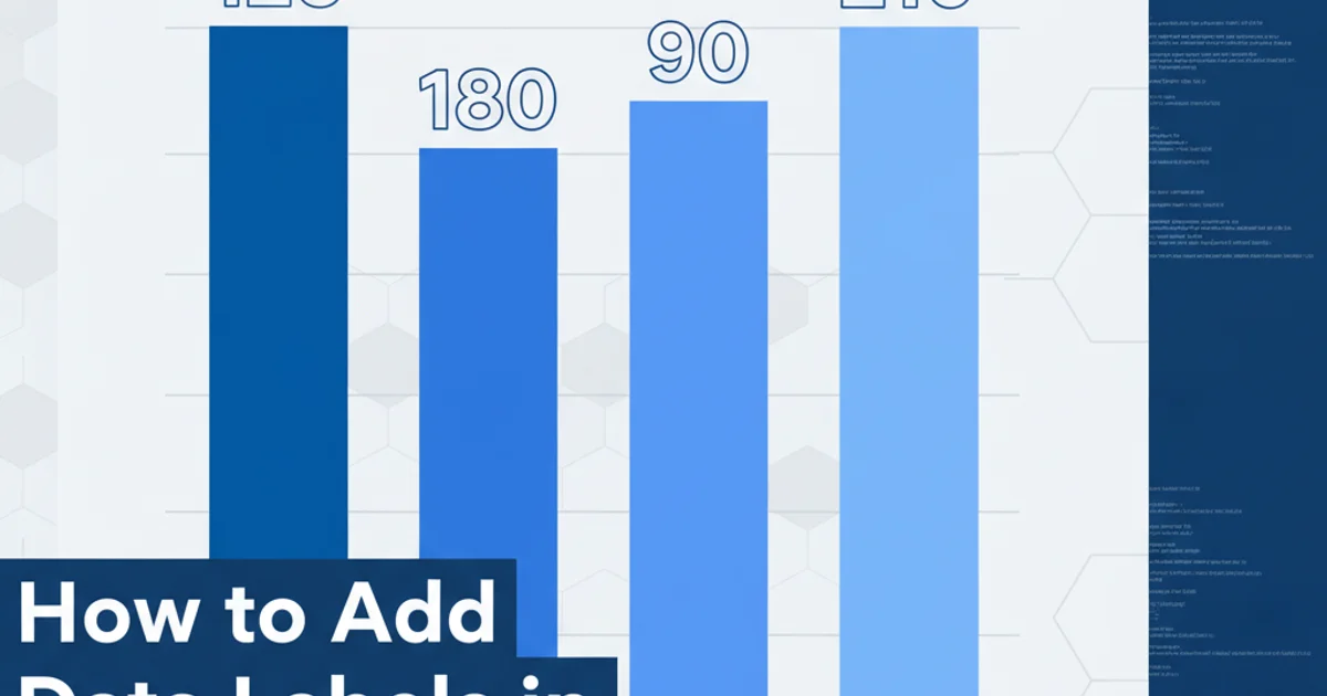
How to Add Data Labels to Google Charts for Enhanced Readability
Learn various methods to add data labels to your Google Charts, improving data visualization and making your charts more informative and easier to understand.
Google Charts are a powerful and flexible tool for visualizing data on your website. While they offer a wide range of chart types and customization options, displaying the exact data values directly on the chart elements (like bars, slices, or points) is often crucial for clear communication. This article will guide you through different techniques to add data labels to your Google Charts, ensuring your audience can quickly grasp the underlying data without needing to hover or refer to a legend.
Understanding Data Labeling in Google Charts
Data labels, also known as value labels, are text annotations that display the numerical value of a data point directly on the chart. This feature is particularly useful for bar charts, column charts, pie charts, and even some line charts, where precise values are important. Google Charts provides several options to enable and customize these labels, primarily through the options object passed to the chart constructor.
flowchart TD
    A[Initialize Google Charts] --> B{Load Data}
    B --> C{Define Chart Options}
    C --> D{"Enable Data Labels?"}
    D -- Yes --> E[Set 'annotations' or 'dataOpacity' options]
    D -- No --> F[Render Chart without labels]
    E --> G[Customize Label Appearance]
    G --> H[Draw Chart]
    F --> H
General workflow for adding data labels to Google Charts.
Method 1: Using the 'annotations' Option for Column/Bar Charts
For column and bar charts, the most straightforward way to add data labels is by utilizing the annotations option. This option allows you to display values directly above or next to your chart elements. You typically need to add an extra column to your data table specifically for annotations, which will hold the string representation of the values you want to display.
google.charts.load('current', {'packages':['corechart']});
google.charts.setOnLoadCallback(drawChart);

function drawChart() {
  var data = google.visualization.arrayToDataTable([
    ['City', '2010 Population', { role: 'annotation' }],
    ['New York', 8175000, '8.1M'],
    ['Los Angeles', 3792000, '3.7M'],
    ['Chicago', 2695000, '2.6M'],
    ['Houston', 2099000, '2.0M']
  ]);

  var options = {
    title: 'City Population',
    annotations: {
      alwaysOutside: true, // Ensures labels are always outside the bars
      textStyle: {
        fontSize: 12,
        color: '#000',
        auraColor: 'none' // No background glow
      }
    }
  };

  var chart = new google.visualization.ColumnChart(document.getElementById('chart_div'));
  chart.draw(data, options);
}
Example of adding data labels to a Column Chart using the 'annotations' role.
role: 'annotation' method, ensure your annotation column contains string values. You can format numbers as strings (e.g., '8.1M') for better readability on the chart.Method 2: Displaying Values on Pie Chart Slices
Pie charts often benefit from showing percentage or absolute values directly on each slice. Google Charts provides the pieSliceText option for this purpose. You can choose to display the value, percentage, or both.
google.charts.load('current', {'packages':['corechart']});
google.charts.setOnLoadCallback(drawChart);

function drawChart() {
  var data = google.visualization.arrayToDataTable([
    ['Task', 'Hours per Day'],
    ['Work',     11],
    ['Eat',      2],
    ['Commute',  2],
    ['Watch TV', 2],
    ['Sleep',    7]
  ]);

  var options = {
    title: 'My Daily Activities',
    pieSliceText: 'value', // Can be 'percentage', 'value', or 'label'
    // pieSliceText: 'percentage',
    // pieSliceText: 'both',
    // sliceVisibilityThreshold: 0.05 // Hide labels for slices smaller than 5%
  };

  var chart = new google.visualization.PieChart(document.getElementById('piechart_div'));
  chart.draw(data, options);
}
Example of adding data labels to a Pie Chart using pieSliceText.
sliceVisibilityThreshold to prevent labels from overlapping on very small slices, improving overall chart clarity.Method 3: Customizing Data Labels for Line and Area Charts
While line and area charts don't have a direct annotations role for every data point by default, you can achieve similar results by using the dataOpacity option in conjunction with annotations or by dynamically adding annotations. However, a common approach for line charts is to show tooltips on hover or to use specific annotation points for key data. If you truly need labels on every point, you might need to combine roles or use event listeners.
google.charts.load('current', {'packages':['corechart']});
google.charts.setOnLoadCallback(drawChart);

function drawChart() {
  var data = google.visualization.arrayToDataTable([
    ['Year', 'Sales', { role: 'annotation' }, 'Expenses', { role: 'annotation' }],
    ['2004',  1000, '1000', 400, '400'],
    ['2005',  1170, '1170', 460, '460'],
    ['2006',  660, '660', 1120, '1120'],
    ['2007',  1030, '1030', 540, '540']
  ]);

  var options = {
    title: 'Company Performance',
    curveType: 'function',
    legend: { position: 'bottom' },
    annotations: {
      textStyle: {
        fontSize: 10,
        color: '#555',
        auraColor: 'none'
      }
    }
  };

  var chart = new google.visualization.LineChart(document.getElementById('linechart_div'));
  chart.draw(data, options);
}
Adding annotations to a Line Chart for specific data points.
1. Load Google Charts Library
Ensure you have the Google Charts library loaded in your HTML file. This is typically done in the <head> or before your chart drawing script.
2. Prepare Your Data Table
Create a google.visualization.DataTable or use arrayToDataTable. If using annotations, add extra columns with { role: 'annotation' } for each series you want to label.
3. Define Chart Options
Create an options object. For column/bar charts, configure the annotations property. For pie charts, set pieSliceText to 'value', 'percentage', or 'both'.
4. Instantiate and Draw the Chart
Create a new chart instance (e.g., new google.visualization.ColumnChart(...)) and call its draw() method, passing your data and options.