CSS background image to fit height, width should auto-scale in proportion
Categories:
CSS Background Image: Fit Height, Auto-Scale Width Proportionally

Learn how to effectively use CSS to make a background image fill the height of its container while maintaining its aspect ratio, allowing the width to adjust automatically.
Styling web pages often involves using background images to enhance visual appeal. A common challenge developers face is ensuring these images adapt gracefully to different screen sizes and container dimensions. Specifically, making a background image fit the height of its parent element while preserving its aspect ratio (so the width scales proportionally) can be tricky. This article will guide you through the CSS properties and techniques required to achieve this responsive behavior, ensuring your images look great without distortion.
Understanding Key CSS Background Properties
To achieve our goal, we'll primarily rely on a few core CSS background properties. Understanding how each one contributes to the final layout is crucial. We'll combine background-image, background-repeat, background-position, and most importantly, background-size.
flowchart TD
    A[Start: Define Container] --> B{Set background-image}
    B --> C{Prevent Tiling: background-repeat: no-repeat}
    C --> D{Center Image: background-position: center center}
    D --> E{Scale Image: background-size: contain OR cover}
    E --> F{Choose Scaling Strategy}
    F -- "Fit Height, Crop Width" --> G[background-size: cover]
    F -- "Fit Height, Show Full Image" --> H[background-size: contain]
    G --> I[End: Image fills height, width auto-scales (may crop)]
    H --> J[End: Image fits height, width auto-scales (may show empty space)]
Decision flow for scaling background images with CSS.
The background-size property is the hero here. It dictates how the background image is scaled. We'll explore two primary values: contain and cover.
Method 1: Using background-size: cover (Fit Height, Crop Width)
The background-size: cover property scales the background image to be as large as possible so that the background area is completely covered by the background image. Some parts of the background image may not be in view within the background positioning area. This is often the desired effect when you want the image to always fill the container's height, even if it means cropping some of the width.
.container {
  width: 100%;
  height: 400px; /* Or any desired height */
  background-image: url('your-image.jpg');
  background-repeat: no-repeat;
  background-position: center center;
  background-size: cover;
}
CSS for a background image that covers the container, fitting height and cropping width.
background-size: cover, ensure your image has enough resolution to look good when scaled up, and consider the focal point of the image, as edges might be cropped.Method 2: Using background-size: contain (Fit Height, Show Full Image)
The background-size: contain property scales the image to the largest size such that both its width and its height can fit inside the content area. This means the entire image will always be visible, but there might be empty space (letterboxing or pillarboxing) if the aspect ratio of the image doesn't match the container.
.container {
  width: 100%;
  height: 400px; /* Or any desired height */
  background-image: url('your-image.jpg');
  background-repeat: no-repeat;
  background-position: center center;
  background-size: contain;
  background-color: #f0f0f0; /* To fill empty space */
}
CSS for a background image that contains within the container, fitting height and showing full image.
background-size: contain, if the image's aspect ratio doesn't match the container's, you'll see empty space. You can fill this space with background-color.Responsive Considerations and Best Practices
While the above methods work well, consider these points for a robust solution:
- Image Optimization: Always use optimized images to improve loading performance. Large background images can significantly slow down your page.
- Media Queries: For more fine-grained control, especially on very small or very large screens, you might use media queries to adjust
background-sizeor even swap out images. - Fallback Background Color: Always provide a
background-coloras a fallback in case the image fails to load or for users with images disabled. - Accessibility: Ensure that any critical information conveyed by the background image is also available in an accessible format (e.g., as text or an
<img>tag withalttext).
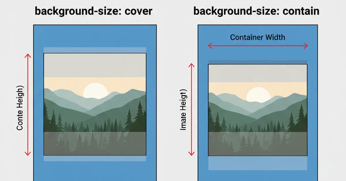
Visual comparison of background-size: cover (left) and background-size: contain (right) effects.
By combining background-image, background-repeat: no-repeat, background-position: center center, and strategically choosing between background-size: cover or background-size: contain, you can achieve flexible and responsive background images that fit your design requirements.