How to set dropdown arrow in spinner?
Categories:
Customizing the Dropdown Arrow in Android Spinners

Learn how to effectively customize the dropdown arrow in Android Spinners to match your application's design language and improve user experience.
Android Spinners are a common UI element used to select one value from a set. By default, they come with a standard dropdown arrow. However, for many applications, customizing this arrow to align with the app's branding or improve visual clarity is a crucial design detail. This article will guide you through various methods to achieve this customization, from simple XML attributes to more advanced drawable manipulation.
Understanding the Spinner's Structure
Before diving into customization, it's helpful to understand how a Spinner is composed. A Spinner typically consists of a main view that displays the currently selected item and a dropdown list that appears when the Spinner is tapped. The dropdown arrow is usually part of the main view's background or a compound drawable. Customizing it often involves replacing the default background or manipulating the drawable resources.
flowchart TD
    A[Spinner Component] --> B{Main View (Selected Item)}
    B --> C[Dropdown Arrow (Indicator)]
    A --> D{Dropdown List (Options)}
    C -- Customization Point --> E[Replace Default Drawable]
    C -- Customization Point --> F[Modify Background]
    D -- Populates from --> G[Adapter Data]
Conceptual structure of an Android Spinner and customization points.
Method 1: Using a Custom Background Drawable
One of the most straightforward ways to change the dropdown arrow is to provide a custom background drawable for your Spinner. This drawable can include your desired arrow image. You'll typically create a layer-list or selector drawable that combines a shape for the Spinner's body and an item with a bitmap or vector drawable for the arrow, positioned to the right.
<!-- res/drawable/spinner_background.xml -->
<layer-list xmlns:android="http://schemas.android.com/apk/res/android">
    <!-- Spinner body -->
    <item>
        <shape android:shape="rectangle">
            <solid android:color="#FFFFFF"/>
            <corners android:radius="4dp"/>
            <stroke android:width="1dp" android:color="#CCCCCC"/>
        </shape>
    </item>
    <!-- Dropdown arrow -->
    <item android:gravity="end|center_vertical" android:right="8dp">
        <bitmap android:src="@drawable/ic_custom_arrow" android:tint="#666666"/>
    </item>
</layer-list>
Custom spinner_background.xml drawable with a custom arrow.
After creating this drawable, apply it to your Spinner in your layout XML:
<!-- activity_main.xml -->
<Spinner
    android:id="@+id/my_spinner"
    android:layout_width="match_parent"
    android:layout_height="wrap_content"
    android:background="@drawable/spinner_background"
    android:spinnerMode="dropdown" />
Applying the custom background to an Android Spinner.
ic_custom_arrow) is a small, appropriately sized vector asset for best results across different screen densities. Vector drawables are highly recommended for UI elements.Method 2: Using android:popupBackground and android:dropDownSelector
While the previous method changes the arrow on the main Spinner view, sometimes you might want to customize the dropdown list's appearance or the indicator that appears when an item is selected within the dropdown. The android:popupBackground attribute controls the background of the dropdown list itself, and android:dropDownSelector controls the highlight drawable for selected items in the dropdown. These don't directly change the arrow on the main Spinner, but are useful for overall Spinner styling.
<!-- styles.xml -->
<style name="CustomSpinnerTheme" parent="Theme.AppCompat.Light.NoActionBar">
    <item name="android:spinnerDropDownItemStyle">@style/CustomSpinnerDropDownItem</item>
    <item name="android:spinnerItemStyle">@style/CustomSpinnerItem</item>
    <!-- This affects the dropdown list's background -->
    <item name="android:dropDownListViewStyle">@style/CustomDropDownListView</item>
</style>

<style name="CustomDropDownListView" parent="android:style/Widget.ListView.DropDown">
    <item name="android:listSelector">@drawable/custom_list_selector</item>
    <item name="android:background">@drawable/custom_dropdown_background</item>
</style>
Customizing dropdown list appearance via themes and styles.
Method 3: Programmatic Customization (Advanced)
For more dynamic or complex scenarios, you might need to customize the Spinner programmatically. This often involves extending Spinner or creating a custom ArrayAdapter that inflates a custom layout for the Spinner's selected item view. Within this custom layout, you have full control over where to place your custom arrow drawable.
// In your custom ArrayAdapter's getView method
@Override
public View getView(int position, View convertView, ViewGroup parent) {
    if (convertView == null) {
        convertView = LayoutInflater.from(getContext()).inflate(R.layout.custom_spinner_item, parent, false);
    }
    TextView textView = convertView.findViewById(R.id.spinner_text);
    textView.setText(getItem(position).toString());
    // You can set a drawableRight here programmatically
    textView.setCompoundDrawablesWithIntrinsicBounds(0, 0, R.drawable.ic_custom_arrow, 0);
    return convertView;
}
Programmatic customization of the Spinner item view using setCompoundDrawablesWithIntrinsicBounds.
This approach gives you granular control, allowing you to place the arrow within a TextView as a compound drawable, or even within an ImageView inside your custom layout. Remember to also handle the dropdown view (getDropDownView) if you want to customize the items in the dropdown list.
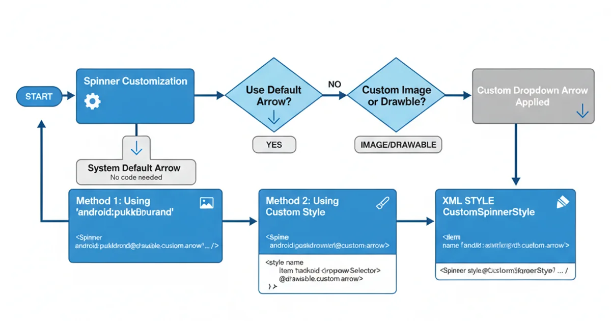
A workflow illustrating the decision points for choosing a Spinner customization method.
1. Define Custom Arrow Drawable
Create a vector drawable (e.g., ic_custom_arrow.xml) for your desired arrow icon. Place it in res/drawable/.
2. Create Spinner Background Drawable
Design a layer-list XML drawable (e.g., spinner_background.xml) that combines a shape for the Spinner's main body and an item containing your custom arrow drawable. Use android:gravity="end|center_vertical" and android:right to position the arrow.
3. Apply Background to Spinner
In your layout XML, set the android:background attribute of your Spinner to @drawable/spinner_background.
4. Test and Adjust
Run your application on various devices and API levels to ensure the arrow appears correctly and is properly aligned. Adjust padding and positioning as needed.