Right align and left align text in same HTML table cell
Categories:
Achieving Dual Alignment in HTML Table Cells

Learn how to right-align and left-align text simultaneously within a single HTML table cell using various CSS techniques.
HTML tables are fundamental for displaying tabular data. While aligning content within a cell (e.g., text-align: left; or text-align: right;) is straightforward, a common challenge arises when you need to display two distinct pieces of text within the same cell, with one left-aligned and the other right-aligned. This article explores several robust CSS techniques to achieve this dual alignment, providing flexibility and control over your table layouts.
The Challenge of Dual Alignment
By default, a table cell (<td>) treats its content as a single block. Applying text-align to the cell affects all its direct text children uniformly. To achieve dual alignment, we need to introduce additional elements within the cell that can be independently positioned or styled. This typically involves using inline-block elements, flexbox, or grid layouts.
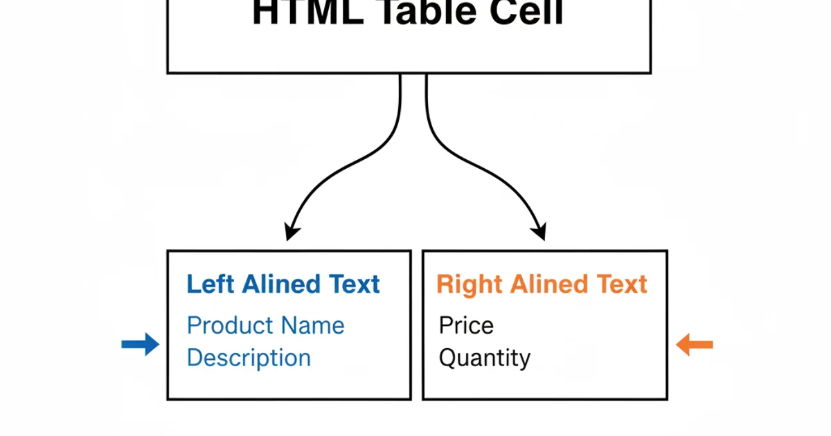
Conceptualizing dual alignment within a single table cell
Method 1: Using <span> Elements with float
One of the simplest and most widely supported methods involves wrapping the two pieces of text in <span> elements and applying the float property. This method works well for basic scenarios where the content is relatively short and doesn't require complex wrapping.
<table>
  <tr>
    <td>
      <span style="float: left;">Item Name</span>
      <span style="float: right;">Price</span>
    </td>
  </tr>
  <tr>
    <td>
      <span style="float: left;">Product A</span>
      <span style="float: right;">$19.99</span>
    </td>
  </tr>
</table>
HTML structure for floating spans
float is effective, it can sometimes cause layout issues with surrounding content if not properly cleared. For more complex layouts or responsive designs, consider flexbox or grid.Method 2: Leveraging Flexbox for Robust Alignment
Flexbox provides a powerful and flexible way to distribute space and align items within a container. By making the <td> a flex container, we can easily place two child elements at opposite ends of the cell. This is generally the recommended approach for modern web development due to its versatility and better handling of varying content lengths.
<table>
  <tr>
    <td class="flex-cell">
      <span>Item Name</span>
      <span>Price</span>
    </td>
  </tr>
  <tr>
    <td class="flex-cell">
      <span>Product B with a longer name</span>
      <span>$299.50</span>
    </td>
  </tr>
</table>
HTML structure for flexbox cell
.flex-cell {
  display: flex;
  justify-content: space-between;
  align-items: center; /* Vertically centers items if needed */
  padding: 8px;
}

.flex-cell span {
  white-space: nowrap; /* Prevents wrapping if content is too long */
}
CSS for flexbox dual alignment
justify-content: space-between; property is key here, as it distributes available space evenly between the items, pushing the first to the start and the last to the end.Method 3: Using position: absolute (Advanced)
For very specific scenarios where precise positioning is required, position: absolute can be used. This method requires the parent <td> to have position: relative and careful management of padding to prevent content overlap. It's generally more complex and less flexible than flexbox but offers pixel-perfect control.
<table>
  <tr>
    <td class="absolute-cell">
      <span class="left-aligned">Item Name</span>
      <span class="right-aligned">Price</span>
    </td>
  </tr>
  <tr>
    <td class="absolute-cell">
      <span class="left-aligned">Product C</span>
      <span class="right-aligned">$9.99</span>
    </td>
  </tr>
</table>
HTML structure for absolute positioning
.absolute-cell {
  position: relative;
  padding: 8px 8px; /* Adjust padding to prevent overlap */
  min-height: 20px; /* Ensure cell has height for positioned elements */
}

.absolute-cell .left-aligned {
  position: absolute;
  left: 8px;
  top: 50%;
  transform: translateY(-50%); /* Vertically center */
}

.absolute-cell .right-aligned {
  position: absolute;
  right: 8px;
  top: 50%;
  transform: translateY(-50%); /* Vertically center */
}
CSS for absolute positioning dual alignment
Choosing the Right Method
The best method depends on your specific needs:
- Flexbox (
display: flex; justify-content: space-between;): Recommended for most modern applications due to its responsiveness, flexibility, and ease of use. It handles varying content lengths gracefully. - Floats (
float: left; float: right;): Simple and effective for basic, non-responsive layouts with short content. Be mindful of clearing floats. - Absolute Positioning (
position: absolute;): Provides precise control but is more complex and less adaptable to responsive designs. Best for very specific, fixed-layout requirements.
By understanding these techniques, you can effectively manage complex text alignments within your HTML table cells, enhancing both the functionality and aesthetics of your data presentation.