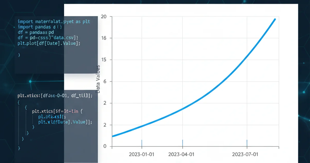
matplotlib plot set x_ticks
Categories:
Mastering Matplotlib: Customizing X-Axis Ticks for Clearer Plots
Learn how to precisely control the placement and labeling of x-axis ticks in Matplotlib plots to enhance readability and convey insights effectively.
Matplotlib is a powerful plotting library in Python, widely used for creating static, animated, and interactive visualizations. One common requirement when creating plots, especially line graphs, is to have fine-grained control over the x-axis ticks. This article will guide you through various methods to set, format, and customize x-axis ticks, ensuring your plots are not only informative but also aesthetically pleasing and easy to interpret.
Understanding X-Axis Ticks
X-axis ticks are the small marks on the horizontal axis that indicate specific data points or intervals. They are accompanied by labels that provide context, such as numerical values, dates, or categories. By default, Matplotlib automatically determines the optimal placement and labeling of these ticks. However, for specific datasets or presentation needs, manual customization becomes essential. This allows you to highlight critical data points, adjust density, or use custom labels that better represent your data.
flowchart TD
    A[Start Plotting] --> B{Default X-Ticks?}
    B -- Yes --> C[Matplotlib Auto-Generates Ticks]
    B -- No --> D[User Customization Required]
    D --> E{Set Tick Locations?}
    E -- Yes --> F[plt.xticks(locations)]
    E -- No --> G{Set Tick Labels?}
    G -- Yes --> H[plt.xticks(locations, labels)]
    G -- No --> I{Format Tick Labels?}
    I -- Yes --> J[Use FuncFormatter or StrftimeFormatter]
    I -- No --> K[End Customization]
    C --> K
    F --> K
    H --> K
    J --> K
Decision flow for customizing Matplotlib X-axis ticks.
Basic X-Tick Customization: plt.xticks()
The most straightforward way to set x-axis ticks is by using the plt.xticks() function. This function allows you to specify both the locations of the ticks and their corresponding labels. If you only provide locations, Matplotlib will use those locations and generate default labels. If you provide both, it will use your specified labels.
import matplotlib.pyplot as plt
import numpy as np

# Sample data
x = np.arange(0, 10, 1)
y = np.sin(x)

plt.figure(figsize=(8, 4))
plt.plot(x, y)

# Set custom x-tick locations
custom_locations = [0, 2, 4, 6, 8, 9.5]
plt.xticks(custom_locations)

plt.title('Plot with Custom X-Tick Locations')
plt.xlabel('X-axis')
plt.ylabel('Y-axis')
plt.grid(True)
plt.show()

plt.figure(figsize=(8, 4))
plt.plot(x, y)

# Set custom x-tick locations and labels
custom_locations = [0, 2, 4, 6, 8]
custom_labels = ['Start', 'Point B', 'Mid', 'Point D', 'End']
plt.xticks(custom_locations, custom_labels)

plt.title('Plot with Custom X-Tick Locations and Labels')
plt.xlabel('Custom X-axis Labels')
plt.ylabel('Y-axis')
plt.grid(True)
plt.show()
Examples of setting x-tick locations and labels using plt.xticks().
Advanced X-Tick Formatting with ticker Module
For more complex scenarios, especially when dealing with dates, times, or numerical data that requires specific formatting (e.g., percentages, currency), Matplotlib's ticker module provides powerful tools. You can use FixedLocator for precise tick placement and FixedFormatter or FuncFormatter for custom label generation.
import matplotlib.pyplot as plt
import numpy as np
import matplotlib.ticker as mticker

# Sample data
x = np.linspace(0, 100, 10)
y = np.random.rand(10) * 100

plt.figure(figsize=(8, 4))
plt.plot(x, y)

# Use FixedLocator for specific positions
locator = mticker.FixedLocator([0, 25, 50, 75, 100])
plt.gca().xaxis.set_major_locator(locator)

# Use FuncFormatter for custom labels (e.g., adding a '%' sign)
def percent_formatter(x, pos):
    return f'{x:.0f}%'

formatter = mticker.FuncFormatter(percent_formatter)
plt.gca().xaxis.set_major_formatter(formatter)

plt.title('Plot with Advanced X-Tick Formatting (Percentages)')
plt.xlabel('Progress (%)')
plt.ylabel('Value')
plt.grid(True)
plt.show()
Using FixedLocator and FuncFormatter for advanced x-tick customization.
Handling Date/Time X-Ticks
When plotting time series data, Matplotlib's dates module is invaluable. It provides specialized locators and formatters that understand date and time objects, allowing you to display ticks at appropriate intervals (e.g., monthly, yearly) and format them correctly.
import matplotlib.pyplot as plt
import datetime
import matplotlib.dates as mdates

# Sample date data
dates = [datetime.datetime(2023, 1, i) for i in range(1, 13)]
values = [i**2 for i in range(1, 13)]

plt.figure(figsize=(10, 5))
plt.plot(dates, values)

# Set major ticks to monthly intervals
plt.gca().xaxis.set_major_locator(mdates.MonthLocator(interval=2))
# Format major ticks to show month and year
plt.gca().xaxis.set_major_formatter(mdates.DateFormatter('%b %Y'))

# Set minor ticks to weekly intervals
plt.gca().xaxis.set_minor_locator(mdates.WeekdayLocator(byweekday=mdates.MONDAY))

plt.title('Time Series Plot with Custom Date X-Ticks')
plt.xlabel('Date')
plt.ylabel('Value')
plt.grid(True)
plt.gcf().autofmt_xdate() # Auto-format date labels for better readability
plt.show()
Customizing x-axis ticks for date-time data using mdates.
plt.gcf().autofmt_xdate() function is crucial for date plots as it automatically rotates and aligns date labels to prevent overlap, making them much more readable.