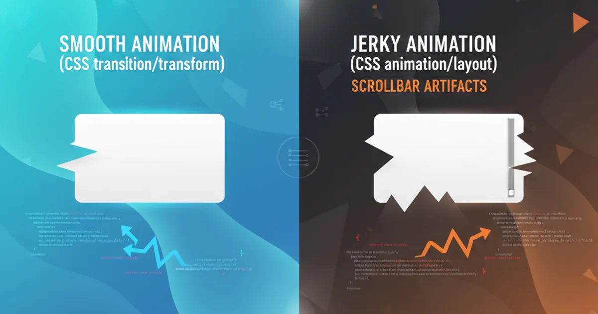
Scrollbar appears through CSS animation/transition
Categories:
Preventing Scrollbars from Appearing During CSS Animations and Transitions
Learn how to effectively manage and prevent unwanted scrollbars from appearing when using CSS animations and transitions, ensuring a smooth user experience.
CSS animations and transitions are powerful tools for creating dynamic and engaging user interfaces. However, a common frustration developers encounter is the sudden appearance of scrollbars during these visual effects. This often happens when an element temporarily expands beyond its parent container or the viewport, even by a single pixel, triggering the browser to render scrollbars. This article will explore the root causes of this issue and provide practical solutions using CSS and, where applicable, considerations for frameworks like AngularJS.
Understanding the Root Cause
The primary reason scrollbars appear during animations is often related to element dimensions or positioning. When an element's width, height, margin, padding, or transform properties change, it can momentarily exceed the available space. Browsers, by default, will add scrollbars to accommodate this overflow. This is particularly noticeable with transform: scale() or transform: translateX/Y() when the transformed element's bounding box extends beyond its original footprint without its parent container being aware or adjusting accordingly.
flowchart TD
    A[Start Animation/Transition] --> B{Element Dimensions Change?}
    B -->|Yes| C{Exceeds Parent/Viewport Bounds?}
    C -->|Yes| D[Browser Renders Scrollbar]
    C -->|No| E[Smooth Animation]
    B -->|No| E
    E --> F[End Animation/Transition]
Flowchart illustrating how element dimension changes can lead to scrollbar appearance.
Common Solutions and Best Practices
Several strategies can be employed to prevent unwanted scrollbars. The most effective approach often depends on the specific animation and the layout context. We'll cover overflow properties, transform origins, and managing element dimensions.
1. Using overflow: hidden
The most straightforward solution is to apply overflow: hidden to the parent container of the animating element, or even the body or html element if the animation affects the entire viewport. This will clip any content that extends beyond the element's padding box, effectively hiding the scrollbars. However, be mindful that this also hides any legitimate overflow content you might want to be visible.
.container {
  overflow: hidden;
  /* Other styles */
}

.animating-element {
  transition: transform 0.3s ease-out;
  /* ... */
}

.animating-element:hover {
  transform: scale(1.1);
}
Applying overflow: hidden to a parent container.
2. Managing transform-origin and transform
When using transform: scale() or transform: translateX/Y(), the default transform-origin (usually center center) can cause the element to expand outwards, potentially pushing it beyond boundaries. Adjusting transform-origin can sometimes mitigate this. For instance, scaling from top left might keep the element within bounds if the expansion is towards the bottom right.
.card {
  transition: transform 0.3s ease-out;
  transform-origin: center center; /* Default */
}

.card:hover {
  transform: scale(1.1);
}

/* Alternative: Scale from top-left */
.card-alt {
  transition: transform 0.3s ease-out;
  transform-origin: top left;
}

.card-alt:hover {
  transform: scale(1.1);
}
Comparing default transform-origin with top left.
3. Using position: absolute or fixed for animating elements
If the animating element is not part of the normal document flow, its transformations are less likely to affect the layout of other elements or trigger scrollbars. Temporarily setting position: absolute or position: fixed during an animation can isolate its layout impact. This is particularly useful for elements that pop up or move across the screen.
.modal-overlay {
  position: fixed;
  top: 0;
  left: 0;
  width: 100vw;
  height: 100vh;
  overflow: hidden; /* Ensure no scrollbars on overlay itself */
  /* ... animation styles ... */
}
Using position: fixed for a full-screen overlay animation.
4. Adjusting Dimensions or Margins
In some cases, the simplest solution is to slightly reduce the dimensions of the animating element or increase the padding/margin of its parent. For example, if an element scales to 1.1, and its parent is 100% width, the scaled element will exceed the parent. You might need to set the parent's width to 90% or add padding to accommodate the expansion.
overflow: hidden to the body or html elements, as this can prevent legitimate scrolling on pages with long content. Consider applying it only during the animation duration or to specific containers.AngularJS Specific Considerations
While the core CSS principles remain the same, AngularJS (and other JavaScript frameworks) can sometimes introduce additional complexities, especially when dynamically adding/removing elements or applying classes. Ensure that your CSS animations are correctly applied and that any JavaScript-driven dimension changes don't conflict with your CSS overflow management.
<div ng-class="{'animate-scale': showElement}">
  <!-- Content -->
</div>
AngularJS example applying a class for animation.
.animate-scale {
  transition: transform 0.3s ease-out;
  transform: scale(1.1);
}

/* Ensure parent can contain it */
.parent-container {
  overflow: hidden;
  /* Or ensure sufficient padding */
  padding: 10px;
}
CSS for the AngularJS animated element and its parent.