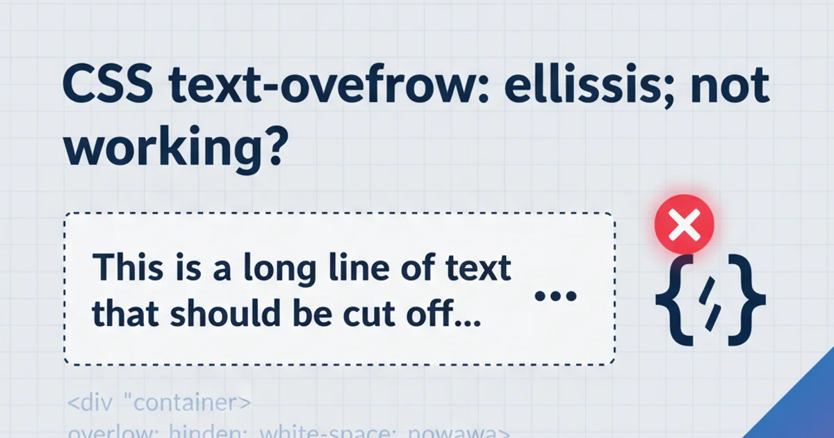
CSS text-overflow: ellipsis; not working?
Categories:
Troubleshooting text-overflow: ellipsis; in CSS
Learn why text-overflow: ellipsis; might not be working as expected and how to correctly implement it for single and multi-line text truncation.
The text-overflow: ellipsis; CSS property is a powerful tool for truncating long strings of text with an elegant ellipsis (...), preventing layout issues and improving readability. However, many developers encounter situations where it doesn't seem to work. This article will demystify the common pitfalls and provide clear solutions to ensure your text truncation works flawlessly.
The Core Requirements for text-overflow: ellipsis;
For text-overflow: ellipsis; to function, several fundamental CSS properties must be correctly applied to the element containing the text. These properties work in conjunction to define a constrained space where overflow can occur and then be visually indicated. If any of these are missing or incorrectly configured, the ellipsis will not appear.
flowchart TD
    A[Element with text] --> B{Has `overflow: hidden;`?}
    B -- No --> F[Ellipsis Fails]
    B -- Yes --> C{Has `white-space: nowrap;`?}
    C -- No --> F[Ellipsis Fails]
    C -- Yes --> D{Has defined `width` or `max-width`?}
    D -- No --> F[Ellipsis Fails]
    D -- Yes --> E[Ellipsis Works!]
Flowchart of essential CSS properties for text-overflow: ellipsis;
Let's break down these essential requirements:
1. Define a fixed width or max-width
The element must have a constrained horizontal space. Without a defined width or max-width, the text will simply expand indefinitely, and there will be no 'overflow' to truncate. This can be a pixel value, percentage, or any other valid width unit.
2. Set overflow: hidden;
This property is crucial. It tells the browser to clip any content that overflows the element's box. If overflow is set to visible (the default), scroll, or auto, the ellipsis will not appear because the content is allowed to be seen or scrolled, not hidden and truncated.
3. Apply white-space: nowrap;
This property prevents the text from wrapping to the next line. text-overflow: ellipsis; is primarily designed for single-line truncation. If the text is allowed to wrap, it won't overflow horizontally, and thus no ellipsis will be needed. This is the most common reason for failure.
.single-line-ellipsis {
  white-space: nowrap; /* Prevents text from wrapping */
  overflow: hidden;    /* Hides overflowing content */
  text-overflow: ellipsis; /* Displays ellipsis for truncated text */
  width: 200px;        /* Or max-width, flex-basis, etc. */
  border: 1px solid #ccc;
  padding: 5px;
}
Correct CSS for single-line text-overflow: ellipsis;
text-overflow: ellipsis; only works on block-level or inline-block elements. If you're applying it to an inline element (like <span>), ensure you set display: block; or display: inline-block; first.Handling Multi-Line Ellipsis
While text-overflow: ellipsis; is natively for single lines, truncating multi-line text with an ellipsis is a common requirement. This typically requires a different approach, often involving WebKit-specific properties or JavaScript.
For multi-line truncation, the most widely used CSS-only solution leverages WebKit's flexible box model properties. This method works well in Chrome, Safari, and other WebKit-based browsers.
.multi-line-ellipsis {
  overflow: hidden;
  text-overflow: ellipsis;
  display: -webkit-box; /* Required for WebKit browsers */
  -webkit-line-clamp: 3; /* Number of lines to show */
  -webkit-box-orient: vertical;
  width: 300px; /* Still needs a defined width */
  border: 1px solid #ccc;
  padding: 5px;
}
CSS for multi-line ellipsis using WebKit properties
-webkit-line-clamp property is non-standard and may not be supported in all browsers (e.g., Firefox, Edge). For broader compatibility, JavaScript solutions or more complex CSS hacks might be necessary.Common Pitfalls and Solutions
Even with the basic requirements met, text-overflow: ellipsis; can sometimes be tricky. Here are some common scenarios and their fixes:
Parent Container Issues
If the parent container doesn't have a defined width or is using display: flex; without proper flex-shrink or flex-basis on the child, the child element might not shrink as expected, preventing overflow.
.flex-container {
  display: flex;
  width: 300px; /* Parent needs a width */
}

.flex-item-with-ellipsis {
  flex-grow: 1;
  flex-shrink: 1; /* Allows item to shrink */
  flex-basis: 0; /* Important for flexible width */
  white-space: nowrap;
  overflow: hidden;
  text-overflow: ellipsis;
}
Using text-overflow: ellipsis; within a flex container
position: absolute; or float; Elements
Elements positioned absolutely or floated out of the normal document flow might behave unexpectedly. Ensure their containing block provides the necessary constraints.
Inline Elements
As mentioned, text-overflow does not apply to inline elements. Always ensure your target element is block, inline-block, or a flex/grid item.