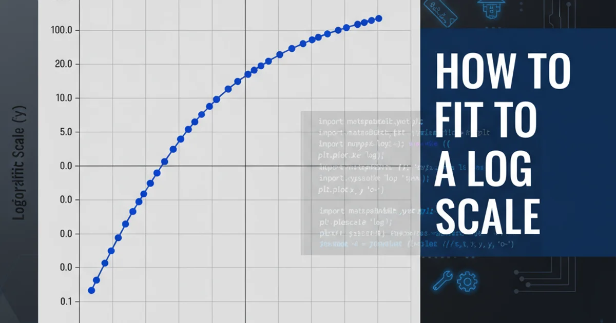
How to fit to a log scale
Categories:
Mastering Logarithmic Scales in Matplotlib for Data Visualization
Learn how to effectively use logarithmic scales in Matplotlib to visualize data with wide ranges, emphasizing relative changes and revealing hidden patterns.
When visualizing data, especially in scientific or financial contexts, you often encounter datasets where values span several orders of magnitude. Plotting such data on a linear scale can compress smaller values, making them indistinguishable, while larger values dominate the plot. This is where logarithmic scales become invaluable. Matplotlib provides robust functionality to transform axes to a logarithmic scale, allowing for clearer representation of relative changes and patterns across a wide range of values.
Why Use Logarithmic Scales?
Logarithmic scales are particularly useful for:
- Visualizing wide data ranges: When data points vary from very small to very large, a log scale can display all points effectively without distortion.
- Emphasizing relative changes: On a log scale, equal ratios appear as equal distances. For example, the distance from 1 to 10 is the same as from 10 to 100, or 100 to 1000. This is crucial for understanding growth rates or exponential decay.
- Revealing power-law relationships: Data that follows a power law (e.g.,
y = ax^b) will appear as a straight line on a log-log plot (both x and y axes are logarithmic). - Handling skewed distributions: Data with a highly skewed distribution (e.g., income distribution, earthquake magnitudes) can often be normalized or better understood on a logarithmic scale.
flowchart TD
    A[Start: Data with Wide Range] --> B{Linear Scale Plot?}
    B -- No, small values compressed --> C[Consider Logarithmic Scale]
    B -- Yes, data range narrow --> D[Use Linear Scale]
    C --> E{Relative Changes Important?}
    E -- Yes --> F[Apply Log Scale to Axis]
    E -- No --> G[Re-evaluate Visualization Goal]
    F --> H[End: Clearer Visualization]
Decision flow for choosing between linear and logarithmic scales.
Implementing Log Scales in Matplotlib
Matplotlib offers straightforward methods to apply logarithmic scaling to either the x-axis, y-axis, or both. The primary functions for this are plt.xscale(), plt.yscale(), and plt.loglog(). You can specify the base of the logarithm, though base 10 is the most common and default choice.
import matplotlib.pyplot as plt
import numpy as np

# Generate sample data with a wide range
x = np.linspace(0.1, 100, 50)
y = np.exp(x / 10) + np.random.rand(50) * 100 # Exponential growth with noise

# --- Linear Scale Plot (for comparison) ---
plt.figure(figsize=(10, 5))
plt.subplot(1, 2, 1)
plt.plot(x, y)
plt.title('Linear Scale')
plt.xlabel('X-axis')
plt.ylabel('Y-axis')
plt.grid(True)

# --- Logarithmic Y-axis Plot ---
plt.subplot(1, 2, 2)
plt.plot(x, y)
plt.yscale('log') # Apply log scale to the y-axis
plt.title('Logarithmic Y-axis')
plt.xlabel('X-axis')
plt.ylabel('Y-axis (log scale)')
plt.grid(True, which="both", ls="-", color='0.7') # Better grid for log scales

plt.tight_layout()
plt.show()
Basic example demonstrating a linear vs. logarithmic y-axis plot.
plt.yscale('log') or plt.xscale('log'), it's often beneficial to set which="both" for plt.grid() to display minor grid lines, which helps in reading values between major logarithmic ticks.Log-Log Plots and Custom Bases
For data where both axes span large ranges or exhibit power-law relationships, a log-log plot is ideal. Matplotlib provides plt.loglog() as a convenient shortcut for setting both axes to a logarithmic scale. You can also specify a custom base for your logarithm using the base parameter in plt.xscale() or plt.yscale().
import matplotlib.pyplot as plt
import numpy as np

# Generate data for a power-law relationship
x_power = np.logspace(0, 3, 100) # 1 to 1000
y_power = 10 * x_power**(-1.5) + np.random.rand(100) * 0.1 # y = 10 * x^-1.5

plt.figure(figsize=(12, 6))

# --- Log-Log Plot ---
plt.subplot(1, 2, 1)
plt.loglog(x_power, y_power, 'o', markersize=4, alpha=0.7)
plt.title('Log-Log Plot (Power Law)')
plt.xlabel('X-axis (log scale)')
plt.ylabel('Y-axis (log scale)')
plt.grid(True, which="both", ls="-", color='0.7')

# --- Custom Log Base Plot ---
plt.subplot(1, 2, 2)
# Data for custom base example (e.g., bacterial growth, often base 2)
x_custom = np.arange(0, 10)
y_custom = 2**x_custom + np.random.rand(10) * 0.5

plt.plot(x_custom, y_custom, 's-', markersize=6)
plt.yscale('log', base=2) # Log base 2 for y-axis
plt.title('Logarithmic Y-axis (Base 2)')
plt.xlabel('Time (generations)')
plt.ylabel('Population (log base 2)')
plt.grid(True, which="both", ls="-", color='0.7')

plt.tight_layout()
plt.show()
Examples of a log-log plot and a plot with a custom logarithmic base.
symlog scale) before plotting on a log scale.Advanced Logarithmic Scaling: Symlog and Locator/Formatter
For datasets that contain both positive and negative values, or values that cross zero, Matplotlib offers the symlog scale. This scale is linear around zero and logarithmic elsewhere. You can also gain finer control over tick placement and labeling on logarithmic axes using LogLocator and LogFormatter.
import matplotlib.pyplot as plt
import numpy as np
from matplotlib.ticker import LogLocator, LogFormatter

# Generate data with positive, negative, and zero values
x_sym = np.linspace(-10, 10, 100)
y_sym = np.sinh(x_sym) # Hyperbolic sine, spans positive and negative

plt.figure(figsize=(12, 6))

# --- Symlog Scale Plot ---
plt.subplot(1, 2, 1)
plt.plot(x_sym, y_sym)
plt.yscale('symlog', linthresh=1) # Linear threshold around zero
plt.title('Symlog Y-axis (linthresh=1)')
plt.xlabel('X-axis')
plt.ylabel('Y-axis (symlog scale)')
plt.grid(True, which="both", ls="-", color='0.7')

# --- Custom Log Ticks and Labels ---
plt.subplot(1, 2, 2)
x_loc = np.logspace(0, 4, 100)
y_loc = x_loc**0.5 # Square root relationship

plt.plot(x_loc, y_loc)
plt.xscale('log')
plt.yscale('log')

# Custom major and minor ticks for x-axis
plt.gca().xaxis.set_major_locator(LogLocator(base=10.0, numticks=10))
plt.gca().xaxis.set_minor_locator(LogLocator(base=10.0, subs=np.arange(1.0, 10.0) * 0.1, numticks=10))
plt.gca().xaxis.set_major_formatter(LogFormatter(labelOnlyBase=False))

plt.title('Log-Log with Custom Ticks')
plt.xlabel('X-axis (log scale)')
plt.ylabel('Y-axis (log scale)')
plt.grid(True, which="both", ls="-", color='0.7')

plt.tight_layout()
plt.show()
Using symlog for data crossing zero and customizing log axis ticks.