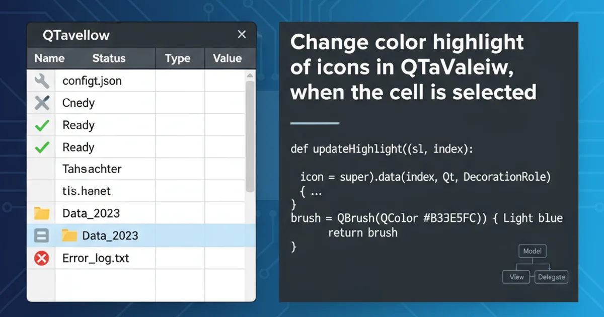
Change color highlight of icons in QTableView, when the cell is selected
Categories:
Customizing QTableView Icon Highlights on Selection
Learn how to prevent QTableView from changing the color of icons when a cell is selected, maintaining visual consistency in your Qt applications.
When working with QTableView in Qt, a common challenge arises when you use icons within cells. By default, QTableView's selection mechanism often applies a highlight color that can obscure or alter the appearance of your carefully chosen icons. This article provides a comprehensive guide on how to customize the rendering of icons in selected cells, ensuring they retain their original colors and clarity, thereby enhancing the user experience and visual integrity of your application.
Understanding QTableView's Default Selection Behavior
By default, QTableView uses a QStyledItemDelegate to draw items. When a cell is selected, the delegate typically draws a selection background and adjusts the foreground (text and icon) color to ensure readability against the new background. This adjustment often involves inverting colors or applying a tint, which can be undesirable for custom icons that rely on specific color palettes for their meaning or branding. To override this, we need to implement a custom delegate that takes control over how selected items are drawn.
flowchart TD
    A[QTableView Selection Event] --> B{QStyledItemDelegate::paint()}
    B --> C{Is Item Selected?}
    C -- Yes --> D[Draw Selection Background]
    D --> E[Adjust Foreground Color (Text/Icon)]
    E --> F[Draw Text/Icon with Adjusted Color]
    C -- No --> G[Draw Text/Icon with Default Color]
    F --> H[Render Cell]
    G --> H
Default QTableView Item Painting Flow
Implementing a Custom Item Delegate
The most robust way to control the rendering of items in QTableView is to subclass QStyledItemDelegate and override its paint() method. Inside paint(), you gain full control over how each item is drawn, including its background, text, and icon. The key is to detect if the item is selected and, if so, draw the icon without applying the default selection color transformation.
#include <QStyledItemDelegate>
#include <QPainter>
#include <QIcon>

class CustomIconDelegate : public QStyledItemDelegate
{
public:
    explicit CustomIconDelegate(QObject *parent = nullptr) : QStyledItemDelegate(parent) {}

    void paint(QPainter *painter, const QStyleOptionViewItem &option, const QModelIndex &index) const override
    {
        QStyleOptionViewItem opt = option;
        initStyleOption(&opt, index);

        painter->save();

        // Draw background (including selection background)
        opt.icon = QIcon(); // Prevent default icon drawing by base class
        QStyledItemDelegate::paint(painter, opt, index);

        // Draw icon manually, ignoring selection state for icon color
        if (!opt.icon.isNull()) {
            QIcon::Mode iconMode = QIcon::Normal;
            // You might want to adjust icon state based on selection for visual feedback
            // For example, QIcon::Selected, but we want to keep original color.
            // So, we stick to QIcon::Normal or QIcon::Active if needed.

            QPixmap pixmap = opt.icon.pixmap(opt.decorationSize, iconMode, QIcon::Off);

            // Calculate icon rectangle
            QRect iconRect = QStyle::alignedRect(
                opt.direction,
                opt.decorationAlignment,
                opt.decorationSize,
                opt.rect
            );

            painter->drawPixmap(iconRect, pixmap);
        }

        // Draw text manually, potentially adjusting color for selection
        // If you want text to also ignore selection color, remove the if (opt.state & QStyle::State_Selected) block
        if (!opt.text.isEmpty()) {
            QColor textColor = opt.palette.text().color();
            if (opt.state & QStyle::State_Selected) {
                textColor = opt.palette.highlightedText().color(); // Use highlighted text color for readability
            }
            painter->setPen(textColor);

            QRect textRect = QStyle::alignedRect(
                opt.direction,
                opt.textAlignment,
                opt.fontMetrics.size(Qt::TextSingleLine, opt.text),
                opt.rect
            );

            // Adjust textRect if icon is present to avoid overlap
            if (!opt.icon.isNull()) {
                int iconWidth = opt.decorationSize.width();
                if (opt.decorationAlignment & Qt::AlignLeft) {
                    textRect.setLeft(textRect.left() + iconWidth + opt.decorationMargin);
                } else if (opt.decorationAlignment & Qt::AlignRight) {
                    textRect.setRight(textRect.right() - iconWidth - opt.decorationMargin);
                }
            }

            painter->drawText(textRect, opt.displayAlignment, opt.text);
        }

        painter->restore();
    }
};
Custom QStyledItemDelegate to control icon and text drawing.
QIcon::Mode parameter in pixmap() determines the icon's state (e.g., normal, disabled, active, selected). By consistently using QIcon::Normal or QIcon::Active regardless of the item's selection state, you ensure the icon's original colors are always rendered. If you need to differentiate selected icons visually, consider a subtle border or shadow instead of color alteration.Applying the Custom Delegate to QTableView
Once your custom delegate is implemented, you need to assign it to your QTableView instance. You can set it for the entire view using setItemDelegate() or for specific columns using setItemDelegateForColumn(). For icons that appear in all columns, setting it for the entire view is usually sufficient.
// In your QTableView setup code:
QTableView *tableView = new QTableView(this);
// ... set model for tableView ...

CustomIconDelegate *delegate = new CustomIconDelegate(tableView);
tableView->setItemDelegate(delegate);

// If you only want this behavior for a specific column (e.g., column 0):
// tableView->setItemDelegateForColumn(0, delegate);
Assigning the custom delegate to a QTableView.
QStyledItemDelegate is responsible for drawing everything within the cell. If you override paint(), you must ensure that all aspects (background, text, icon, focus rectangle, etc.) are drawn correctly, or delegate to the base class for parts you don't want to customize. In the example, we draw the background via the base class, then manually draw the icon and text.1. Create a Custom Delegate Class
Subclass QStyledItemDelegate and override its paint() method. This method will be responsible for drawing each cell's content.
2. Handle Background Drawing
Inside paint(), call the base class's paint() method first, but clear the icon from the QStyleOptionViewItem to prevent the default icon drawing. This ensures the selection background is drawn correctly.
3. Draw Icon Manually
Extract the QIcon from the QModelIndex using index.data(Qt::DecorationRole). Then, use QIcon::pixmap() with QIcon::Normal mode to get the icon's original appearance, and draw it using painter->drawPixmap().
4. Draw Text Manually (Optional Color Adjustment)
Extract the text using index.data(Qt::DisplayRole). You can choose to draw it with the default highlightedText() color for selected items or keep its original color, similar to the icon. Use painter->drawText().
5. Apply the Delegate
Instantiate your custom delegate and set it on your QTableView using setItemDelegate() or setItemDelegateForColumn().