CSS - border radius and solid border curved inside
Categories:
CSS Border-Radius: Achieving Curved Inner Borders with Solid Outlines
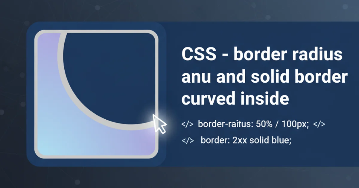
Explore advanced CSS techniques to create visually appealing elements with a solid outer border and a distinct, curved inner border effect using border-radius and pseudo-elements.
The border-radius CSS property is a powerful tool for rounding the corners of an element's outer border. However, achieving a distinct inner curved border while maintaining a solid, non-rounded outer border can be a bit more challenging. This article delves into a common technique using pseudo-elements (::before or ::after) to create this specific visual effect, providing a clean and semantic solution.
Understanding the Challenge
When you apply border-radius directly to an element, both its background and its border follow the curve. The goal here is to have a sharp, 90-degree corner for the element's actual border, but an internal curve that appears to be a separate border. This creates a layered look, where the outer layer is rectangular and the inner layer has rounded corners.
flowchart TD
    A[Element with border-radius] --> B{Applies to both border and background}
    B --> C[Desired: Solid outer border, curved inner border]
    C --> D[Solution: Use pseudo-elements]
    D --> E[Pseudo-element for inner curve]
    E --> F[Main element for solid outer border]
    F --z-index--> E
Conceptual flow of applying border-radius and achieving an inner curve.
The Pseudo-Element Approach
The most effective way to achieve a curved inner border is by using a pseudo-element (::before or ::after). The main idea is to style the parent element with the desired solid, sharp-cornered border, and then use a pseudo-element positioned absolutely inside it. This pseudo-element will then receive the border-radius and act as the 'inner curved border'.
<div class="container">
  <div class="content">Hello World</div>
</div>
Basic HTML structure for the example.
.container {
  position: relative; /* Needed for absolute positioning of pseudo-element */
  width: 200px;
  height: 100px;
  border: 2px solid #333; /* The solid, sharp outer border */
  overflow: hidden; /* Crucial to hide the pseudo-element's corners */
}

.container::before {
  content: '';
  position: absolute;
  top: 5px; /* Adjust for desired inner border thickness */
  left: 5px;
  right: 5px;
  bottom: 5px;
  border: 2px solid #007bff; /* The curved inner border */
  border-radius: 15px; /* Apply border-radius to the pseudo-element */
  z-index: 1; /* Ensure it's above the content if needed */
}

.content {
  position: relative; /* Ensure content is above the pseudo-element */
  z-index: 2;
  padding: 10px;
  text-align: center;
  color: #333;
}
CSS demonstrating the pseudo-element technique for a curved inner border.
overflow: hidden; property on the parent container is critical. Without it, the sharp corners of the pseudo-element (before border-radius takes full effect visually) might peek out from behind the parent's border, especially if the top, left, right, bottom values are small.Explanation of Properties
Let's break down the key CSS properties used in this technique:
.container(Parent Element):position: relative;: This establishes a positioning context for its absolutely positioned child (the::beforepseudo-element).border: 2px solid #333;: This defines the outer, sharp-cornered border.overflow: hidden;: This is essential. It clips any content of the pseudo-element that extends beyond the padding box of the container, effectively hiding the sharp corners of the pseudo-element before itsborder-radiusfully takes effect visually within the container.
.container::before(Pseudo-element):content: '';: Required for pseudo-elements to render.position: absolute;: Takes the pseudo-element out of the normal document flow, allowing precise positioning relative to itsposition: relative;parent.top,left,right,bottom: These properties are used to size and position the pseudo-element. By setting them to a small positive value (e.g.,5px), you create a gap between the parent's border and the pseudo-element's border, which effectively becomes the 'thickness' of the outer border.border: 2px solid #007bff;: This is the actual inner curved border.border-radius: 15px;: This applies the desired curvature to the inner border.z-index: 1;: Ensures the pseudo-element is layered correctly. If you have content inside the container, you might need to give the content a higherz-indexto ensure it appears above the pseudo-element.
top, left, right, and bottom values on the ::before pseudo-element allows you to control the 'gap' or 'padding' between the outer solid border and the inner curved border. This effectively dictates the perceived thickness of the outer border.Alternative: Using Two Elements
While pseudo-elements are generally preferred for their semantic benefits (not adding extra HTML elements), you could achieve a similar effect with two nested div elements. The outer div would have the solid border, and the inner div would have the border-radius and its own border. This approach is less elegant but might be easier to understand for beginners.
<div class="outer-box">
  <div class="inner-box">Hello World</div>
</div>
HTML for the two-element approach.
.outer-box {
  width: 200px;
  height: 100px;
  border: 2px solid #333; /* Solid outer border */
  padding: 5px; /* Creates space for the inner box */
  box-sizing: border-box; /* Include padding in width/height */
}

.inner-box {
  width: 100%;
  height: 100%;
  border: 2px solid #007bff; /* Curved inner border */
  border-radius: 15px;
  display: flex;
  align-items: center;
  justify-content: center;
  color: #333;
}
CSS for the two-element approach.