Understanding of css value: 2em 10px
Categories:
Demystifying CSS Shorthand: Understanding '2em 10px'

Explore the meaning and application of the CSS value '2em 10px', commonly used for properties like margin and padding, and learn how it defines spacing in web design.
In CSS, shorthand properties allow developers to set multiple related values in a single declaration. While convenient, these can sometimes be confusing, especially when dealing with different units and implicit directions. One such common shorthand value is 2em 10px. This article will break down what this value means, how it's interpreted by the browser, and its practical applications in web development.
The Basics: Shorthand Properties and Directional Values
Many CSS properties, like margin, padding, and border-width, can accept multiple values in a single declaration. When two values are provided, as in 2em 10px, CSS follows a specific rule for interpreting these values. This rule applies to properties that define spacing around an element: top, right, bottom, and left.
flowchart TD
    A[CSS Shorthand Property (e.g., margin)] --> B{Number of Values?}
    B -->|1 Value| C[All 4 sides: Top, Right, Bottom, Left]
    B -->|2 Values (e.g., '2em 10px')| D["Value 1: Top & Bottom"]
    D --> E["Value 2: Right & Left"]
    B -->|3 Values| F["Value 1: Top"]
    F --> G["Value 2: Right & Left"]
    G --> H["Value 3: Bottom"]
    B -->|4 Values| I["Value 1: Top"]
    I --> J["Value 2: Right"]
    J --> K["Value 3: Bottom"]
    K --> L["Value 4: Left"]
CSS Shorthand Value Interpretation for Directional Properties
Deconstructing '2em 10px'
When you encounter 2em 10px for a property like margin or padding, the browser interprets it as follows:
- First Value (
2em): This value is applied to the top and bottom sides of the element. - Second Value (
10px): This value is applied to the right and left sides of the element.
So, margin: 2em 10px; is equivalent to:
margin-top: 2em;
margin-bottom: 2em;
margin-right: 10px;
margin-left: 10px;
This shorthand is a powerful way to reduce code verbosity and improve readability, especially when you want symmetrical vertical and horizontal spacing.
/* Shorthand declaration */
.my-element {
  padding: 2em 10px;
}

/* Equivalent longhand declaration */
.my-element-expanded {
  padding-top: 2em;
  padding-bottom: 2em;
  padding-right: 10px;
  padding-left: 10px;
}
Comparison of shorthand and longhand CSS for padding
Understanding the Units: em vs. px
The example 2em 10px also highlights the use of different CSS units:
em(relative unit):emis a relative unit that refers to the computedfont-sizeof the element itself. If the element'sfont-sizeis16px, then2emwould be32px. If thefont-sizechanges, theemvalue scales proportionally. This makesemideal for creating scalable layouts that adapt to user preferences or different screen sizes.px(absolute unit):px(pixels) is an absolute unit.10pxwill always be10px, regardless of the element'sfont-sizeor the rootfont-size. Pixels are useful when you need precise, fixed measurements, such as for borders or small, consistent gaps.
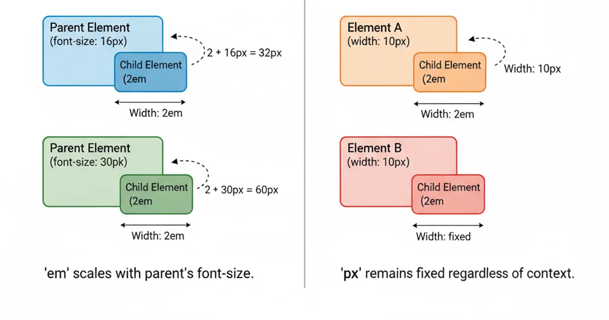
Visualizing the difference between 'em' (relative) and 'px' (absolute) units.
Practical Applications and Best Practices
Using 2em 10px (or similar two-value shorthands) is common for:
- Buttons: Often, buttons need more vertical padding than horizontal to look balanced.
padding: 0.8em 1.5em;is a common pattern. - Card Components: Providing consistent vertical spacing between cards and horizontal spacing from the edge of the container.
- Form Fields: Ensuring form inputs have adequate internal padding for readability.
Best Practices:
- Consistency: Use shorthands consistently throughout your stylesheet for better maintainability.
- Readability: While shorthands are concise, ensure they don't make your code harder to understand for others (or your future self).
- Unit Choice: Thoughtfully choose between relative units (
em,rem,vw,vh) and absolute units (px) based on whether you need scalability or fixed precision.
/* Example: Styling a button */
.button {
  background-color: #007bff;
  color: white;
  padding: 0.75em 1.5em; /* 0.75em top/bottom, 1.5em left/right */
  border: none;
  border-radius: 5px;
  cursor: pointer;
  font-size: 16px; /* This font-size affects the 'em' values */
}

/* Example: Styling a card */
.card {
  border: 1px solid #ccc;
  padding: 1em 20px; /* 1em top/bottom, 20px left/right */
  margin-bottom: 15px;
  background-color: #f9f9f9;
}
Practical examples of using em and px in shorthand properties