add x=y line to scatterplot
Categories:
Adding a Reference Line (y=x) to Your R Scatterplot
Learn how to effectively visualize the relationship between two variables by adding a y=x reference line to your scatterplots in R, enhancing data interpretation.
Scatterplots are fundamental tools for visualizing the relationship between two numerical variables. Often, to better understand this relationship, it's useful to add a reference line. A common and particularly insightful reference line is the y=x line, which represents perfect equality between the two variables. This article will guide you through the process of adding such a line to your scatterplots in R, using both base R graphics and the popular ggplot2 package.
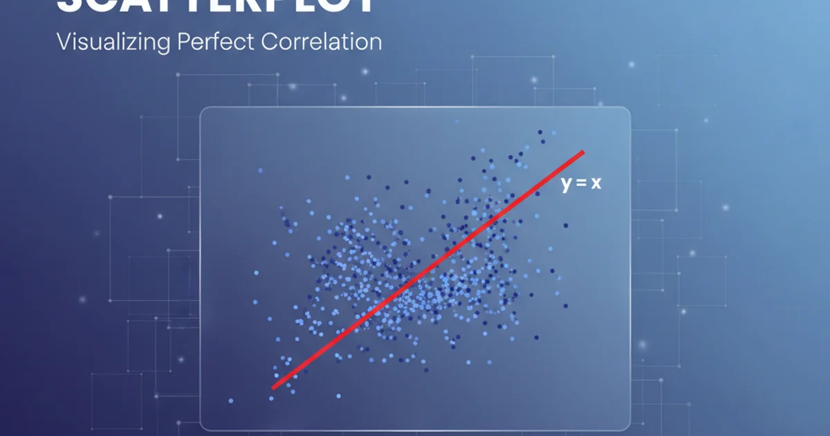
Understanding the y=x Reference Line
The y=x line serves as a visual benchmark. Any data point falling directly on this line indicates that the value of the x-variable is equal to the value of the y-variable. Points above the line suggest that y > x, while points below the line indicate y < x. This is especially useful in scenarios like comparing observed vs. predicted values, pre-test vs. post-test scores, or any situation where you expect or want to highlight equality between two measurements.
flowchart TD
    A[Start with Data] --> B{Create Scatterplot}
    B --> C{Identify Min/Max Range}
    C --> D{Generate y=x Line Data}
    D --> E{Add Line to Plot}
    E --> F[Analyze Relationship]
Workflow for adding a y=x line to a scatterplot.
Adding y=x Line with Base R Graphics
Base R graphics provide a straightforward way to create scatterplots and add lines. The abline() function is particularly useful for adding straight lines to existing plots. To add a y=x line, you can specify a=0 (intercept) and b=1 (slope).
# Generate some sample data
set.seed(123)
x_data <- runif(100, 0, 10)
y_data <- x_data + rnorm(100, mean = 0, sd = 2)

# Create a basic scatterplot
plot(x_data, y_data,
     main = "Scatterplot with y=x Line (Base R)",
     xlab = "X-axis Label",
     ylab = "Y-axis Label",
     xlim = c(0, 12), ylim = c(0, 12)) # Set limits for better visualization

# Add the y=x line
abline(a = 0, b = 1, col = "red", lty = 2, lwd = 2)

# Add a legend (optional)
legend("topleft", legend = "y=x line", col = "red", lty = 2, lwd = 2)
R code to create a scatterplot and add a y=x line using base R graphics.
abline(a=0, b=1), ensure your xlim and ylim are set appropriately to encompass the range where the y=x line is relevant. If your data ranges from 0 to 10, setting limits from 0 to 12 can make the line more visible at the plot's edges.Adding y=x Line with ggplot2
ggplot2 offers a more structured and flexible approach to creating plots. For adding a y=x line, the geom_abline() function is the equivalent of base R's abline(). You can specify intercept = 0 and slope = 1 within this geom.
# Ensure ggplot2 is installed and loaded
# install.packages("ggplot2")
library(ggplot2)

# Create a data frame for ggplot2
df <- data.frame(x = x_data, y = y_data)

# Create the scatterplot with ggplot2
ggplot(df, aes(x = x, y = y)) +
  geom_point() +
  geom_abline(intercept = 0, slope = 1, color = "blue", linetype = "dashed", size = 1) +
  labs(title = "Scatterplot with y=x Line (ggplot2)",
       x = "X-axis Label",
       y = "Y-axis Label") +
  coord_fixed(ratio = 1) + # Ensures equal scaling for x and y axes
  theme_minimal()
R code to create a scatterplot and add a y=x line using ggplot2.
coord_fixed(ratio = 1) function in ggplot2 is crucial when adding a y=x line. It ensures that one unit on the x-axis occupies the same physical length as one unit on the y-axis, making the y=x line appear at a true 45-degree angle. Without it, the line might look distorted if the axis scales are different.