Where can I find examples of element heavy web forms?
Categories:
Designing Element-Heavy Web Forms: Examples and Best Practices
Explore real-world examples and design considerations for creating complex web forms that are both functional and user-friendly, focusing on CSS and layout strategies.
Web forms are the backbone of user interaction on the internet, enabling everything from simple logins to intricate data submissions. When forms become 'element-heavy' – meaning they contain a large number of input fields, selections, and interactive components – their design and layout become critical. A poorly designed heavy form can lead to user frustration, errors, and abandonment. This article delves into examples of such forms and provides insights into how to manage their complexity effectively using CSS and thoughtful layout strategies.
Understanding the Challenges of Element-Heavy Forms
Before diving into examples, it's crucial to understand why element-heavy forms pose unique design challenges. The primary goal is to maintain clarity and usability despite the sheer volume of information required from the user. Key challenges include:
- Cognitive Load: Too many fields at once can overwhelm users.
- Visual Clutter: Without proper organization, forms can look messy and intimidating.
- Navigation: Users need a clear path through the form, especially if it spans multiple sections or steps.
- Responsiveness: Heavy forms must adapt gracefully to various screen sizes.
- Error Handling: Providing clear, immediate feedback for errors is essential.
Effective design mitigates these issues, transforming a potentially daunting task into a manageable one.
flowchart TD
    A[Start Form] --> B{Many Fields?}
    B -- Yes --> C[High Cognitive Load]
    B -- Yes --> D[Visual Clutter]
    B -- Yes --> E[Navigation Difficulty]
    B -- No --> F[Simple Form]
    C --> G[User Frustration]
    D --> G
    E --> G
    G --> H[Form Abandonment]
    F --> I[Easy Completion]
    style A fill:#f9f,stroke:#333,stroke-width:2px
    style H fill:#f99,stroke:#333,stroke-width:2px
    style I fill:#9f9,stroke:#333,stroke-width:2px
Challenges of Element-Heavy Forms
Common Examples of Element-Heavy Forms
Element-heavy forms are prevalent in many industries. Here are some common scenarios where you'll encounter them:
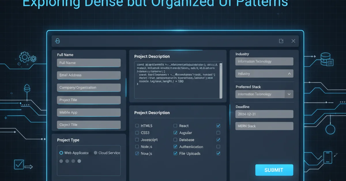
- E-commerce Checkout Processes: These often involve shipping addresses, billing addresses, payment details, shipping options, and order summaries. While often broken into steps, each step can still be dense.
- Account Registration/Profile Creation: Beyond basic username and password, these forms might ask for extensive personal details, preferences, security questions, and communication settings.
- Application Forms (Job, Loan, University): These are perhaps the quintessential heavy forms, requiring detailed personal history, educational background, employment history, references, and often essay-style inputs.
- Configuration/Settings Panels: Admin interfaces or software settings often present numerous options, toggles, dropdowns, and text areas for customization.
- Data Entry Systems (CRM, ERP): Business applications frequently feature forms for creating new records (e.g., customer, product, invoice) that encompass a vast array of data points.
In each of these cases, the sheer number of required inputs necessitates careful design to prevent user fatigue.
Design Strategies for Managing Complexity with CSS and Layout
Effective CSS and layout techniques are paramount for making element-heavy forms usable. Here are some strategies:
1. Grouping Related Fields
Use <fieldset> and <legend> HTML elements, combined with CSS for visual separation (e.g., borders, background colors, spacing). This helps users process information in chunks.
2. Multi-Column Layouts
For desktop views, arranging fields in two or three columns can reduce vertical scroll and make the form appear less daunting. Ensure this collapses gracefully to a single column on smaller screens.
3. Step-by-Step Wizards/Progress Indicators
Breaking a very long form into multiple steps, each with a clear progress indicator, significantly reduces cognitive load. This is often implemented with JavaScript, but CSS handles the visual styling of the steps.
4. Accordions and Tabs
For forms with distinct, optional sections, accordions or tabs can hide less critical information until needed, reducing initial visual clutter.
5. Clear Labeling and Placeholder Text
Labels should be concise and always visible. Placeholder text can offer hints but should not replace labels, as it disappears on input.
6. Visual Hierarchy and Spacing
Use CSS to create a clear visual hierarchy. Larger headings for sections, consistent spacing between fields, and distinct styling for required fields guide the user's eye.
7. Responsive Design
Utilize CSS Grid or Flexbox for flexible layouts that adapt to different screen sizes. Media queries are essential for adjusting column counts, font sizes, and spacing.
8. Inline Validation and Error Messaging
Provide immediate feedback as users fill out the form. Clear, concise error messages placed near the offending field prevent users from submitting an invalid form and then having to hunt for errors.
/* Example CSS for grouping fields and responsive columns */

.form-group {
  margin-bottom: 1.5rem;
  padding: 1rem;
  border: 1px solid #ddd;
  border-radius: 4px;
}

.form-group legend {
  font-weight: bold;
  font-size: 1.1em;
  padding: 0 0.5rem;
  color: #333;
}

.form-columns {
  display: grid;
  grid-template-columns: repeat(auto-fit, minmax(280px, 1fr)); /* Responsive columns */
  gap: 1.5rem;
}

.form-field {
  margin-bottom: 1rem;
}

label {
  display: block;
  margin-bottom: 0.5rem;
  font-weight: 500;
}

input[type="text"],
input[type="email"],
input[type="password"],
textarea,
select {
  width: 100%;
  padding: 0.8rem;
  border: 1px solid #ccc;
  border-radius: 4px;
  box-sizing: border-box;
}

/* Error styling */
.form-field.error input,
.form-field.error textarea,
.form-field.error select {
  border-color: #e74c3c;
}

.error-message {
  color: #e74c3c;
  font-size: 0.85em;
  margin-top: 0.3rem;
}

/* Responsive adjustments */
@media (max-width: 768px) {
  .form-columns {
    grid-template-columns: 1fr; /* Single column on small screens */
  }
}
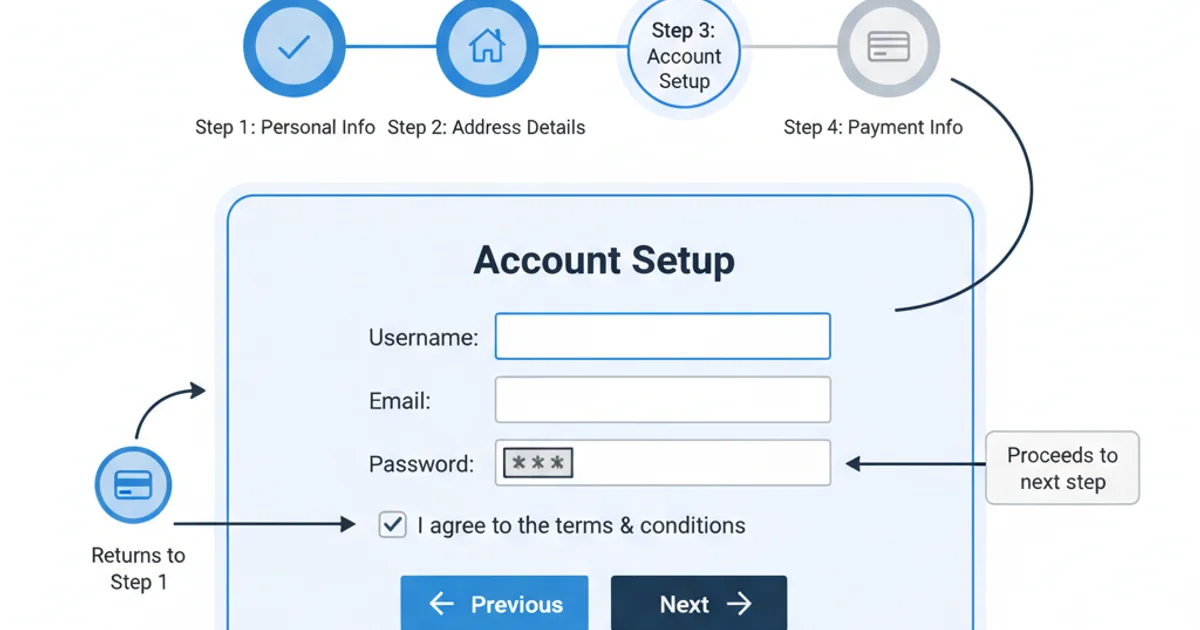
Breaking down a complex form into a multi-step wizard.
Practical Examples and Further Resources
While specific live examples can change, here are types of websites and applications that frequently feature well-designed element-heavy forms:
- Government Portals: Tax filing systems, visa applications, and public service forms often handle a vast amount of data. Look for examples from countries known for good digital services (e.g., UK's GOV.UK, Estonia's e-Residency).
- Financial Institutions: Online banking, loan applications, and investment platforms require extensive personal and financial data.
- SaaS Onboarding: Many Software-as-a-Service products have detailed onboarding flows that collect user preferences, team details, and initial configuration.
- CRM/ERP Demos: Companies like Salesforce, HubSpot, or SAP often have demo environments with complex data entry forms for creating customer records, sales opportunities, or product inventories.
When evaluating these examples, pay close attention to:
- How fields are grouped and labeled.
- The use of visual hierarchy and whitespace.
- Error handling and validation feedback.
- Responsiveness across devices.
- Any progressive disclosure techniques (showing fields only when relevant).
By studying these real-world implementations, you can gather inspiration and best practices for your own element-heavy web forms.