How to apply horizontal break to a d3.js bar chart
Categories:
Applying Horizontal Breaks to D3.js Bar Charts

Learn how to implement horizontal breaks in D3.js bar charts to handle large data ranges effectively, improving readability and visual impact.
D3.js is a powerful library for creating dynamic, interactive data visualizations. While it offers immense flexibility, certain visualization challenges, like displaying bar charts with a wide range of values, require creative solutions. A common issue arises when some bars are significantly larger than others, making smaller bars almost invisible and distorting the overall perception of the data. This article will guide you through applying a horizontal 'break' to a D3.js bar chart, allowing you to effectively visualize disparate data ranges without sacrificing detail or readability.
Understanding the Need for Chart Breaks
When dealing with datasets where values vary drastically, a standard linear scale can be problematic. For instance, if one bar represents a value of 1000 and another represents 10, the bar for 10 will be barely visible. Chart breaks, also known as 'scale breaks' or 'axis breaks', address this by visually segmenting the axis, allowing different parts of the scale to be compressed or expanded. For bar charts, a horizontal break typically means splitting the bars into two or more segments, each with its own scale, and then visually indicating the break.
flowchart TD
    A[Start] --> B{Data Range Disparity?}
    B -->|Yes| C[Identify Break Point]
    B -->|No| D[Standard Bar Chart]
    C --> E[Create Two Scales (Lower & Upper)]
    E --> F[Draw Lower Bar Segments]
    F --> G[Draw Upper Bar Segments]
    G --> H[Add Break Indicator (e.g., jagged line)]
    H --> I[Adjust Axis Labels]
    I --> J[End]
Workflow for implementing a horizontal break in a D3.js bar chart.
Implementing a Horizontal Break in D3.js
The core idea behind implementing a horizontal break is to use two separate scales for the x-axis (or y-axis for vertical bars) and then render two segments for each bar. We'll define a 'break point' and map values below this point to one scale and values above it to another. The visual break will be represented by a jagged line or similar graphic.
const data = [
    { label: 'A', value: 50 },
    { label: 'B', value: 1200 },
    { label: 'C', value: 70 },
    { label: 'D', value: 1500 },
    { label: 'E', value: 30 }
];

const width = 600;
const height = 400;
const margin = { top: 20, right: 20, bottom: 30, left: 40 };

const svg = d3.select("body").append("svg")
    .attr("width", width + margin.left + margin.right)
    .attr("height", height + margin.top + margin.bottom)
  .append("g")
    .attr("transform", `translate(${margin.left},${margin.top})`);

const breakPoint = 200; // The value at which the break occurs
const breakHeight = 20; // Visual height of the break

// Define two x-scales
const x0 = d3.scaleLinear()
    .domain([0, breakPoint])
    .range([0, width * 0.3]); // Lower segment takes 30% of width

const x1 = d3.scaleLinear()
    .domain([breakPoint, d3.max(data, d => d.value)])
    .range([width * 0.3 + breakHeight, width]); // Upper segment starts after break and takes remaining width

const y = d3.scaleBand()
    .domain(data.map(d => d.label))
    .range([0, height])
    .padding(0.1);

// Draw lower segments of bars
svg.selectAll(".bar-lower")
    .data(data)
    .enter().append("rect")
    .attr("class", "bar-lower")
    .attr("y", d => y(d.label))
    .attr("height", y.bandwidth())
    .attr("x", 0)
    .attr("width", d => x0(Math.min(d.value, breakPoint)))
    .attr("fill", "steelblue");

// Draw upper segments of bars (only for values above breakPoint)
svg.selectAll(".bar-upper")
    .data(data.filter(d => d.value > breakPoint))
    .enter().append("rect")
    .attr("class", "bar-upper")
    .attr("y", d => y(d.label))
    .attr("height", y.bandwidth())
    .attr("x", d => x1(breakPoint)) // Start from the break point on the upper scale
    .attr("width", d => x1(d.value) - x1(breakPoint))
    .attr("fill", "steelblue");

// Add the break indicator (jagged line)
const breakLine = d3.line()
    .x(d => d.x)
    .y(d => d.y)
    .curve(d3.curveBasis);

svg.append("path")
    .datum([
        { x: width * 0.3, y: 0 },
        { x: width * 0.3 + breakHeight / 2, y: height * 0.25 },
        { x: width * 0.3, y: height * 0.5 },
        { x: width * 0.3 + breakHeight / 2, y: height * 0.75 },
        { x: width * 0.3, y: height }
    ])
    .attr("fill", "none")
    .attr("stroke", "black")
    .attr("stroke-width", 1)
    .attr("d", breakLine);

// Add axes (simplified for example)
svg.append("g")
    .attr("class", "y-axis")
    .call(d3.axisLeft(y));

// Custom x-axis for lower segment
svg.append("g")
    .attr("class", "x-axis-lower")
    .attr("transform", `translate(0,${height})`)
    .call(d3.axisBottom(x0).ticks(5));

// Custom x-axis for upper segment
svg.append("g")
    .attr("class", "x-axis-upper")
    .attr("transform", `translate(0,${height})`)
    .call(d3.axisBottom(x1).ticks(5));

// Add tooltips or labels for better readability
svg.selectAll(".bar-label")
    .data(data)
    .enter().append("text")
    .attr("class", "bar-label")
    .attr("y", d => y(d.label) + y.bandwidth() / 2)
    .attr("x", d => {
        if (d.value <= breakPoint) {
            return x0(d.value) + 5;
        } else {
            return x1(d.value) + 5;
        }
    })
    .attr("dy", "0.35em")
    .text(d => d.value)
    .attr("fill", "black");
D3.js code for creating a bar chart with a horizontal break.
breakPoint, consider the distribution of your data. It should typically be a value that separates the 'small' values from the 'large' values, ensuring that both segments are clearly visible and informative.Refinements and Considerations
While the basic implementation provides a functional break, several refinements can enhance the user experience and chart clarity. These include dynamic break point calculation, improved break indicator styling, and interactive elements.
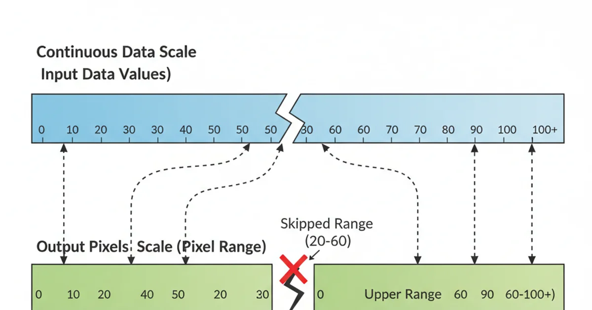
Conceptual diagram of two scales mapping data to visual space with a break.
1. Dynamic Break Point
Instead of a fixed breakPoint, calculate it dynamically based on data distribution, e.g., using a percentile or a threshold that separates outliers. This makes your chart more robust to varying datasets.
2. Enhanced Break Indicator
The jagged line is a common indicator, but you can use other visual cues like a dashed line, a shaded area, or even a custom SVG path to represent the break more effectively. Ensure it doesn't obscure data.
3. Interactive Tooltips
Implement tooltips that show the exact value when hovering over a bar segment. This is crucial for broken charts, as the visual length no longer directly corresponds to the value on a single linear scale.
4. Axis Labeling
Carefully label your axes to indicate the break. You might need to add text annotations near the break point to explain the scale change, or use custom axis ticks that reflect the dual scaling.