CSS: Animation vs. Transition
Categories:
CSS Animations vs. Transitions: Choosing the Right Tool for Dynamic UIs
Explore the fundamental differences between CSS Animations and Transitions, understand their use cases, and learn how to effectively implement each for creating engaging web interfaces.
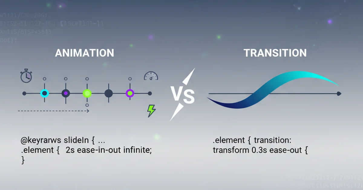
CSS provides powerful tools for bringing web interfaces to life: transitions and animations. While both are used to create dynamic visual effects, they serve different purposes and are best suited for distinct scenarios. Understanding their core differences is crucial for building performant, maintainable, and engaging user experiences. This article will delve into each concept, providing practical examples and guidance on when to use one over the other.
CSS Transitions: Smooth State Changes
CSS Transitions are designed for creating smooth, gradual changes between two states of an element. They are typically triggered by a change in a CSS property, such as a user interaction (e.g., hovering over a button, focusing on an input field) or a JavaScript-driven style modification. Transitions are ideal for simple, one-off state changes where you want to animate from an initial style to a final style.
.button {
  background-color: #007bff;
  color: white;
  padding: 10px 20px;
  border: none;
  border-radius: 5px;
  transition: background-color 0.3s ease-in-out, transform 0.2s ease-out;
}

.button:hover {
  background-color: #0056b3;
  transform: scale(1.05);
}
A simple CSS transition applied to a button's background color and transform property on hover.
flowchart TD
    A[Initial State] --> B{"Property Change Triggered?"}
    B -- Yes --> C[Transition Starts]
    C --> D[Intermediate States (Animated)]
    D --> E[Final State]
    B -- No --> A
    E --> A
Flowchart illustrating the lifecycle of a CSS Transition.
opacity and transform. These are handled directly by the GPU, leading to smoother animations.CSS Animations: Complex, Multi-Step Effects
CSS Animations offer a more robust and flexible way to create complex, multi-step, and looping visual effects. Unlike transitions, animations are defined using @keyframes rules, which allow you to specify styles at various points (percentages) throughout the animation's duration. This enables control over multiple intermediate states, creating intricate sequences without direct user interaction. Animations can run indefinitely, be delayed, or play a specific number of times.
@keyframes pulse {
  0% {
    transform: scale(1);
    opacity: 1;
  }
  50% {
    transform: scale(1.1);
    opacity: 0.7;
  }
  100% {
    transform: scale(1);
    opacity: 1;
  }
}

.pulsing-element {
  width: 50px;
  height: 50px;
  background-color: red;
  border-radius: 50%;
  animation: pulse 2s infinite ease-in-out;
}
A CSS animation defining a 'pulse' effect using @keyframes and applying it to an element.
sequenceDiagram
    participant Dev as Developer
    participant Browser as Browser Engine

    Dev->>Dev: Define `@keyframes` (0%, 50%, 100%)
    Dev->>Dev: Apply `animation` property to element
    Browser->>Browser: Parse CSS
    Browser->>Browser: Start animation based on properties
    loop Animation Cycle
        Browser->>Browser: Render element at 0% keyframe
        Browser->>Browser: Interpolate to 50% keyframe
        Browser->>Browser: Render element at 50% keyframe
        Browser->>Browser: Interpolate to 100% keyframe
        Browser->>Browser: Render element at 100% keyframe
    end
    Browser->>Browser: Repeat or stop based on `animation-iteration-count`
Sequence diagram showing how CSS Animations are defined and executed by the browser.
Key Differences and When to Use Which
The choice between CSS Transitions and Animations boils down to complexity, control, and trigger. Transitions are simpler, reactive, and best for single-state changes. Animations offer granular control over multiple states, can be self-starting, and are suitable for continuous or complex sequences. Consider the following table for a quick comparison:
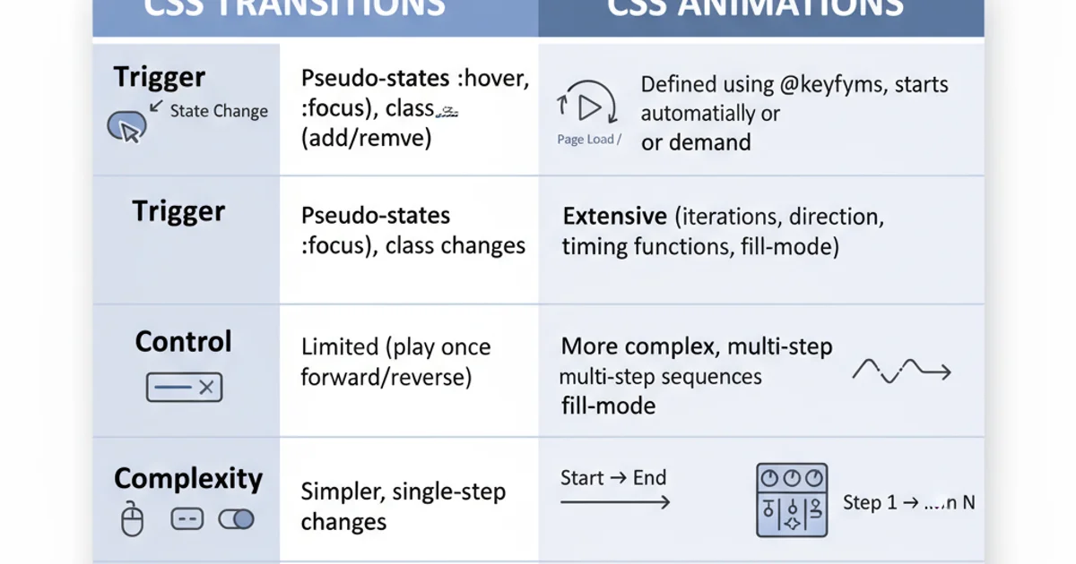
Comparison of CSS Transitions vs. CSS Animations