What is the Facebook Font Used in Messaging?
Categories:
Unmasking the Facebook Font: What Typeface Powers Your Messages?
Explore the evolution of Facebook's typography, focusing on the fonts used in its messaging interfaces across different platforms and how they contribute to the user experience.
Have you ever wondered about the specific font Facebook uses in its messaging apps? While it might seem like a minor detail, typography plays a crucial role in readability, brand identity, and overall user experience. Facebook, like many tech giants, has evolved its font choices over time to maintain a modern aesthetic and ensure optimal legibility across a vast array of devices and operating systems. This article delves into the primary fonts you'll encounter in Facebook's messaging features, from the main platform to Messenger.
The Core Facebook Font: Segoe UI and San Francisco
For a long time, Facebook's primary font across its web and mobile platforms was a custom version of Segoe UI on Windows and San Francisco (SF Pro Display/Text) on Apple devices. This strategy of using native system fonts is common among applications to ensure a consistent look and feel with the operating system, often leading to better performance and rendering. Segoe UI is a humanist sans-serif typeface designed by Microsoft, known for its clarity and legibility on screens. San Francisco, Apple's proprietary typeface, is optimized for readability on iOS and macOS, dynamically adjusting spacing and weight for different sizes.
flowchart TD
    A[Facebook Platform] --> B{Operating System}
    B -->|Windows| C[Segoe UI]
    B -->|macOS/iOS| D["San Francisco (SF Pro)"]
    C --> E[Messaging Interface]
    D --> E[Messaging Interface]
Facebook's font selection logic based on operating system
Introducing Facebook Sans: A Unified Brand Experience
In recent years, Facebook (now Meta) has been moving towards a more unified brand identity across its family of apps. This led to the development and gradual rollout of Facebook Sans, a custom typeface designed to be consistent across all platforms and devices. Facebook Sans is a modern, geometric sans-serif font that aims to be highly readable, accessible, and distinctive. It's part of a broader rebranding effort to solidify Meta's visual language. While the transition is ongoing, you'll increasingly see Facebook Sans in various parts of the Facebook ecosystem, including messaging.
Messenger's Font Evolution and Readability
Facebook Messenger, as a standalone application, largely follows the same typographic principles as the main Facebook platform. Initially, it relied on system fonts (Segoe UI/San Francisco). As Facebook Sans rolls out, Messenger is also adopting this new typeface to create a cohesive visual experience with the broader Meta brand. The design choices for Messenger's font prioritize:
- Readability: Ensuring messages are easy to scan and comprehend quickly.
- Accessibility: Catering to users with various visual needs.
- Brand Consistency: Aligning with Meta's overall design language.
These fonts are carefully chosen and optimized for digital screens, taking into account factors like pixel density, screen size, and user interface elements.
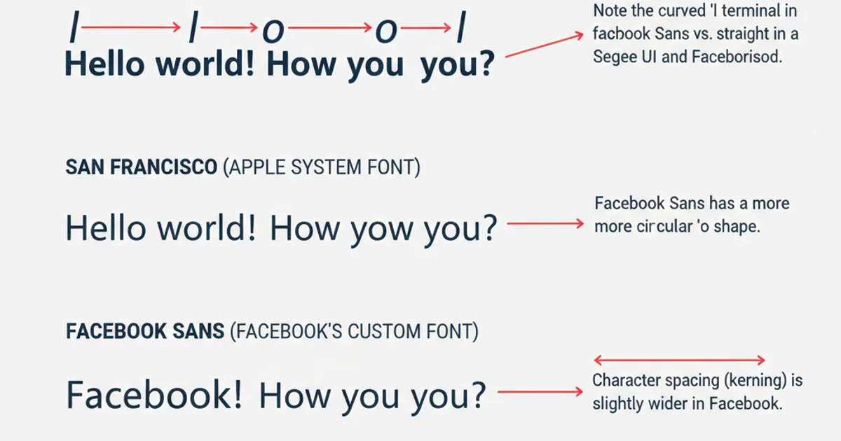
Subtle differences in character design between common system fonts and Facebook Sans.
Understanding the fonts used by platforms like Facebook provides insight into the meticulous design decisions that shape our digital interactions. From system-native fonts to custom-designed typefaces, the goal remains the same: to create a clear, consistent, and pleasant reading experience for billions of users worldwide.