What is the content value for this arrow facing down?
Categories:
Understanding the Content Value of the Down Arrow Symbol (↓) in XAML

Explore the various interpretations and common uses of the down arrow symbol (↓) within XAML, particularly in WinRT and UWP applications, and how it impacts UI design and user experience.
The down arrow symbol (↓) is a ubiquitous glyph used across many digital interfaces to convey a variety of meanings. In the context of XAML-based applications, especially those built for WinRT (Windows Runtime) and UWP (Universal Windows Platform), its interpretation is often tied to the control it's associated with, the surrounding text, or the overall UI design. This article delves into the common content values and implications of this simple yet powerful symbol.
Common Interpretations of the Down Arrow in XAML UI
The meaning of a down arrow in a XAML UI is highly contextual. It can indicate a dropdown menu, a collapse action, a download operation, or even a sorting order. Understanding these common interpretations is crucial for both developers implementing UI elements and designers crafting intuitive user experiences.
flowchart TD
    A[Down Arrow Symbol (↓)] --> B{Context?}
    B -->|Dropdown/Expand| C[ComboBox, MenuFlyout, Expander]
    B -->|Download/Save| D[Button, Hyperlink]
    B -->|Sort Order| E[ListView/GridView Column Header]
    B -->|Scroll/Navigate| F[Scroll Indicator, Pager]
    C --> C1["Shows more options/details"]
    D --> D1["Initiates file transfer/storage"]
    E --> E1["Indicates descending order"]
    F --> F1["Suggests content below/next page"]
Contextual interpretations of the down arrow symbol in XAML UI.
Let's break down some of the most frequent scenarios where you'll encounter the down arrow and what it typically signifies:
Dropdown and Expansion Indicators
Perhaps the most common use of the down arrow is to signify a dropdown or expandable element. Controls like ComboBox, MenuFlyout, or custom expander components frequently use this symbol. When placed next to text or an input field, it strongly suggests that clicking or tapping will reveal a list of options or additional content.
<ComboBox Width="200" Header="Select an Option">
    <ComboBoxItem Content="Option 1"/>
    <ComboBoxItem Content="Option 2"/>
    <ComboBoxItem Content="Option 3"/>
</ComboBox>

<!-- The ComboBox implicitly uses a down arrow for its dropdown functionality -->
A standard ComboBox in XAML, which typically displays a down arrow.
ComboBox automatically handles the visual indicator, for custom expander controls, you might use a FontIcon with the ChevronDown glyph or a custom path geometry to represent the down arrow.Download and Save Actions
Another prevalent use is to indicate a download or save action. A button or hyperlink adorned with a down arrow often means that clicking it will initiate the transfer of a file from a remote source to the user's device, or save current data. This is a widely recognized convention across operating systems and web applications.
<Button Content="Download File" Margin="10">
<Button.ContentTemplate>
<DataTemplate>
<StackPanel Orientation="Horizontal">
<FontIcon Glyph="" Margin="0,0,5,0"/> <!-- Download glyph -->
<TextBlock Text="{Binding}"/>
</StackPanel>
</DataTemplate>
</Button.ContentTemplate>
</Button>
A XAML button using a FontIcon for a download glyph (often a down arrow variant).
Sorting Order in Data Grids
In data-bound controls like ListView or GridView, especially within column headers, a down arrow frequently indicates that the data is currently sorted in descending order by that particular column. An up arrow (↑) would typically signify ascending order. This provides immediate visual feedback to the user about the data arrangement.
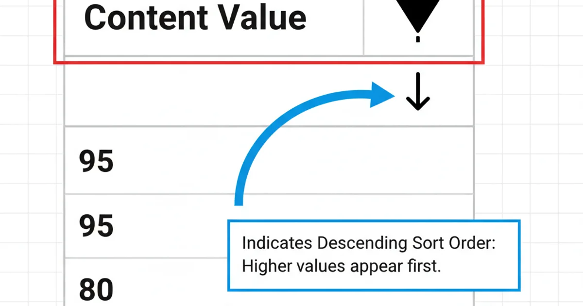
Example of a down arrow indicating descending sort order in a data grid.
Implementing this usually involves custom templates for column headers and logic to update the glyph based on the current sort state.