In a bootstrap responsive page how to center a div
Categories:
Centering a Div in Bootstrap Responsive Pages
Learn various techniques to horizontally center a div element within a Bootstrap responsive layout, ensuring consistent display across different screen sizes.
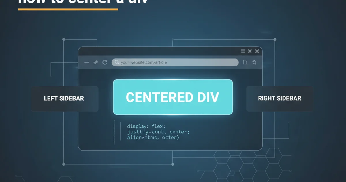
Centering elements, especially divs, is a common task in web development. When working with Bootstrap, a popular front-end framework, achieving perfect horizontal centering in a responsive manner requires understanding its grid system and utility classes. This article will guide you through several effective methods to center a div in a Bootstrap responsive page, from simple utility classes to more advanced flexbox techniques.
Understanding Bootstrap's Grid and Centering Challenges
Bootstrap's responsive design is built upon a 12-column grid system. By default, elements within this grid are left-aligned. When you want to center a div, you're essentially asking it to occupy less than the full width available and then distribute the remaining space equally on both sides. This can be tricky, especially when the div's width changes based on screen size. The key is to leverage Bootstrap's built-in tools that handle these responsive adjustments for you.
flowchart TD
    A[Start: Div to Center] --> B{Has fixed width?}
    B -- Yes --> C[Use `mx-auto` or `offset`]
    B -- No --> D{Use Flexbox?}
    D -- Yes --> E[Apply `d-flex`, `justify-content-center`]
    D -- No --> F[Consider `text-center` for inline/inline-block]
    C --> G[End]
    E --> G[End]
    F --> G[End]
Decision flow for centering a div in Bootstrap
Method 1: Using Bootstrap's Margin Auto Utilities (mx-auto)
For elements with a defined width, Bootstrap's mx-auto utility class is the simplest and most common way to center them horizontally. This class sets the left and right margins to auto, which effectively centers the block-level element within its parent container. This method works best when your div has a specific width, either explicitly set or inherited from Bootstrap's column classes.
<div class="container">
  <div class="row">
    <div class="col-md-6 mx-auto bg-light p-3 border">
      This div is centered using mx-auto.
    </div>
  </div>
</div>
Centering a column with mx-auto
mx-auto class is a shorthand for margin-left: auto; margin-right: auto;. It only works on block-level elements that have a specified width (or a width less than 100%). If your div takes up 100% width, mx-auto will have no visible effect.Method 2: Centering with Bootstrap's Grid Offsets
Another powerful way to center columns within Bootstrap's grid is by using offset classes. Offset classes (offset-md-X, offset-lg-X, etc.) push columns to the right by a specified number of columns. To center a column, you can calculate the offset needed to push it to the middle. For example, a col-md-6 (6 columns wide) in a 12-column grid would need an offset-md-3 on one side to be centered.
<div class="container">
  <div class="row">
    <div class="col-md-6 offset-md-3 bg-info p-3 text-white border">
      This div is centered using offset classes.
    </div>
  </div>
</div>
Centering a column using offset-md-3
mx-auto if your column widths change significantly across breakpoints. You might need to define different offset classes for different screen sizes.Method 3: Using Flexbox Utilities for Dynamic Centering
Bootstrap 4+ heavily leverages Flexbox, providing a robust set of utility classes for alignment and distribution. This method is particularly useful when you want to center content that might not have a fixed width or when you need more control over alignment within a container. By making the parent a flex container, you can easily center its children.
<div class="container">
  <div class="d-flex justify-content-center bg-warning p-3 border">
    <div class="p-2 bg-light border">
      This div is centered using Flexbox utilities.
    </div>
  </div>
</div>

<div class="container mt-3">
  <div class="row justify-content-center">
    <div class="col-auto bg-success p-3 text-white border">
      Another Flexbox example within a row.
    </div>
  </div>
</div>
Centering content using d-flex and justify-content-center
Method 4: Centering Inline or Inline-Block Elements with text-center
If you need to center inline-level elements (like <span>, <a>, or images) or elements that are display: inline-block; within a block-level parent, Bootstrap's text-center utility class is the way to go. This class applies text-align: center; to the parent, which then centers its inline children.
<div class="container">
  <div class="text-center bg-primary p-3 text-white border">
    <p>This paragraph is centered.</p>
    <img src="https://via.placeholder.com/100" alt="Placeholder Image" class="img-fluid d-inline-block border">
    <span class="d-inline-block bg-light text-dark p-2 border">Centered Span</span>
  </div>
</div>
Centering inline and inline-block elements with text-center
text-center only affects inline-level content. It will not center block-level elements unless they are explicitly set to display: inline-block; and have a defined width.