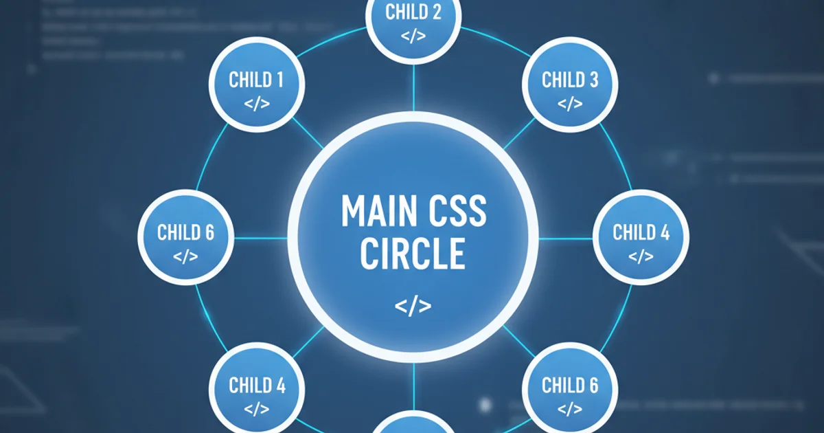
Creating CSS circles connected by lines to middle main circle
Categories:
Crafting Connected CSS Circles: A Guide to Radial Layouts

Learn how to create a visually appealing radial layout in CSS, featuring a central circle connected to surrounding satellite circles with elegant lines. This article covers positioning, styling, and responsive design techniques.
Creating dynamic and engaging layouts is a cornerstone of modern web design. One such layout, often used for navigation menus, data visualizations, or organizational charts, involves a central element surrounded by connected satellite elements. This article will guide you through the process of building a CSS-based radial layout where smaller circles are connected by lines to a main central circle. We'll explore the core CSS properties needed for positioning, styling, and ensuring responsiveness.
Understanding the Core Concept: Positioning and Structure
The fundamental challenge in creating this layout lies in accurately positioning the satellite circles around a central point and then drawing lines between them. We'll primarily use CSS position: absolute; for precise placement and leverage transform properties for rotation and translation. The structure will consist of a main container, a central circle, and several satellite circles, each potentially wrapped in its own container to manage positioning and line drawing more effectively.
graph TD
    A[Container] --> B[Main Circle]
    A --> C[Satellite Container 1]
    A --> D[Satellite Container 2]
    A --> E[Satellite Container 3]
    C --> C1[Satellite Circle 1]
    D --> D1[Satellite Circle 2]
    E --> E1[Satellite Circle 3]
    B -- Connects --> C1
    B -- Connects --> D1
    B -- Connects --> E1
Conceptual structure of the radial layout
HTML Structure: Setting the Stage
Our HTML will be straightforward. We'll have a main container (.radial-container) to hold everything. Inside, there will be a central circle (.main-circle) and a series of satellite circles (.satellite-circle). For simplicity and better control over positioning and line drawing, each satellite circle will be nested within its own .satellite-wrapper.
<div class="radial-container">
  <div class="main-circle">Main</div>
  <div class="satellite-wrapper satellite-1">
    <div class="satellite-circle">Sat 1</div>
  </div>
  <div class="satellite-wrapper satellite-2">
    <div class="satellite-circle">Sat 2</div>
  </div>
  <div class="satellite-wrapper satellite-3">
    <div class="satellite-circle">Sat 3</div>
  </div>
  <div class="satellite-wrapper satellite-4">
    <div class="satellite-circle">Sat 4</div>
  </div>
</div>
Basic HTML structure for the radial layout
CSS Styling and Positioning: Bringing it to Life
The CSS is where the magic happens. We'll define the sizes and basic styles for our circles. The .radial-container will be position: relative; to serve as the positioning context for its children. Both the main circle and satellite wrappers will be position: absolute; and centered using top: 50%; left: 50%; transform: translate(-50%, -50%);. The key to radial positioning lies in rotating the .satellite-wrapper elements and then translating the .satellite-circle within them. This allows us to draw lines from the center of the main circle to the center of each satellite circle.
.radial-container {
  position: relative;
  width: 400px;
  height: 400px;
  border: 1px dashed #ccc;
  margin: 50px auto;
  border-radius: 50%; /* Optional: for visual centering */
}

.main-circle,
.satellite-circle {
  position: absolute;
  border-radius: 50%;
  display: flex;
  align-items: center;
  justify-content: center;
  color: white;
  font-family: sans-serif;
  font-size: 14px;
}

.main-circle {
  width: 80px;
  height: 80px;
  background-color: #3498db;
  top: 50%;
  left: 50%;
  transform: translate(-50%, -50%);
  z-index: 2;
}

.satellite-wrapper {
  position: absolute;
  top: 50%;
  left: 50%;
  transform-origin: 0 0; /* Rotate around the center of the container */
  width: 1px; /* Effectively a pivot point */
  height: 1px;
}

.satellite-circle {
  width: 60px;
  height: 60px;
  background-color: #2ecc71;
  /* Position relative to its wrapper's pivot point */
  left: 150px; /* Distance from the center */
  transform: translate(-50%, -50%); /* Center the circle itself */
  z-index: 1;
}

/* Rotate each satellite wrapper */
.satellite-1 { transform: rotate(0deg); }
.satellite-2 { transform: rotate(90deg); }
.satellite-3 { transform: rotate(180deg); }
.satellite-4 { transform: rotate(270deg); }

/* Lines (using pseudo-elements or SVG for more complex lines) */
.satellite-wrapper::before {
  content: '';
  position: absolute;
  top: 0;
  left: 0;
  width: 150px; /* Match 'left' of satellite-circle */
  height: 2px;
  background-color: #95a5a6;
  transform-origin: 0 0;
  transform: rotate(0deg); /* This will be rotated by the parent wrapper */
  z-index: 0;
}
Core CSS for styling and positioning circles and lines
Dynamic Positioning with JavaScript (Optional)
While static positioning works for a fixed number of circles, you might want to dynamically add or remove satellites, or adjust their positions based on data. JavaScript can calculate the rotation angles and distances, applying them to the CSS variables or inline styles. This approach makes the layout highly flexible and scalable.
document.addEventListener('DOMContentLoaded', () => {
  const container = document.querySelector('.radial-container');
  const satellites = document.querySelectorAll('.satellite-wrapper');
  const numSatellites = satellites.length;
  const radius = 150; // Must match 'left' in .satellite-circle CSS

  satellites.forEach((satellite, index) => {
    const angle = (360 / numSatellites) * index;
    satellite.style.transform = `rotate(${angle}deg)`;

    // Adjust line length if needed, or use CSS variables
    const line = satellite.querySelector('::before'); // Pseudo-elements can't be selected directly
    // For lines, it's often easier to manage them purely in CSS with the wrapper rotation
    // or use a dedicated line element inside the wrapper.
  });
});
JavaScript for dynamic satellite positioning
::before) will naturally follow the rotation of its parent wrapper, simplifying the line's positioning relative to the satellite circle.