How to visualize profile files graphically?
Categories:
Visualizing Go Profile Files Graphically

Learn how to effectively analyze Go application performance by visualizing CPU, memory, and other profile data using pprof and its graphical output capabilities.
Profiling is a crucial step in optimizing the performance of any application. Go provides excellent built-in profiling tools through its runtime/pprof package and the go tool pprof command. While pprof can generate textual reports, visualizing these profiles graphically often provides a much clearer and more intuitive understanding of where your application spends its time and resources.
Understanding Go Profiling Basics
Before diving into graphical visualization, it's important to understand how Go profiling works. Go applications can expose various profiles, such as CPU, memory (heap), goroutine, blocking, mutex, and trace profiles. These profiles capture different aspects of your application's behavior. The pprof tool then consumes these profile files to generate reports and visualizations.
package main

import (
	"fmt"
	"log"
	"net/http"
	"runtime/pprof"
	"time"
)

func handler(w http.ResponseWriter, r *http.Request) {
	fmt.Fprintf(w, "Hello, world!")
	// Simulate some work
	for i := 0; i < 100000000; i++ {
		_ = i * i
	}
}

func main() {
	http.HandleFunc("/", handler)

	// Expose pprof endpoints
	// import _ "net/http/pprof"
	// For simplicity, we'll manually write a CPU profile for this example

	log.Println("Starting server on :8080")
	log.Fatal(http.ListenAndServe(":8080", nil))
}
A simple Go HTTP server that can be profiled. For real-world scenarios, import net/http/pprof.
_ "net/http/pprof" will register handlers at /debug/pprof that allow you to fetch profiles directly from a running server (e.g., http://localhost:8080/debug/pprof/heap).Generating and Visualizing Profiles
The go tool pprof command is your primary interface for analyzing profile data. It can read profile files generated by runtime/pprof or fetched from a running application via HTTP. To visualize profiles graphically, pprof relies on external tools like Graphviz. If Graphviz is not installed, pprof will fall back to text-based output.
flowchart TD
    A[Go Application] --> B{Generate Profile Data}
    B --> C[Profile File (e.g., cpu.pprof)]
    C --> D["go tool pprof cpu.pprof"]
    D --> E{Choose Output Format}
    E --> F["Text Report (default)"]
    E --> G["Graphical Output (requires Graphviz)"]
    G --> H["Flame Graph (SVG)"]
    G --> I["Call Graph (SVG/PDF)"]
    G --> J["Web UI (interactive)"]
Workflow for generating and visualizing Go profile files.
1. Step 1: Install Graphviz
Graphviz is essential for pprof to generate graphical output. Install it using your system's package manager:
- Debian/Ubuntu:
sudo apt-get install graphviz - macOS (Homebrew):
brew install graphviz - Windows: Download from the Graphviz website and add to PATH.
2. Step 2: Generate a Profile File
Run your Go application and generate a profile. For a CPU profile, you might use:
go run main.go &
PID=$!
curl -o cpu.pprof "http://localhost:8080/debug/pprof/cpu?seconds=30"
kill $PID
Or, if you're profiling a test:
go test -cpuprofile cpu.pprof -bench . ./...
3. Step 3: Visualize with go tool pprof
Once you have a profile file (e.g., cpu.pprof), you can open it with pprof:
go tool pprof cpu.pprof
This will launch an interactive pprof shell. From there, you can type web to open a call graph in your browser (requires Graphviz), or svg to generate an SVG file. For an interactive flame graph, type go tool pprof -http=:8000 cpu.pprof and navigate to http://localhost:8000 in your browser.
pprof reports Failed to execute dot. Is Graphviz installed in your PATH?, ensure Graphviz is correctly installed and its executable (dot) is accessible from your system's PATH.Interpreting Graphical Output
Graphical visualizations like call graphs and flame graphs provide different perspectives on your application's performance:
Call Graphs (e.g.,
pprof web): These are directed graphs where nodes represent functions and edges represent calls. The size of the nodes and thickness of the edges often indicate the amount of time spent in a function or the frequency of calls. They are excellent for identifying critical paths and bottlenecks.Flame Graphs: These are stacked bar charts that show the call stack. The width of each bar represents the total time spent in that function and its children. The x-axis shows the stack samples, and the y-axis shows the stack depth. Flame graphs are particularly good for quickly identifying 'hot' code paths and understanding where CPU cycles are consumed.
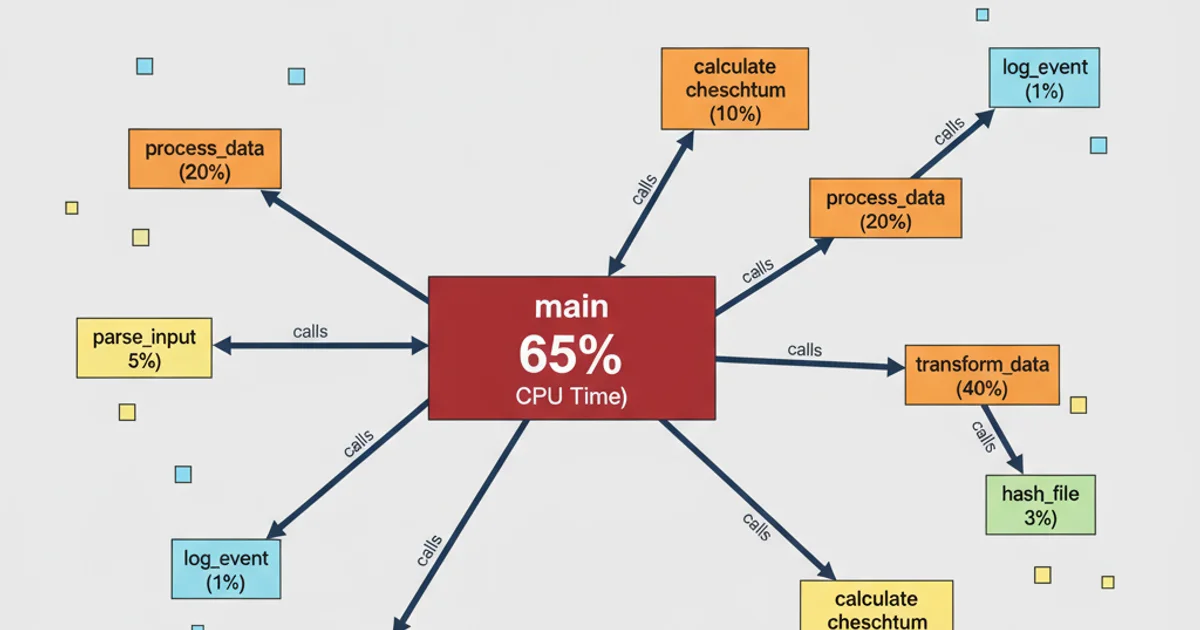
A typical call graph generated by pprof web, highlighting functions with significant CPU usage.